
Create and interpret dot plots (simple)

Dot plots are a graphical way of showing how often a particular choice was made or how many times an event occurred. They are best used for small to medium size data sets.
Just by looking at a dot plot we can see:
- the most frequent (common) choice/ event.
- the highest and lowest scores
- how spread out the scores are
- whether there are any outliers (scores that are very different from the rest)
Worked Example
Question 1
Mrs. Brown took a survey of the type of pets owned by her students and displayed her results in the dot plot below.
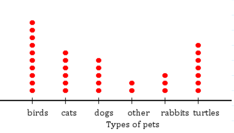
a) Which pet is most common?
Think: The most common pet will have the most dots, so the column will be the tallest.
Do: Birds were the most common type of pets.
b) There is the fewest of which type of pet?
Think: "Fewest" means "least" so we are looking for the column with the least number of dots.
Do: There is the fewest "other" pets.
c) How many students had cats?
Think: One dot represents one cat, so we need to count the number of dots.
Do: $6$6 students had cats.
d) Which pets could belong to the other category?
A) Birds B) Dogs C) Mice D) Cats
Think: We need to find the animal that was not mentioned in the dot plot.
Do: Birds, dogs and cats were all columns in the dot plot, so C) mice could belong to the other category.
Class Activity: Create Your Own Dot Plot
-
Think of a question to ask your classmates e.g. shoe size, type of pet, number of siblings (remember you don't want too many different answers so pick carefully).
-
Keep a tally of people's answers.
-
Create a dot plot of your data. Remember to include a title for your graph, as well as the names of all the possible responses (even if no people picked a particular answer).
-
Discuss your results as a class.