Create and interpret box and whisker

Box and whisker plots are a great way of displaying quantitative (numerical) data as they clear show all the quartiles in a data set. Since statisticians are interested in what's "normal," they assume that most scores will be somewhere in the middle. As such, the "box" in box-and-whisker plots indicates the middle half of the scores. As you read through this chapter, you should get a clear idea of how box-and-whisker plots give us a clear picture of a data set's central tendency and spread.
Let's take a minute to get familiar with the features of box-and-whisker plots.
Features of a box-and-whisker plot
We start with a number line that displays the values in our data set.
Above that, you'll see that there are two lines or "whiskers" that extend from the box outwards. The two end points of these lines show the highest and lowest scores in the data set.
The two vertical edges of the box show the quartiles of the data range. The left hand side of the box is the lower quartile and the right hand side of the box is the upper quartile.
Finally, the vertical line inside the box shows the median (the middle score) of the data.
The diagram below shows a nice summary of all this information:

Each quartile represents $25%$25% of the data set.
In other words, the lowest score to the lower quartile represents $25%$25% of the data, the lower quartile to the median represents another $25%$25%, the median to the upper quartile is another $25%$25% and the upper quartile to the highest score represents another $25%$25%.
We can add these quartiles together. For example, $50%$50% of the scores in a data set lie between the lower and upper quartiles.
Creating a box-and-whisker plot
- Put your data in ascending order (from smallest to largest).
- Find the median of your data.
- To divide the data into quarters, you then find the medians of the lowest point and the median, as well as the median and the highest score. To divide the data into quarters, you then find the medians of these two halves. If there are lots of scores in your data set, it may be easier to work out which scores represent the median and the upper and lower quartiles. This way, you won't have to count so many terms. If you need a reminder of how to do this, click here.
Examples
Question 1

For the box-and-whisker plot above, find the:
a) lowest score
Think: The lowest score is at the end of the left whisker.
Do: $3$3
b) highest score
Think: The highest score is at the end of the right whisker.
Do: $18$18
c) range
Think: The range is the difference between the highest score and the lowest score.
Do: $18-3=15$18−3=15
d) median
Think: The median is shown by the line inside the box on the graph.
Do: $10$10
e) interquartile range (IQR)
Think: The IQR is the difference between the upper quartile and the lower quartile.
Do: $15-8=7$15−8=7
Question 2

Using the box-and-whisker plot above:
a) what percentage of scores lie between:
$10.9$10.9 and $11.2$11.2
$10.8$10.8 and $10.9$10.9
$11.1$11.1 and $11.3$11.3
$10.9$10.9 and $11.3$11.3
$10.8$10.8 and $11.2$11.2
Think: For these five questions, think about how many quartiles are in that range. Remember that one quartile represents $25%$25% of the data set.
Do:
$50%$50% of scores lie between Q1 to Q3.
$25%$25% of the scores lie between the lowest score and Q1.
$50%$50% of scores lie between the median and the highest score.
$75%$75% of scores lie between Q2 and the highest score.
$75%$75% of scores lie between the lowest score and Q3.
b) In which quartile (or quartiles) is the data the most spread out?
Think: Which quartile takes up the longest space on the graph?
Do: The second quartile is the most spread out.
Question 3
Below is the luggage weight of $30$30 passengers.
| Weight (kg) | Frequency |
|---|---|
| $16$16 | $5$5 |
| $17$17 | $5$5 |
| $18$18 | $2$2 |
| $19$19 | $4$4 |
| $20$20 | $6$6 |
| $21$21 | $4$4 |
| $22$22 | $4$4 |
a) What is the mean check in weight? Leave your answer to two decimal places if needed.
Think: We need to add up the scores and divide it by the number of scores.
Do:
| $\text{Mean weight }$Mean weight | $=$= | $\frac{5\times16+5\times17+2\times18+4\times19+6\times20+4\times21+4\times22}{30}$5×16+5×17+2×18+4×19+6×20+4×21+4×2230 |
| $=$= | $\frac{569}{30}$56930 | |
| $=$= | $18.9666$18.9666... | |
| $=$= | $18.97$18.97kg |
b) Determine the:
i) Median
Think: The median is the $\frac{n+1}{2}$n+12th score.
Do: The median is the $\frac{30+1}{2}$30+12th score, which is the $15.5$15.5th score. This means that the median weight is $19$19kg.
ii) Lower Quartile
Think: The lower quartile is the $\frac{n+1}{4}$n+14th score.
Do: The $\frac{31}{4}$314th score is the $7.75$7.75th score. This means that the lower quartile is $17$17kg.
iii) Upper Quartile
Think: The upper quartile is the $\frac{3\left(n+1\right)}{4}$3(n+1)4th score.
Do: The $\frac{3\times31}{4}$3×314th score is the $23.25$23.25th score. This means that the upper quartile is $21$21kg.
c) In which quartile does the mean lie?
Think: The mean lies between the lower quartile and the median.
Do: The mean lies in the second quartile.
Question 4
Question 5
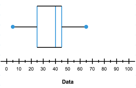
Using the information in the table, create a box plot to represent this data:
| Minimum | $5$5 |
| Lower Quartile | $25$25 |
| Median | $40$40 |
| Upper Quartile | $45$45 |
| Maximum | $65$65 |
Think: Where do each of these values sit on a box and whisker plot?
Do: Here is our graph. Notice how the values in our table correspond to particular places on the box-and-whisker plot.