
Create and interpret histograms and polygons
Histograms
Histograms are very similar to column graphs. The only difference is that the columns are all joined together in a histogram, rather than having a space in between. This is because histograms are used to display continuous data. In other words, there are no distinct categories between the groups. Instead, histograms display ranges of data that are determined by the person creating the graph. The width of the columns in a histogram are used to show the interval or bin that they represent.
Here is an example of a histogram. See how each column has a range of $5$5?

Frequency Polygons
Frequency polygons are particularly useful for helping us understand the shapes of distributions and for comparing data sets. They are also a good way to display cumulative frequency distributions. A frequency polygon is a graph that makes a kind of shape by joining the middle-top points of the columns of a histogram, as shown below.
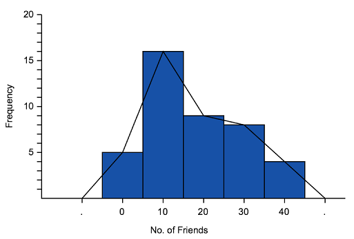 '
'
We can use frequency polygons to help us estimate how many people got a particular score. For example, the graph above shows that $6$6 people have $35$35 friends.
Examples
Question 1
Data is represented in a histogram as shown:

Complete the following frequency table:
| Score | Frequency |
|---|---|
| $21$21 | $\editable{}$ |
| $23$23 | $\editable{}$ |
| $25$25 | $\editable{}$ |
| $27$27 | $\editable{}$ |
| $29$29 | $\editable{}$ |
| $31$31 | $\editable{}$ |
Think: How often does each score appear? We can determine this by looking at the height of of column on the $y$y axis.
Do:
| Score | Frequency |
|---|---|
| $21$21 | $20$20 |
| $23$23 | $16$16 |
| $25$25 | $16$16 |
| $27$27 | $12$12 |
| $29$29 | $18$18 |
| $31$31 | $12$12 |
Question 2
Examine the histogram given and answer the following questions.
Which number occured most frequently?
How many scores of $1$1 were there?
How many more scores of $1$1 were there than scores of $4$4?