
Shape and Correlation of Bivariate Data
Bivariate data arises when a study aims to determine whether there is a relation between two variable quantities. The quantities under investigation are called the explanatory variable and the response variable, or equivalently, the independent- and the dependent variable.
If the dependent variable is found to be related in a definite way to the values taken by the independent variable, then further research may show that there is a causal relationship between the two. This is not necessarily the case, however, because the two quantities may both be varying in response to changes in a third factor and so it could not be claimed that one of the variables being studied has had a causal effect on the other. You can read more on causality and correlation here.
The results of bivariate data investigations can be displayed graphically using a scatter plot. The level of the independent variable corresponds to a position on the horizontal axis and the resulting value of the dependent variable corresponds to a distance along the vertical axis. In this way, each data point is displayed as a point in a two-dimensional coordinate system.
Correlations
A correlation is a way of expressing a relationship between two variables and, more specifically, how strongly pairs of data are related. We describe the correlation from data using language like positive correlation, negative correlation or no correlation. We can even further strengthen the language by using strong or weak.
Linear
It is often possible to determine by looking at a scatter plot the nature of a relation between variables. If the data points lie on or close to a line, a linear relation is strongly suggested. An algebraic model of the form $y=ax+b$y=ax+b may then be proposed as a summary of the relation. If the points are not close to a line but still display a generally linear trend, a weak linear relation may be said to exist. Techniques are available to find the best fitting linear model to any bivariate data set whether or not there is a genuine linear relation.
The slope of a line fitted to a data set may be positive or negative, depending on the sign of the coefficient $a$a in the formula $y=ax+b$y=ax+b. This corresponds to whether the response variable increases or decreases respectively in response to an increase in the explanatory variable.
Positive Correlations
A positive correlation is when the data appears to gather in a positive relationship. Similar to a straight line with a positive gradient.
In other words, as one variable increases, the other variable also increases.
There are three types of positive correlation:
- Perfect positive correlation, where it lines up on a straight line exactly.
- Strong positive correlation, where it closely resembles a straight line with a positive gradient.
- Weak positive correlation, where the relationship is still positive.
You may also come across a moderate correlation, which is a correlation between weak and strong. Here are some examples of positive style correlations
 |
 |
 |
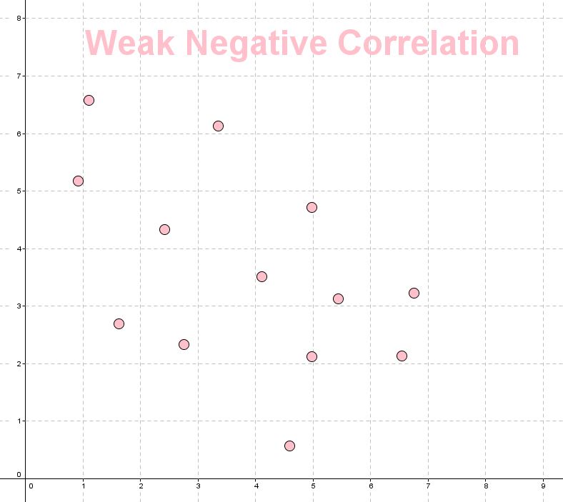
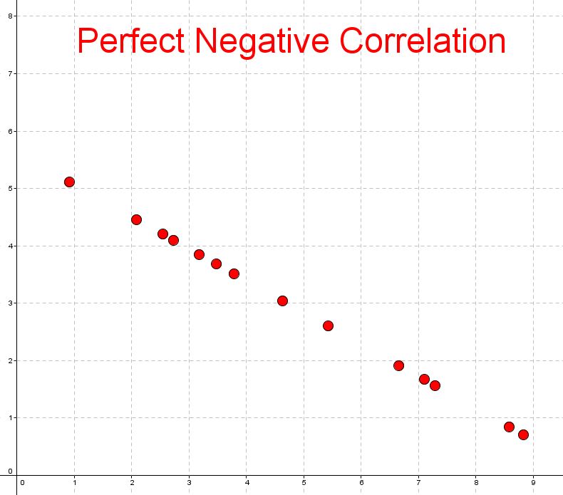
Negative Correlations
A negative correlation is when the data appears to gather in a negative relationship. Similar to a straight line with a negative gradient.
In other words, as one variable increases, the other one decreases.
Like positive correlation, there are three types of negative correlation:
- Perfect negative correlation, where it lines up on a decreasing line perfectly
- Strong negative correlation, where the data presents strongly in a negative direction
- Weak negative correlation.
Here are some examples of negative style correlations
 |
 |
 |
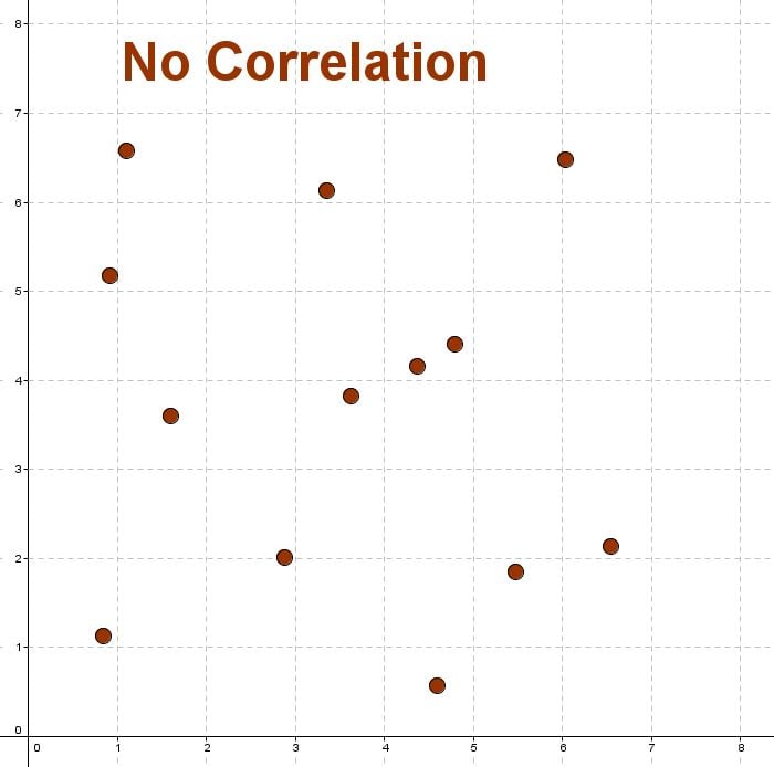
No Correlation
No correlation is when there is no relationship between the variables.
This means that there is a random or nonlinear relationship between the two sets of data.
Here is a diagram of no correlation
Non-linear
Shapes other than a line may be apparent in a scatter plot. If the data points lie on or near a curve, it may be appropriate to infer a non-linear relation between the variables. It is possible, for example, to find the best-fitting polynomial of a given degree or some other function, that reasonably describes the observed effect. Non-linear relations would still be described as strong/moderate/weak and positive/negative depending on how strongly they resemble the chosen curve and whether the curve is positive or negative in shape.
Clustering and Outliers
Other features that may appear in scatter plots include clustering and outliers.
In an observational study, a gap in the values available in the explanatory variable may create the appearance of clusters in the response values. Such a feature might arise when the population under consideration is made up of distinct sub-populations. Even without gaps in the values of the independent variable there may be distinct sets of data points in which different trends are apparent, indicating the existence of different groups within the population.
An outlier occurs where a single value of the response variable is very different from neighbouring values. An outlier might be due to measurement error, but not necessarily. An outlier should not be discarded from the data set before looking for a satisfactory explanation.
Worked Examples
QUESTION 1
Consider the following graph:

The correlation is: (select the best answer)
No Correlation
ALinear Negative
BNonlinear
CLinear Positive
DThe correlation features:
Gaps
AOutliers
BClusters
CNone
D
QUESTION 2
The scatter plot shows the relationship between sea temperatures and the amount of healthy coral.

Describe the correlation between sea temperature the amount of healthy coral.
Select all that apply.
Weak
ANegative
BStrong
CPositive
DWhich variable is the dependent variable?
Sea temperature
ALevel of healthy coral
BWhich variable is the independent variable?
Sea temperature
ALevel of healthy coral
B
QUESTION 3
The following table has data results from an experiment.
| $X$X | $2$2 | $4$4 | $7$7 | $9$9 | $12$12 | $15$15 | $17$17 | $20$20 |
| $Y$Y | $2$2 | $4$4 | $6$6 | $8$8 | $12$12 | $18$18 | $28$28 | $38$38 |
Plot the data from the table on the graph below.
Loading Graph...What is the type of correlation between the data points? Select the best answer.
Linear Positive
ALinear Negative
BNonlinear
CNo Correlation
D