
Statistical Displays - A review
Graphs are a visual way of presenting information. They can be really useful as they help us sort and order the information we collect and present it in a clear, concise way. Selecting a good type of graph to display your data is really important and the best type of graph to pick will change depending on the type of information you need to display. Let's run through a few different types of graphs now.
Picture graphs
A picture graph is a statistical graph for organising and displaying categorical data (that is data that can be split into different categories or groups). It uses pictures or symbols to represent data. Picture graphs have a key, which is like a little instruction box that explains what each symbol means. For example, in the graph below, the key says that one bus represents $40$40 children. Each column of buses represents how many children caught the bus each day. So if you look in the "Monday" column, there are $2$2 buses. This means that $2\times40$2×40, or $80$80 children caught the bus on Monday.

Tables
A table is another great way to display data in an organised way. In a table, the headings of the various things we have measured label the columns. Each row will show all the characteristics about one particular item or person.
Let's look at the table below:
| Name | Age | Favourite Animal |
|---|---|---|
| George | 12 | Tiger |
| Yi | 11 | Parrot |
| Sarah | 12 | Koala |
If we look at the column headings, we can see we have collected information about three topics: people's names, ages and favourite animals.
We can read across the rows to see all the information that relates to each person. For example, Sarah is $12$12 and her favourite animal is a koala.
It’s "Back to school" time and a shop recorded the number of pens they sold this week.
| Day | Number of pens sold |
|---|---|
| Monday |  |
| Tuesday | |
| Wednesday | |
| Thursday | |
| Friday | |
| Saturday | |
| Sunday | |
Where represents $5$5 pens.
How many pens were sold on Wednesday?
How many more pens were sold on Saturday than on Wednesday?
Venn Diagrams
A Venn diagram is a great way of displaying multiple sets of categorical data
John Venn created the Venn diagram as a way of picturing relationships between different groups of things. In other words, Venn diagrams are a great way of displaying different sets of categorical data, as we can easily see what is common between the groups and what is different between the groups.
In a Venn diagram, each group is represented by a separate circle. If the circles overlap, this shows a similarity between the two groups. For example, say we wanted to display the different types of sports people like. In the diagram people, the blue circle might represent people who like soccer and the orange circle might represent people who like cricket. The area in the middle where the circles overlap, represents people who like both soccer and cricket.

We can even display more than two groups. Check out the three groups shown below. See how we display the similarities and differences between the three groups?

Divided bar graph
A divided bar graph is a rectangle (or bar) that is split up into different sections like this:

The size of each section represents the proportion of the "whole" that is being graphed. It is important to know the exact size of the whole, as each section of the bar represents a fraction of that amount. We can see in the graph above that hockey is the least popular sport, as it takes up the smallest part of the bar. Conversely, soccer is the most popular sport as it takes up the biggest amount of the bar.
Bar graphs
Bar graph is a generic name for any graph that displays information using rectangular or cylindrical bars.
Example
The sales of different products are shown in the following bar graph.

a) Which is the best-selling product?
Think: The best-selling product will have the longest line in the bar graph.
Do: Product D is the best-selling product.
b) How many units of all products were sold in total?
Think: We need to add the frequency of each column. Remember that each value is multiplied by $1000$1000.
Do: $9000+6000+5000+10000+9000+7000=46000$9000+6000+5000+10000+9000+7000=46000 units
Column graphs
A column graph is the name for a specific type of bar graph that uses vertical bars, so they appear like columns. Column graphs are used to show categories of data that you have counted. In a column graph, the height of the column shows the number of scores. Both the horizontal and vertical axes should be labelled to help explain the information in the graph.
Example
A survey of the preferred sport was done for a group of boys and the results are shown in the column graph below:

a) How many boys prefer football to other sports?
Think: We need to look at the "football" column, then look at the corresponding value on the vertical axis.
Do: $6$6 boys prefer football to other sports.
b) Which is the most popular sport?
Think: The tallest column represents the most popular sport.
Do: Cricket is the most popular sport.
c) How many boys took part in the survey?
Think: We need to add the frequency of each column to find the total number of participants.
Do: $6+8+7+7+10=38$6+8+7+7+10=38 boys
Histograms
Histograms are very similar to column graphs. The only difference is that the columns are all joined together in a histogram, rather than having a space in between. This is because histograms are used to display continuous data. In other words, there are no distinct categories between the groups. Instead, histograms display ranges of data that are determined by the person creating the graph. The width of the columns in a histogram are used to show the interval or bin that they represent.
The Difference between Column Graphs & Histograms
The types of questions we can ask about column graphs and histograms are the same. The main difference is the type of data we are displaying. Remember data can be classified as continuous or discreet, categorical or numerical.
When creating a graph about preferred sports, we need gaps between the bars. This is because football and tennis are both sports, but they are very different as they use different numbers of players, different rules, different equipment and so forth. We call this categorical data, and so there are gaps.
A survey of the preferred sport was done for a group of boys and the results are shown in the bar graph below:
How many boys prefer football to other sports?
Which is the most popular sport?
Football
ATennis
BRugby
CBasketball
DHockey
EHow many boys took part in the survey?
However, on a histogram, the bars touch as where one group ends, the other begins. For this histogram the length of a call is continuous data, as a $59.9$59.9 second call would be in the 1 minute group whereas a $60.1$60.1 second call is in the two minute group. The length of call is the only difference and the data runs on from one group to the next. This is numerical data - so the bars touch.
Consider the histogram below, showing the length of a number of phone calls.
Complete the frequency table.
Length of call (to the nearest minute) Number of calls $1$1 $\editable{}$ $2$2 $\editable{}$ $3$3 $\editable{}$ $4$4 $\editable{}$ $5$5 $\editable{}$ $6$6 $\editable{}$ $7$7 $\editable{}$ What is the total number of minutes spent on phone calls?
If you receive $123$123 minutes of free calls, and are charged $\$1.00$$1.00 per minute afterwards, what is your total spending?
Give your answer correct to two decimal places.
Frequency Polygons
Frequency polygons are particularly useful for helping us understand the shapes of distributions and for comparing data sets. They are also a good way to display cumulative frequency distributions. A frequency polygon is a graph that makes a kind of shape by joining the middle-top points of the columns of a histogram, as shown below.
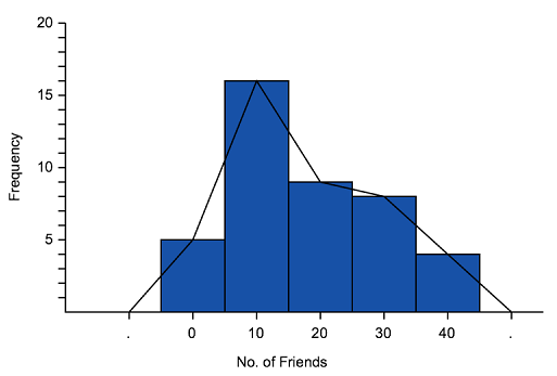 '
'
We can use frequency polygons to help us estimate how many people got a particular score. For example, the graph above shows that $6$6 people have $35$35 friends.
Line Graphs
Line graphs are used to display continuous data and are often used to show changing information. Examples of data that could be displayed in a line graph include temperature, your heart rate throughout the day and a company's daily sales.
Basically, a line graph is drawn as one continuous line to show a continual (usually changing) set of scores.
Example
The line graph below shows how the temperature changed throughout the day.

a) What was the temperature at $6$6am?
Think: Let's find $6$6am on the horizontal axis, then look up to the red line, then to the corresponding point on the vertical axis.
Do: It was $15^\circ$15°C at $6$6am.
b) At what time was the temperature the hottest?
Think: When does the red line reach the highest point?
Do: It is hottest at $2$2pm.

Dot plots
Dot plots are a graphical way of displaying the frequencies of discrete quantitative or categorical data. In other words, they show how often a particular choice was made or how many times an event occurred. They are best used for small to medium size sets of data and are good for visually highlighting how the data is spread and whether there are any outliers that may change our measures of central tendency, particularly the mean and the median.
How to construct or read a dot plot
We start off with a kind of number line or a list of all the possible outcomes in our study. For example, if the number of children in peoples' families ranged between $1$1 and $5$5, I would construct my dot plot with all the possible values we could have scored: $1,2,3,4$1,2,3,4 or $5$5:

Each of these possible values is written on a number line. The number of dots above each score corresponds to the frequency of each score. For example, in the dot plot above, we can see that 3 families have one child, 8 families have two children and so on.
The number of 'three-pointers' scored by a basketball team in each game of the season is represented in the dot plot.

In how many games did the team score $2$2 'three-pointers'?
How many games did the team play this season?
What was the average number of three pointers per game this season? Leave your answer to two decimal places.
Stem-and-leaf Plots
Stem-and-leaf plots are a great way to display moderately sized data sets as they give a good overview of the shape of the data. This means we can identify any skew, outliers and/or clustering. Further, since each individual score is recorded in a stem-and-leaf plot, they also make it easy to identify the mode in a data set.
Reading a Stem-and-Leaf Plot
In a stem-and-leaf plot, the last digit in a score is split from the other digits in the score. The last digit becomes the "leaf" and the other digits become the "stem."
The scores $10,13,16,21,26,27,28,35,35,36,41,41,45,46,49,50,53,56,58$10,13,16,21,26,27,28,35,35,36,41,41,45,46,49,50,53,56,58 are displayed in the stem-and-leaf plot below.

Notice how the "stem" is a column and the stem values are written downwards in that column? The "leaf" values are written across in the rows corresponding to the "stem" value. The "leaf" values are written in ascending order from the stem outwards.

The "stem" is used to group the scores and each "leaf" indicates the individual scores within each group.

Notice that all the scores are written in ascending order. If you have to create your own stem-and-leaf plot, it's easier to write all your scores in order before you start putting them into a stem and leaf plot. In other words, put all the numbers in order from smallest to largest.
The stem-and-leaf plot below shows the age of people to enter through the gates of a concert in the first $5$5 seconds.
| Stem | Leaf | |
| $1$1 | $1$1 $2$2 $4$4 $5$5 $6$6 $6$6 $7$7 $9$9 $9$9 | |
| $2$2 | $2$2 $3$3 $5$5 $5$5 $7$7 | |
| $3$3 | $1$1 $3$3 $8$8 $9$9 | |
| $4$4 | ||
| $5$5 | $8$8 | |
|
||
How many people passed through the gates in the first $5$5 seconds?
What was the age of the youngest person?
The youngest person was $\editable{}$ years old.
What was the age of the oldest person?
The oldest person was $\editable{}$ years old.
What proportion of the concert-goers were under $20$20 years old?