
Displaying bivariate data with a scattergraph
Bivariate data is the name for numerical data consisting of two sets of individual data. We are often interested in whether there seems to be any connection between the two sets of data. A scattergraph (or scatterplot) provides a visual representation of the numerical data which can help to determine whether there is a relationship between the two sets.
The explanatory variable is plotted on the horizontal axis and the response variable is plotted on the vertical axis. A single data point in a bivariate data set is written in the form $\left(x,y\right)$(x,y), with the first number $x$x being the explanatory variable and the second number $y$y being the response variable.
Worked example
Example 1
Scientists want to see how quickly a plant grows under controlled conditions. They start with ten seedlings of the same height and give each a different measure of weekly fertiliser. They then measure the height of the plants after 6 weeks and record the data in the table below.
| Weekly amount of fertiliser (in cups) 1 cup = 250 ml |
$1$1 | $2$2 | $3$3 | $4$4 | $5$5 | $6$6 | $7$7 | $8$8 | $9$9 | $10$10 |
|---|---|---|---|---|---|---|---|---|---|---|
| Height (cm) | $1.55$1.55 | $2.32$2.32 | $3.32$3.32 | $4.51$4.51 | $5.75$5.75 | $6.91$6.91 | $7.86$7.86 | $8.58$8.58 | $9.09$9.09 | $9.43$9.43 |
Think: We are interested in what happens to the height as the number of cups of fertiliser increases. In other words, the fertiliser explains the change in height. So fertiliser is the explanatory variable (plotted on the $x$x axis) and height is the response variable (plotted on the $y$y axis).
We can write these data points as ordered pairs, $\left(1,1.55\right),\left(2,2.32\right),\dots$(1,1.55),(2,2.32),…
Do: To make a scatterplot we plot each of the data points on a cartesian plane.
For example, to plot the first data point, $\left(1,1.55\right)$(1,1.55) we plot the point where $x=1$x=1 and $y=1.55$y=1.55.

From this scattergraph, we can easily see the relationship between the number of cups of fertiliser and the height of the plant. As the number of cups of fertiliser increases, the height of the plant also increases. We could draw an approximate line with a positive gradient that shows the general trend of the points.
When two variables have a relationship we say they correlate.
Just by observation we can describe the relationship shown in the scattergraph above in three ways.
We say there is a strong, positive, linear correlation between the two variables. But what does this actually mean?
Describing correlation
When describing the correlation of the two variables in a scattergraph, we want to describe the strength of the correlation and the direction of the correlation.
To describe the strength of a correlation, we use the words perfect, strong, weak, and no correlation. Perfect correlation means that the points in the scattergraph form a perfect line, and no correlation means that the points form no trend at all.
To describe the direction of a correlation, we use the words positive and negative correlation. Positive correlation means that as the explanatory variable increases, the response variable also increases. Negative correlation means that as the explanatory variable increases, the response variable decreases. Even without a scattergraph, we can use these words to describe the relationship between two variables.
Here are some examples of what each correlation description looks like.
Positive correlations
 |
 |
 |
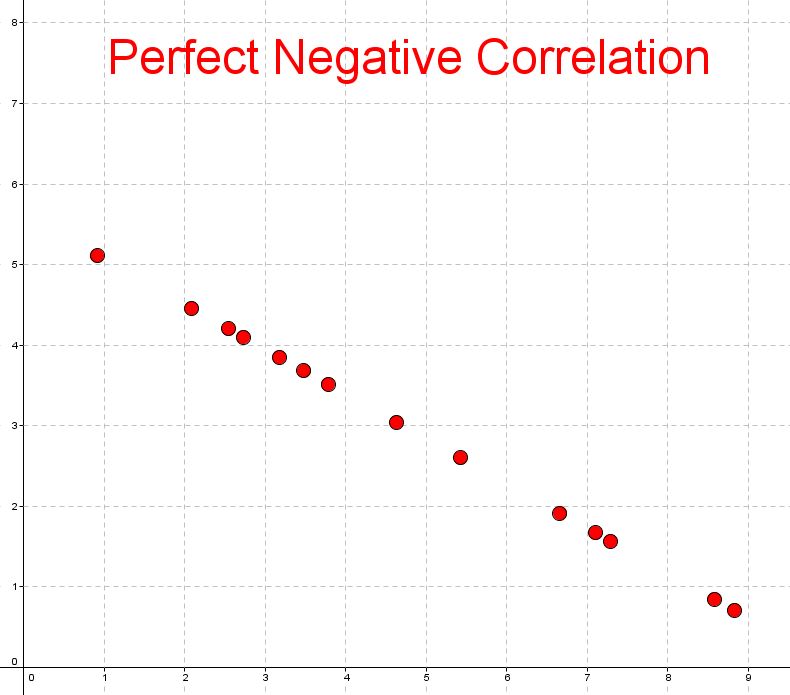
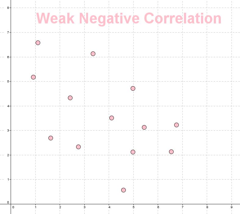
Negative correlations
 |
 |
 |
Practice questions
question 1
Identify the type of correlation in the following scatter plot.

Weak positive correlation
AWeak negative correlation
BNo correlation
CStrong negative correlation
DStrong positive correlation
E
question 2
The following table shows the number of traffic accidents associated with a sample of drivers of different age groups.
| Age | Accidents |
|---|---|
| $20$20 | $41$41 |
| $25$25 | $44$44 |
| $30$30 | $39$39 |
| $35$35 | $34$34 |
| $40$40 | $30$30 |
| $45$45 | $25$25 |
| $50$50 | $22$22 |
| $55$55 | $18$18 |
| $60$60 | $19$19 |
| $65$65 | $17$17 |
Which of the following scatter plots correctly represents the above data?
 A
A B
B C
CIs the correlation between a person's age and the number of accidents they are involved in positive or negative?
Positive
ANegative
BIs the correlation between a person's age and the number of accidents they are involved in strong or weak?
Strong
AWeak
BWhich age group's data represent an outlier?
30-year-olds
ANone of them
B65-year-olds
C20-year-olds
D
question 3
Consider the two variables: time spent studying and exam performance.
Is there likely to be a relationship between the two?
Yes
ANo
BDo you think the correlation is positive or negative?
Positive
ANegative
B