
Describing the shape of data
When we learnt about column graphs and histograms, we saw that the graphs can have a variety of shapes depending on the data that is being displayed. Sometimes there were lots of low scores, sometimes there were lots of high scores and sometimes most of the scores were right in the middle.
When we describe the shape of data sets, we focus on how the data values are distributed and whether the shape is symmetric or asymmetric. We can also identify features such as the mode (or modal class) and data values that are significantly different from the rest of the distribution.
Symmetry and skew
Data may be described as symmetric or asymmetric.
For a symmetric distribution, $50%$50% of scores will be above the mean and $50%$50% of scores will be below the mean. That is, the mean and the median are the same value.
In practice, a distribution from measured data is unlikely to be exactly symmetric.
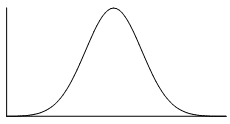
Symmetric distribution
Some examples of distributions that would be classified as symmetric are shown below.
 |
 |
 |
 |
The distribution represented by the histogram in the bottom left is approximately uniform because the frequencies of all groups are the almost equal.
If a data set is asymmetric (i.e. it isn't symmetric), it may be described as skewed.
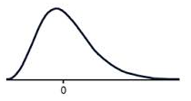
Positive skew
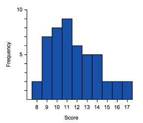
Positive skew (or skewed right) means that the majority of the scores are low and the long tail is on the positive (right) side of the peak of the graph.
The tail on the positive side (right) tends to increase the means value so the mean is greater than the median.
A positively skewed graph can look like the examples shown below.
 |
 |
 |
|
Negative skew
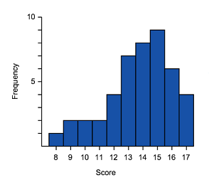
Negative skew (or skewed left) means that the majority of the scores are high and the long tail is on the negative (left) side of the peak.
The tail on the left tends to decrease the means value so the mean is less than the median.
A negatively skewed graph can look like these examples.
 |
 |
 |
|
Practice questions
QUESTION 1
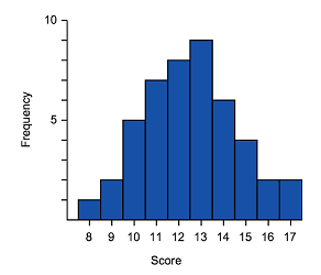
The table shows the number of crime novels in a bookshop for different price ranges.
| Price of crime novel to nearest $\$5$$5 | Frequency |
|---|---|
| $5$5 | $5$5 |
| $10$10 | $10$10 |
| $15$15 | $17$17 |
| $20$20 | $8$8 |
| $25$25 | $17$17 |
| $30$30 | $10$10 |
| $35$35 | $5$5 |
Plot this data as a histogram.
Which of the following best describes the data in the graph and table?
Symmetrical
ARight skewed
BLeft skewed
CUniform distribution
D
QUESTION 2
What type of skew is shown in the graph below?
No skew
ARight skew
BLeft skew
C
Modality
We have learned that the mode of a data distribution is the data value that occurs most frequently. In the case of grouped data we refer to the modal class as the group that has the highest frequency.
Sometimes there is more than one value or group that has the highest frequency, so the modality is an important characteristic when we are describing the distribution.
- unimodal - a distribution where there is a single value or class with the highest frequency
- multi-modal - more than one value or class have the equal highest frequency. (If there are exactly two modes, the data can be referred to as bi-modal.)
It is important to recognised the modality when we are analysing our data because it could indicate that our population is made up of two or more distinct groups.
For example, if we were to analyse long-jump results for a population made up of Year 8 students and Year 12 students we would very likely find that this data is bi-modal - with one peak (at a shorter distance) for the Year 8 students, and another peak (at a greater distance) for the Year 12 students.
The histograms below are examples of a bi-modal and multi-modal distributions. If the data has multiple dominant peaks it can be described as bi-modal or multi-modal, even if the peaks are not exactly the same height.

A bi-modal distribution

A multi-modal distribution
Clustering
In data displays, if lots of the data values are grouped together within a very small range, we call this clustering. The groups with lower frequencies between clusters are referred to as gaps.
In the dot frequency graph below, we can see that the data for girls is clustered around $2-3$2−3 minutes, $5-7$5−7 minutes and $9-12$9−12 minutes.

Practice questions
Question 3
The masses (rounded to the nearest kg) of students in room $A$A are listed below:
$65,62,70,60,64,70,64,72,72,62,72,65,69,71,66,69,66,66,72,60,65,69,63,64,66,70$65,62,70,60,64,70,64,72,72,62,72,65,69,71,66,69,66,66,72,60,65,69,63,64,66,70
Complete the following frequency table:
Class interval (kg) Class centre ($x$x) Frequency ($f$f) $60-64$60−64 $\editable{}$ $\editable{}$ $65-69$65−69 $\editable{}$ $\editable{}$ $70-74$70−74 $\editable{}$ $\editable{}$ Totals $\editable{}$ Which is the modal class?
$60-64$60−64
A$65-69$65−69
B$70-74$70−74
C
Question 4
Which words accurately describe the shape of the graph?
Symmetrical
ACluster and gaps
BBell curve
CUniform distribution
D
Outliers
The shape of a data also shows us whether there are any outliers or unusually high or low scores in our data set.
For example, in the dot plot below, do you see how all the scores range between $12$12 and $14$14 except one? This means that $24$24 is an outlier.

In this case the data is clearly way outside the range of the rest of the data set.
Outliers can be caused by an error in the collection of data, such as an incorrect counting or measurement, but they are not always errors.
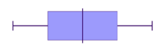
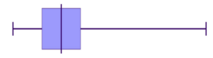
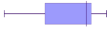
In the box and whisker plot below, an outlier at $F$F is indicated by an 'x' , while the whiskers show the range of data with the outlier excluded.

Outliers can affect the shape of our data. If we include an outlier in our calculations, then
- The range will increase significantly
- The median might change a little bit
- The mean might change significantly
- The mode will stay the same because an outlier will never be the most frequent occurrence.
Identifying outliers
In most cases, outliers can be identified by inspection. However, it can be useful to have a systematic process to determine outliers.
To do this, we calculate values for "fences" that set the limits for the expected normal range of data. Any data that fall outside the fence lines will be considered an outlier.
$\text{Lower fence}=\text{Lower quartile}-1.5\times\text{Interquartile Range}$Lower fence=Lower quartile−1.5×Interquartile Range
$\text{Upper fence}=\text{Upper quartile}+1.5\times\text{Interquartile Range}$Upper fence=Upper quartile+1.5×Interquartile Range
Example
Consider the box plot given below.

By calculating the lower and upper fence, determine whether the data points $4$4 and $32$32 can be considered outliers.
From the graph we can see that
Lower quartile$=11$=11
Upper quartile$=19$=19
and we can calculate the interquartile range
IQR$=19-11=8$=19−11=8
Now we can determine the fences, which define the limits for a value to be considered an outlier.
Lower fence$=11-1.5\times8=-1$=11−1.5×8=−1
Upper fence$=19+1.5\times8=31$=19+1.5×8=31
Since $4$4 is above the lower fence of $-1$−1, it is inside the fence and hence not an outlier.
Since $32$32 is above the upper fence of $31$31, it is outside the fence and hence is an outlier.
Identify outliers with CAS
A CAS calculator can be used to construct a boxplot with the outliers indicated.
Worked example
Use a CAS calculator to construct a boxplot and identify outliers for the data set represented by this frequency table:
| Score | Frequency |
|---|---|
| $12$12 | $1$1 |
| $13$13 | $0$0 |
| $14$14 | $8$8 |
| $15$15 | $11$11 |
| $16$16 | $14$14 |
| $17$17 | $7$7 |
ClassPad
Using the Statistics mode:
- Enter values into "list 1"
- Enter frequencies into "list 2"
- Set the graph Type to "MedBox" with "Show Outliers" selected.


The boxplot shows a dot to indicate that the value of $12$12 is an outlier.
With this outlier removed, the minimum score of $14$14 and the lower $25%$25% of values, without the outlier is indicated by the left whisker.
Practice questions
Question 5
Consider the dot plot below.

Determine the median, lower quartile score and the upper quartile score.
Median $=$= $\editable{}$
Lower quartile $=$= $\editable{}$
Upper quartile $=$= $\editable{}$
Hence, calculate the interquartile range.
Calculate $1.5\times IQR$1.5×IQR, where IQR is the interquartile range.
An outlier is a score that is more than $1.5\times IQR$1.5×IQR above or below the Upper Quartile or Lower Quartile respectively. State the outlier.
Question 6
Consider the following set of data:
$9$9 $5$5 $3$3 $2$2 $6$6 $1$1
Complete the five-number summary for this data set.
Minimum $\editable{}$ Lower quartile $\editable{}$ Median $\editable{}$ Upper quartile $\editable{}$ Maximum $\editable{}$ Calculate the interquartile range.
Calculate the value of the lower fence.
Calculate the value of the upper fence.
Would the value $-3$−3 be considered an outlier?
No
AYes
B
Question 7
Consider the following set of data:
$53,46,25,50,30,30,40,30,47,109$53,46,25,50,30,30,40,30,47,109
Fill in this table of summary statistics.
Mean $\editable{}$ Median $\editable{}$ Mode $\editable{}$ Range $\editable{}$ Which data value is an outlier?
Fill in this table of summary statistics after removing the outlier $109$109.
Mean $\editable{}$ Median $\editable{}$ Mode $\editable{}$ Range $\editable{}$ Let $A$A be the original data set and $B$B be the data set without the outlier.
Fill in this table using the symbols $>$>, $<$< and $=$= to compare the statistics before and after removing the outlier.
With outlier Without outlier Mean: $A\editable{}B$AB Median: $A\editable{}B$AB Mode: $A\editable{}B$AB Range: $A\editable{}B$AB