
Time series data refers to bivariate data where the explanatory variable, or independent variable, is time. This can be time in hours, days, months, weeks, quarters or any unit of time that is collected at regular intervals. Time is always plotted on the horizontal axis.
Some examples of time series data include:
- fuel prices–they tend to rise and fall in a cyclical pattern according to the day of the week
- air-conditioner sales–they do not remain constant all year as sales increase and decrease according to the time of year
- ocean tides–their height is cyclical over a $24$24 hour period
Graphs and language of time series data
A time series graph is a bit like a scattergraph however the points are connected in sequential order by lines.
Trend–by looking at the graph we can see overall whether the response variable is increasing (positive trend), decreasing (negative trend), or stable (not increasing or decreasing).
.svg) |
.svg) |
.svg) |
|---|---|---|
| Increasing trend - note the ‘peaks’ and ‘troughs’ are steadily getting higher. | Decreasing trend - note the ‘peaks’ and ‘troughs’ are steadily getting lower. | Stable trend - note the ‘peaks’ and ‘troughs’ are at a similar level. |
Seasonality–by following the rise and fall, or cyclical nature of the data, we can determine how many seasons or time periods constitute one cycle of the data. To determine how many seasons in a cycle we count the number of points from peak to peak or trough to trough. The example below shows how to count the number of points in a cycle.
.svg)
Note: to be seasonal, each cycle must have the same number of points. If there is a repeating pattern but the number of data points is different for each cycle, then we say it is cyclical rather than seasonal. In the above example each cycle has $4$4 points so we say it is seasonal and there are $4$4 seasons per cycle.
Irregular Fluctuations–once we've observed trend and seasonality, we can determine whether the data for some seasons or for entire cycles has irregular fluctuations.
Outliers–once we've observed trend and seasonality, we can determine outliers, which are data points that do not follow the pattern of the rest of the data.
.svg)
Let's take a look at a few time series graphs.
Worked Examples
Example 1
The following graph is from the data collected by the Australian Competition and Consumer Commission and represents the fuel price cycle for Perth in January and February.
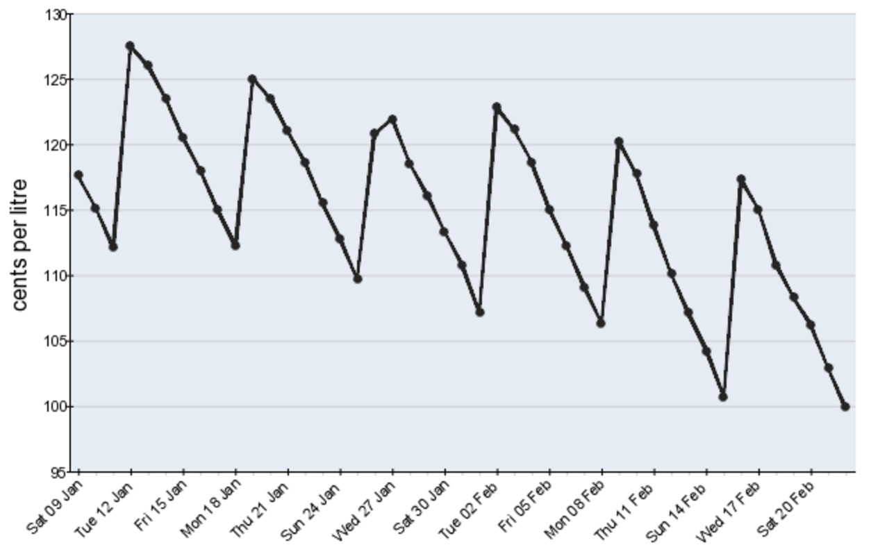
The overall trend of the data is a decreasing trend as we see the peak prices fall. This means petrol is getting cheaper to buy in Perth.
When we count the points in each cycle from peak to peak, we find there are $7$7 points in each cycle. Thus a cycle lasts one week and we say there are 'seven seasons per cycle'. Check with the graph above. Start at the peak on Tuesday $12$12 January and count the $7$7 points to Tuesday $19$19 January.
There doesn't appear to be any fluctuations or outliers, however it does appear that on Monday the $15$15th of February, the price dropped more steeply than usual. Monday seems to be the best time to buy petrol since this is when the price is at its lowest in the cycle.
Note that we often allocate a numerical value to each time point in order to predict future values. Common variables are '$t$t', '$n$n' and '$d$d'. In this case $t=1$t=1 would be Sat $09$09 Jan, $t=2$t=2 would be Sun $10$10 Jan etc.
Example 2
The graph below shows house and apartment prices in Melbourne.

The overall trend is increasing. There is not enough detail to see the seasonality of the data or count how many cycles in one season.
There are some clear fluctuations.
- We can see prices flattening out leading up to the GFC–Global Financial Crisis, and then house prices took a bit of a dive from September 2008 to March 2009. Recovery was fast and house prices rose rapidly.
- There was with a big jump in December 2010.
- Almost a year later in September 2011, prices seem to be falling. At this time, investors may have been wondering whether they were in a pricing bubble which means prices are well above the normal market value. When the bubble bursts, prices drop rapidly and this causes a lot of uncertainty in the market.
- In this case, if we were to allocate numerical values to the time periods, $t=1$t=1 would be Sept 06, $t=2$t=2 would be Dec 06 etc.
Practice questions
Question 1
Consider the following Time Series graph.
Describe the trend of the data:
Increasing
ADecreasing
BState the number of points per cycle:
There are $\editable{}$ points per cycle.
Question 2
Consider the following set of Time Series data:
| Time Period | $1$1 | $2$2 | $3$3 | $4$4 | $5$5 | $6$6 | $7$7 | $8$8 | $9$9 | $10$10 | $11$11 | $12$12 |
|---|---|---|---|---|---|---|---|---|---|---|---|---|
| Data | $5$5 | $10$10 | $18$18 | $1$1 | $11$11 | $20$20 | $7$7 | $13$13 | $22$22 | $10$10 | $15$15 | $25$25 |
Plot this data on the graph below.
Loading Graph...Here is the graph with segments between each point:
Loading Graph...State the number of seasons (points per cycle) in this data.
There are $\editable{}$ seasons in each cycle of this data.
Describe the trend of the data:
Increasing
ADecreasing
BFor which time period is the recorded data most likely to indicate an outlier or unusual fluctuation?
Time Period = $\editable{}$