When we describe the shape of data sets, we want to focus on how the scores are distributed. Some questions that we might be interested include:
- Is the distribution symmetrical or not?
- Are there any clusters or gaps in the data?
- Are there any outliers?
- Where is the centre of the data located approximately? (Recall our three measures of centre: mean, median and mode)
- Is the data widely spread or very compact? (Recall our three measures of spread: range, interquartile range and standard deviation)
Symmetry
Data may be described as symmetrical or asymmetrical.
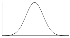
There are many cases where the data tends to be around a central value with no bias left or right. In such a case, roughly $50%$50% of scores will be above the mean and $50%$50% of scores will be below the mean. In other words, the mean and median roughly coincide.
The normal distribution is a common example of a symmetrical distribution of data. The normal distribution looks like the following bell-shaped curve:
The picture below shows how a data set that has an approximate normal distribution may appear in a histogram. The dark line shows the nice, symmetrical curve that can be drawn over the histogram that the data roughly follows.
In the distribution above, the peak of the data represents the mean, the median and the mode (taken as the centre of the modal class)–all these measures of central tendency are equal for this symmetrical distribution.
A uniform distribution is a symmetrical distribution where each outcome is equally likely, so the frequency should be the same for each outcome. For example, when rolling dice the outcomes are equally likely, while we might get an irregular column graph if only a small number of rolls were performed if we continued to roll the dice the distribution would approach a uniform distribution like that shown below.
Skew
If a data set is asymmetrical instead (i.e. it isn't symmetrical), it may be described as skewed.
A data set that has positive skew (sometimes called a 'right skew') has a longer tail of values to the right of the data set. The mass of the distribution is concentrated on the left of the figure.
A positively skewed graph looks something like this:
 |
 |
| General shape of positively skewed data with right side stretched out | General shape shown over a histogram of positively skewed data |
A data set that has negative skew (sometimes called a 'left skew') has a longer tail of values to the left of the data set. The mass of the distribution is concentrated on the right of the figure.
A negatively skewed graph looks something like this:
 |
 |
| General shape of negatively skewed data with left side stretched out | General shape shown over a histogram of negatively skewed data |
Clustering
In a set of data, a cluster occurs when a large number of the scores are grouped together within a small range. Clustering may occur at a single location or several locations. For example, annual wages for a factory may cluster around $\$40000$$40000 for unskilled factory workers, $\$55000$$55000 for tradespersons and $\$70000$$70000 for management. The data may also have clear gaps where values are either very uncommon or not possible in the data set. If the data has two clear peaks then the shape is called bimodal.
Outliers
As we have seen previously, an outlier is a data point that varies significantly from the body of the data. An outlier will be a value that is either significantly larger or smaller than other observations. Outliers are important to identify as they point to unusual bits of data that may require further investigation and impact some calculations such as mean, range and standard deviation.
Example
For the dot plot given above the score of $9$9 would be considered an outlier as it is well above the body of the data.
Practice questions
Question 1
State whether the scores in each histogram are positively skewed, negatively skewed or symmetrical (approximately).
A histogram that represents the distribution of scores. The x-axis enumerates discrete scores as individual points, while the y-axis corresponds to the frequency of each score interval. Each bar on the histogram corresponds to one of these distinct scores, with the bar's height reflecting the count or frequency of occurrences for that particular score. Most of the scores are relatively high. Positively skewed
ASymmetrical
BNegatively skewed
CA histogram that represents the distribution of scores. The x-axis enumerates discrete scores as individual points, while the y-axis corresponds to the frequency of each score interval. Each bar on the histogram corresponds to one of these distinct scores, with the bar's height reflecting the count or frequency of occurrences for that particular score. Approximately, as the score goes higher, the frequency goes lower. Positively skewed
ANegatively skewed
BSymmetrical
CA histogram that represents the distribution of scores. The x-axis enumerates discrete scores as individual points, while the y-axis corresponds to the frequency of each score interval. Each bar on the histogram corresponds to one of these distinct scores, with the bar's height reflecting the count or frequency of occurrences for that particular score. The scores have its peak approximately in the middle. Negatively skewed
ASymmetrical
BPositively skewed
C
Question 2
The table shows the number of crime novels in a bookshop for different price ranges.
| Price of crime novel to nearest $\$5$$5 | Frequency |
|---|---|
| $5$5 | $5$5 |
| $10$10 | $10$10 |
| $15$15 | $17$17 |
| $20$20 | $8$8 |
| $25$25 | $17$17 |
| $30$30 | $10$10 |
| $35$35 | $5$5 |
Plot this data as a histogram.
Which of the following best describes the data in the graph and table?
Symmetrical
ARight skewed
BLeft skewed
CUniform distribution
D
Question 3
For the Stem and Leaf plot attached:
| Stem | Leaf | |
| $0$0 | $5$5 | |
| $1$1 | $7$7 $8$8 | |
| $2$2 | $0$0 $8$8 | |
| $3$3 | $0$0 $4$4 $6$6 $7$7 $8$8 $9$9 | |
| $4$4 | $1$1 $3$3 $5$5 $8$8 $8$8 $8$8 | |
| $5$5 | ||
| $6$6 | ||
| $7$7 | ||
| $8$8 | ||
| $9$9 | $3$3 | |
|
||
Are there any outliers?
Yes
ANo
BIdentify the outlier.
Is there any clustering of data?
Yes
ANo
BWhere does the clustering occur?
10s - 20s
A30s - 40s
B20s - 30s
CWhat is the modal class(es)?
10-19
A40-49
B30-39
C20-29
DNot including the outlier, the distribution of the data is:
Positively skewed
ASymmetrical
BNegatively skewed
C
Connect histograms and box plots
We have seen how data can be displayed in histograms and in box plots. These two displays are great for being able to identify key features of the shape of the data, as well as the range and in the case of the box plot, the interquartile range and median.
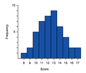
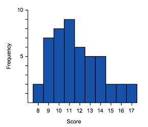
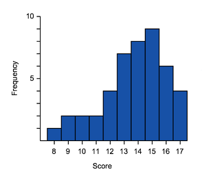
We should expect then that the shape of the data would be the same whether it is represented in a polygon, box plot or histogram. Remember that the shape of data can be symmetric, negatively skewed or positively skewed.
Symmetric
 |
 |
|
| Common shape of a symmetrical distribution | Histogram of approximately symmetrical data | Box plot of symmetrical data |
- The median is in the centre of the range and the tails (whiskers) of the data are of equal length
- The graph should be approximately a mirror image of itself about the centre of the data
Positive skewed (also called skewed right)
 |
 |
|
| General shape positively skewed data | Histogram of positively skewed data | Box plot of positively skewed data |
- The data is stretched out to the right, producing a longer tail (whisker) to the right of the graph
- The bulk of the data is to the left–higher frequency columns and the box should appear to the left
Negative skewed (also called skewed left)
 |
 |
|
| General shape negatively skewed data | Histogram of negatively skewed data | Box plot of negatively skewed data |
- The data is stretched out to the left, producing a longer tail (whisker) to the left of the graph
- The bulk of the data is to the right–higher frequency columns and the box should appear to the right
Looking at the diagrams above, can you see the similarities in the representations?
We can see the skewed tails, where the bulk of the data sits and general shape. These are some of the features you can use to match histograms and box plots. We can also look at the data range.
Let's try matching histograms to their correct box plot representation.
Worked example
Match the histograms to its box plot.
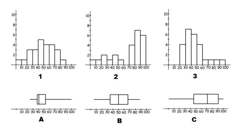
Think: To identify matching data we can start by looking for skew (left or right) and symmetric distributions of data.
Do:
- A and $3$3 have extended right tails, and thus are both right skewed. We can also use the range by noticing these are the only graphs with no values in the $0$0 to $10$10 and $10$10 to $20$20 intervals. So they are a match.
- C and $2$2 have stretched out left tails, and thus are both left skewed. So they are a match.
- Which leaves B and $1$1. They are both symmetric data and have no values in the interval $90$90 to $100$100. So we have our final match.
Practice questions
question 4
Match the column graph shown here to the correct box plot.
- 102030405060708090
A box plot has a horizontal axis ranging from $10$10 to $90$90 marked in major intervals of $10$10 and minor intervals of $5$5. The minimum value starts at $30$30. The left side of the box is at $40$40, the median value is at $50$50, and the right side of the box is at $60$60. The maximum value ends at $70$70. A102030405060708090A box plot has a horizontal axis ranging from $10$10 to $90$90 marked in major intervals of $10$10 and minor intervals of $5$5. The minimum value starts at $10$10. The left side of the box is at $20$20, the median value is at $30$30, and the right side of the box is at $40$40. The maximum value ends at $90$90. B102030405060708090A box plot has a horizontal axis ranging from $10$10 to $90$90 marked in major intervals of $10$10 and minor intervals of $5$5. The minimum value starts at $10$10. The left side of the box is at $60$60, the median value is at $70$70, and the right side of the box is at $80$80. The maximum value ends at $90$90. C102030405060708090A box plot has a horizontal axis ranging from $10$10 to $90$90 marked in major intervals of $10$10 and minor intervals of $5$5. The minimum value starts at $10$10. The left side of the box is at $20$20, the median value is at $50$50, and the right side of the box is at $80$80. The maximum value ends at $90$90. D
question 5
Match the box plot shown to the correct column graph.
- ABCD
question 6
Consider the following pairs of histograms and box plots:
Which two of these histograms and box plots are correctly paired?

 A
A
 B
B
 C
C
 D
DIn part (a) we determined that the following histogram/box plot were an incorrect match:


Which two of the options correctly describe why?
The box plot has a long tail to the right which indicates positive skew, while the histogram does not appear to be skewed.
AThe data on the histogram is widely spread, while the box plot indicates that the data is mostly located around the median.
BThe median for the histogram is roughly in the middle, while the median of the box plot is located further to the left.
C
When we describe the shape of data sets, we want to focus on how the scores are distributed. Some questions that we might be interested include:
- Is the distribution symmetrical or not?
- Are there any clusters or gaps in the data?
- Are there any outliers?
- Where is the centre of the data located approximately? (Recall our three measures of centre: mean, median and mode)
- Is the data widely spread or very compact? (Recall our three measures of spread: range, interquartile range and standard deviation)
Symmetry
Data may be described as symmetrical or asymmetrical.
There are many cases where the data tends to be around a central value with no bias left or right. In such a case, roughly $50%$50% of scores will be above the mean and $50%$50% of scores will be below the mean. In other words, the mean and median roughly coincide.
The normal distribution is a common example of a symmetrical distribution of data. The normal distribution looks like the following bell-shaped curve:

The picture below shows how a data set that has an approximate normal distribution may appear in a histogram. The dark line shows the nice, symmetrical curve that can be drawn over the histogram that the data roughly follows.
In the distribution above, the peak of the data represents the mean, the median and the mode (taken as the centre of the modal class)–all these measures of central tendency are equal for this symmetrical distribution.
A uniform distribution is a symmetrical distribution where each outcome is equally likely, so the frequency should be the same for each outcome. For example, when rolling dice the outcomes are equally likely, while we might get an irregular column graph if only a small number of rolls were performed if we continued to roll the dice the distribution would approach a uniform distribution like that shown below.
Skew
If a data set is asymmetrical instead (i.e. it isn't symmetrical), it may be described as skewed.
A data set that has positive skew (sometimes called a 'right skew') has a longer tail of values to the right of the data set. The mass of the distribution is concentrated on the left of the figure.
A positively skewed graph looks something like this:
 |
 |
| General shape of positively skewed data with right side stretched out | General shape shown over a histogram of positively skewed data |
A data set that has negative skew (sometimes called a 'left skew') has a longer tail of values to the left of the data set. The mass of the distribution is concentrated on the right of the figure.
A negatively skewed graph looks something like this:
 |
 |
| General shape of negatively skewed data with left side stretched out | General shape shown over a histogram of negatively skewed data |
Clustering
In a set of data, a cluster occurs when a large number of the scores are grouped together within a small range. Clustering may occur at a single location or several locations. For example, annual wages for a factory may cluster around $\$40000$$40000 for unskilled factory workers, $\$55000$$55000 for tradespersons and $\$70000$$70000 for management. The data may also have clear gaps where values are either very uncommon or not possible in the data set. If the data has two clear peaks then the shape is called bimodal.
Outliers
As we have seen previously, an outlier is a data point that varies significantly from the body of the data. An outlier will be a value that is either significantly larger or smaller than other observations. Outliers are important to identify as they point to unusual bits of data that may require further investigation and impact some calculations such as mean, range and standard deviation.
Example
For the dot plot given above the score of $9$9 would be considered an outlier as it is well above the body of the data.
Identifying outliers
In many cases, outliers can be identified by inspection. However, it can be useful to have a systematic process to determine outliers.
To do this, we calculate values for "fences" that set the limits for the expected normal range of data. Any data that fall outside the fence lines will be considered an outlier.
Lower fence $=$= Lower quartile $-1.5\times$−1.5× Interquartile Range
Upper fence $=$= Upper quartile $+1.5\times$+1.5× Interquartile Range
Practice questions
Question 1
State whether the scores in each histogram are positively skewed, negatively skewed or symmetrical (approximately).
A histogram that represents the distribution of scores. The x-axis enumerates discrete scores as individual points, while the y-axis corresponds to the frequency of each score interval. Each bar on the histogram corresponds to one of these distinct scores, with the bar's height reflecting the count or frequency of occurrences for that particular score. Most of the scores are relatively high. Positively skewed
ASymmetrical
BNegatively skewed
CA histogram that represents the distribution of scores. The x-axis enumerates discrete scores as individual points, while the y-axis corresponds to the frequency of each score interval. Each bar on the histogram corresponds to one of these distinct scores, with the bar's height reflecting the count or frequency of occurrences for that particular score. Approximately, as the score goes higher, the frequency goes lower. Positively skewed
ANegatively skewed
BSymmetrical
CA histogram that represents the distribution of scores. The x-axis enumerates discrete scores as individual points, while the y-axis corresponds to the frequency of each score interval. Each bar on the histogram corresponds to one of these distinct scores, with the bar's height reflecting the count or frequency of occurrences for that particular score. The scores have its peak approximately in the middle. Negatively skewed
ASymmetrical
BPositively skewed
C
Question 2
The table shows the number of crime novels in a bookshop for different price ranges.
| Price of crime novel to nearest $\$5$$5 | Frequency |
|---|---|
| $5$5 | $5$5 |
| $10$10 | $10$10 |
| $15$15 | $17$17 |
| $20$20 | $8$8 |
| $25$25 | $17$17 |
| $30$30 | $10$10 |
| $35$35 | $5$5 |
Plot this data as a histogram.
Which of the following best describes the data in the graph and table?
Symmetrical
ARight skewed
BLeft skewed
CUniform distribution
D
Question 3
For the Stem and Leaf plot attached:
| Stem | Leaf | |
| $0$0 | $5$5 | |
| $1$1 | $7$7 $8$8 | |
| $2$2 | $0$0 $8$8 | |
| $3$3 | $0$0 $4$4 $6$6 $7$7 $8$8 $9$9 | |
| $4$4 | $1$1 $3$3 $5$5 $8$8 $8$8 $8$8 | |
| $5$5 | ||
| $6$6 | ||
| $7$7 | ||
| $8$8 | ||
| $9$9 | $3$3 | |
|
||
Are there any outliers?
Yes
ANo
BIdentify the outlier.
Is there any clustering of data?
Yes
ANo
BWhere does the clustering occur?
10s - 20s
A30s - 40s
B20s - 30s
CWhat is the modal class(es)?
10-19
A40-49
B30-39
C20-29
DNot including the outlier, the distribution of the data is:
Positively skewed
ASymmetrical
BNegatively skewed
C
Connect histograms and box plots
We have seen how data can be displayed in histograms and in box plots. These two displays are great for being able to identify key features of the shape of the data, as well as the range and in the case of the box plot, the interquartile range and median.
We should expect then that the shape of the data would be the same whether it is represented in a polygon, box plot or histogram. Remember that the shape of data can be symmetric, negatively skewed or positively skewed.
Symmetric
 |
 |
|
| Common shape of a symmetrical distribution | Histogram of approximately symmetrical data | Box plot of symmetrical data |
- The median is in the centre of the range and the tails (whiskers) of the data are of equal length
- The graph should be approximately a mirror image of itself about the centre of the data
Positive skewed (also called skewed right)
 |
 |
|
| General shape positively skewed data | Histogram of positively skewed data | Box plot of positively skewed data |
- The data is stretched out to the right, producing a longer tail (whisker) to the right of the graph
- The bulk of the data is to the left–higher frequency columns and the box should appear to the left
Negative skewed (also called skewed left)
 |
 |
|
| General shape negatively skewed data | Histogram of negatively skewed data | Box plot of negatively skewed data |
- The data is stretched out to the left, producing a longer tail (whisker) to the left of the graph
- The bulk of the data is to the right–higher frequency columns and the box should appear to the right
Looking at the diagrams above, can you see the similarities in the representations?
We can see the skewed tails, where the bulk of the data sits and general shape. These are some of the features you can use to match histograms and box plots. We can also look at the data range.
Let's try matching histograms to their correct box plot representation.
Worked example
Match the histograms to its box plot.

Think: To identify matching data we can start by looking for skew (left or right) and symmetric distributions of data.
Do:
- A and $3$3 have extended right tails, and thus are both right skewed. We can also use the range by noticing these are the only graphs with no values in the $0$0 to $10$10 and $10$10 to $20$20 intervals. So they are a match.
- C and $2$2 have stretched out left tails, and thus are both left skewed. So they are a match.
- Which leaves B and $1$1. They are both symmetric data and have no values in the interval $90$90 to $100$100. So we have our final match.
Practice questions
question 4
Match the column graph shown here to the correct box plot.
- 102030405060708090
A box plot has a horizontal axis ranging from $10$10 to $90$90 marked in major intervals of $10$10 and minor intervals of $5$5. The minimum value starts at $30$30. The left side of the box is at $40$40, the median value is at $50$50, and the right side of the box is at $60$60. The maximum value ends at $70$70. A102030405060708090A box plot has a horizontal axis ranging from $10$10 to $90$90 marked in major intervals of $10$10 and minor intervals of $5$5. The minimum value starts at $10$10. The left side of the box is at $20$20, the median value is at $30$30, and the right side of the box is at $40$40. The maximum value ends at $90$90. B102030405060708090A box plot has a horizontal axis ranging from $10$10 to $90$90 marked in major intervals of $10$10 and minor intervals of $5$5. The minimum value starts at $10$10. The left side of the box is at $60$60, the median value is at $70$70, and the right side of the box is at $80$80. The maximum value ends at $90$90. C102030405060708090A box plot has a horizontal axis ranging from $10$10 to $90$90 marked in major intervals of $10$10 and minor intervals of $5$5. The minimum value starts at $10$10. The left side of the box is at $20$20, the median value is at $50$50, and the right side of the box is at $80$80. The maximum value ends at $90$90. D
question 5
Match the box plot shown to the correct column graph.
- ABCD
question 6
Consider the following pairs of histograms and box plots:
Which two of these histograms and box plots are correctly paired?

 A
A
 B
B
 C
C
 D
DIn part (a) we determined that the following histogram/box plot were an incorrect match:


Which two of the options correctly describe why?
The box plot has a long tail to the right which indicates positive skew, while the histogram does not appear to be skewed.
AThe data on the histogram is widely spread, while the box plot indicates that the data is mostly located around the median.
BThe median for the histogram is roughly in the middle, while the median of the box plot is located further to the left.
C


