topic badge

6.01 Data displays

Introduction

In 6th grade, we constructed and analyzed data in histograms, box plots, and dot plots. These displays highlight or hide different aspects of a set of data. We will choose appropriate displays and justify our reasoning in this lesson.

Data displays

Data displays are useful to aid with summarizing, analyzing, and interpreting a data distribution. The best data displays make useful information easy to read for the intended audience.

Numerical data can be displayed using histograms, box plots, and dot plots.

Histograms display the frequency of data as either a count or relative proportion along the y-axis and divide the numerical data into bins of equal width along the x-axis.

A histogram titled Annual Rainfall in inches. The y-axis is titled Number of Cities. The x-axis is titles Rainfall in inches and shows the boxes of different heights and bin ranges of the same width visually and numerically. The bin ranges of each of the bars of different heights are as follows: 1 to 5 has height 10; 5 to 9 has height 22; 9 to 13 has height 46; 13 to 17 has height 48; 17 to 21 has height 18; 21 to 25 has height 9.

Generally, we include the lower bound and exclude the upper bound, so the equivalent labels for the x-axis would be:

A histogram entitled Annual Rainfall in inches. The y-axis is titled Number of Cities. The x-axis is titles Rainfall in inches and shows the boxes of different heights and bin ranges of the same width visually and numerically. The bin ranges of each of the bars of different heights are as follows: open bracket 1, 5 close bracket, height 10; open parenthesis 5, 9 close bracket, height 22; open parenthesis 9, 13 close bracket, height 46; open parenthesis 13,  17 close bracket, height 48; open parenthesis 17 , 21 close bracket, height 18; open parenthesis 21, 25 close bracket, height 9.

Box plots divide data into four equal quartiles using the five-number summary: minimum, lower quartile, median, upper quartile, and maximum.

A box plot on a number line ranging from 0 to 40 with an interval of 2. A line extends from 4 to 7, a box extends from 7 to 28 with a median plotted at 10 represented by a vertical segment in the box. A line extends from 28 to 34.

Dot plots display the frequency of data by the number of dots at each value. This display is best used for discrete values with a small range.

A dot plot with no title is shown. X's representing individual data point are stacked with equal size. The number line ranges from 1 to 3 with an interval of one fourth. The number of X's in each interval is as follows: at 1, 2; at 1 and 1 fourth, 3; at 1 and 1 half, 2; at 1 and 3 fourth, 1; at 2, 3, at 2 and 1 fourth, 3; at 2 and 1 half, 2; at 2 and 3 fourth, 1; and at 3, 1.

Exploration

The histogram, box plot, and dot plot summarize the heights of 29 students in a class, in inches:

A histogram titled Classmate Height with Number of Students on the y-axis, with numbers 0 through 15, and Height in inches on the x-axis, with bars labeled at their endpoint 60 to 80 in steps of 5. The 60 through 65 bar goes to 11 on the y-axis, 65 through 70 goes to 13, 70 through 75 goes to 1, and 75 through 80 goes to 6.
A box plot on a number line ranging from 0 to 10 and titled Classmate Heights. A line extends from 60 to 63, a box extends from 63 to 68 with a vertical line plotted at 66, and a line extends from 68 to 79.
A line plot titled Classmate Heights in inches, ranging from 60 to 80 in steps of 1. The number of dots is as follows: at 60, 2; at 61, 3; at 62, 2; at 63, 1; at 64, 3; at 65, 2; at 66, 4; at 67, 2; at 68, 5; at 74, 1; at 75, 1; at 76, 2; at 78, 2; and at 79, 1.
  1. What do you notice about the different displays for the same data?

Histograms, box plots, and dot plots may display the same data, but the different displays have their own strengths and weaknesses.

A table with 3 rows titled Histograms, Box Plots and Dot Plots, and 2 columns titled Strengths and Weaknesses. The data is as follows: Histogram: Strengths, Easily display large or spread out quantities of data; shape, center and spread clearly visible, Weaknesses, Cannot see individual data values; Box Plots: Strengths, Easily display large quantities of data; shape, center and spread clearly visible, Weaknesses, Cannot see individual data values; Dot Plots: Strengths, Useful for individual data values, Weaknesses, Not for large quantities of data.

Niether histograms nor box plots show every individual data value, but histograms will show intervals where there may be gaps or a lower frequency of data. Box plots provide a quick, efficient overall view of the shape, center and spread of the data if we're not interested in where there may be gaps in the data.

Examples

Example 1

Determine the best type of data display(s) for each set of data:

a

The number of goals scored in each high school soccer game for the season

Worked Solution
Create a strategy

First, decide the size and possible range of values of the data set.

Apply the idea

A dot plot

The number of games in a season would be small, and the number of goals per game would not vary greatly.

Reflect and check

A box plot would lose the individual scores of each game. It could be difficult to find appropriate bin widths for a histogram without hiding the shape of the data.

b

The height of all 196 Olympic gymnasts in the most recent summer games

Worked Solution
Apply the idea

Since there is a large number of data points, a histogram or box plot would be the best graph to summarize the data. Since there might be significant height differences between male and female gymnasts, we may prefer to use a histogram that will show any gaps in the data.

Reflect and check

Technology can ease some of the inefficiencies of graphing data. With technology, we can create and compare a dot plot, histogram, and box plot to determine which visual best reflects the data.

Example 2

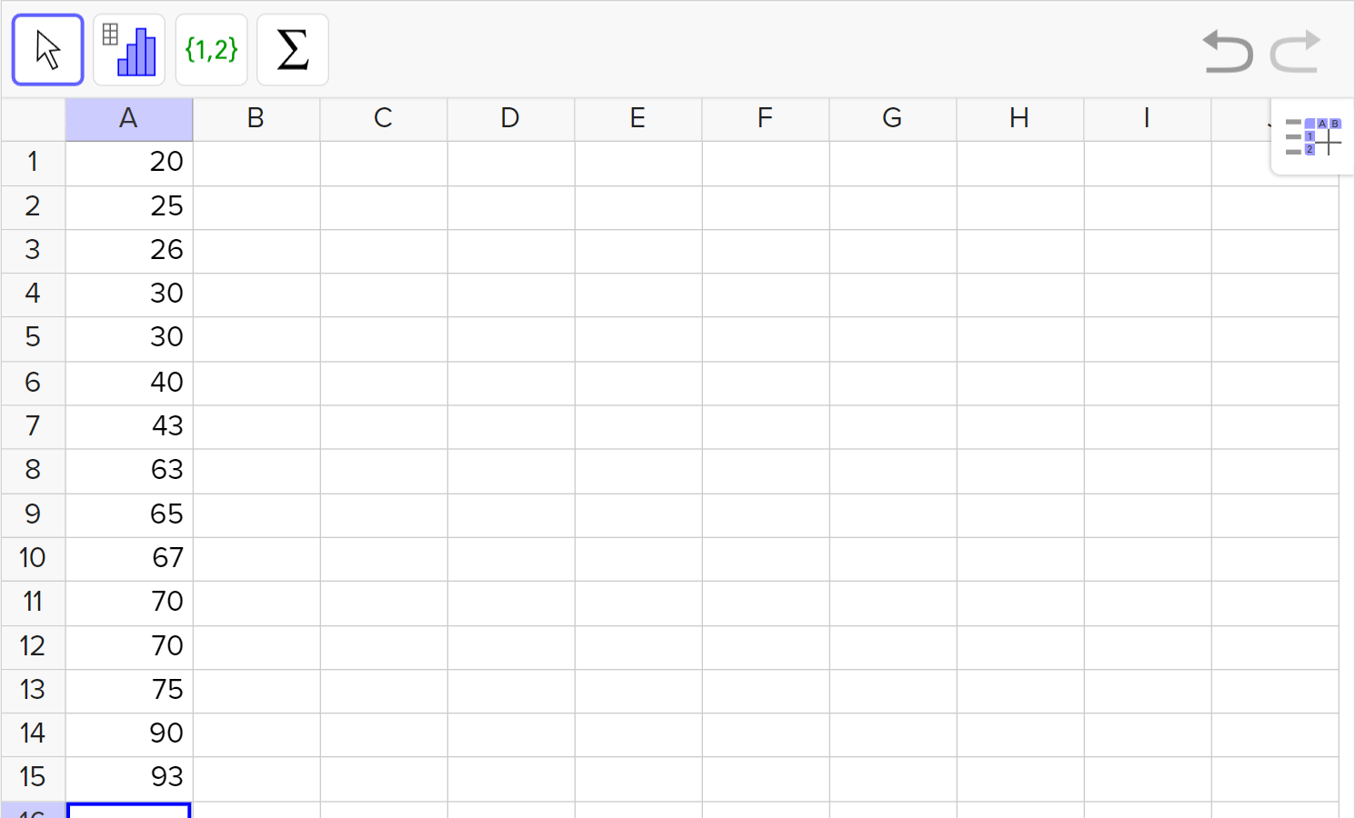
Shown below are the quiz score percentages from Mr. Sanchez's first period math class: \{20, 25, 26, 30, 30, 40, 43, 63, 65, 67, 70, 70, 75, 90, 93 \}

a

Construct a box plot of the quiz scores.

Worked Solution
Create a strategy

Recall how to find the five-number summary using the data provided or use technology, as shown in the example below:

  1. Enter the data in a single column.

    A screenshot of the GeoGebra statistics tool showing the data 20, 25, 26, 30, 30, 40, 43, 63, 65, 67, 70, 70, 75, 90, and 93 entered in column A, rows 1 to 15. Speak to your teacher for more details.
  2. Select all of the cells containing data and choose "One Variable Analysis".

    A screenshot of the GeoGebra statistics tool showing the cells containing 20, 25, 26, 30, 30, 40, 43, 63, 65, 67, 70, 70, 75, 90, and 93 selected. The menu from the second leftmost icon is shown. Speak to your teacher for more details.
  3. Select "Show Statistics" to reveal a list of statistical values, including the five-number summary.

    A screenshot of the GeoGebra statistics tool. From left to right, the following are shown: the cells containing 20, 25, 26, 30, 30, 40, 43, 63, 65, 67, 70, 70, 75, 90, and 93 selected, a list of statistical values, and a histogram. Speak to your teacher for more details.

Use the minimum, Q1 (first quartile), median, Q3 (third quartile), and maximum from the statistics listed to create the box plot.

Apply the idea
Entitled Mrs. Sanchez's Period 1 Math Quiz Results, A box plot on a number line ranging from 0 to 100 with interval of 10 is shown. A line extends from 20 to 30 and a box extends from 30 to 70 with a median represented by a vertical segment between 60 and 70. A line extends from 70 to a number between 90 and 100.
b

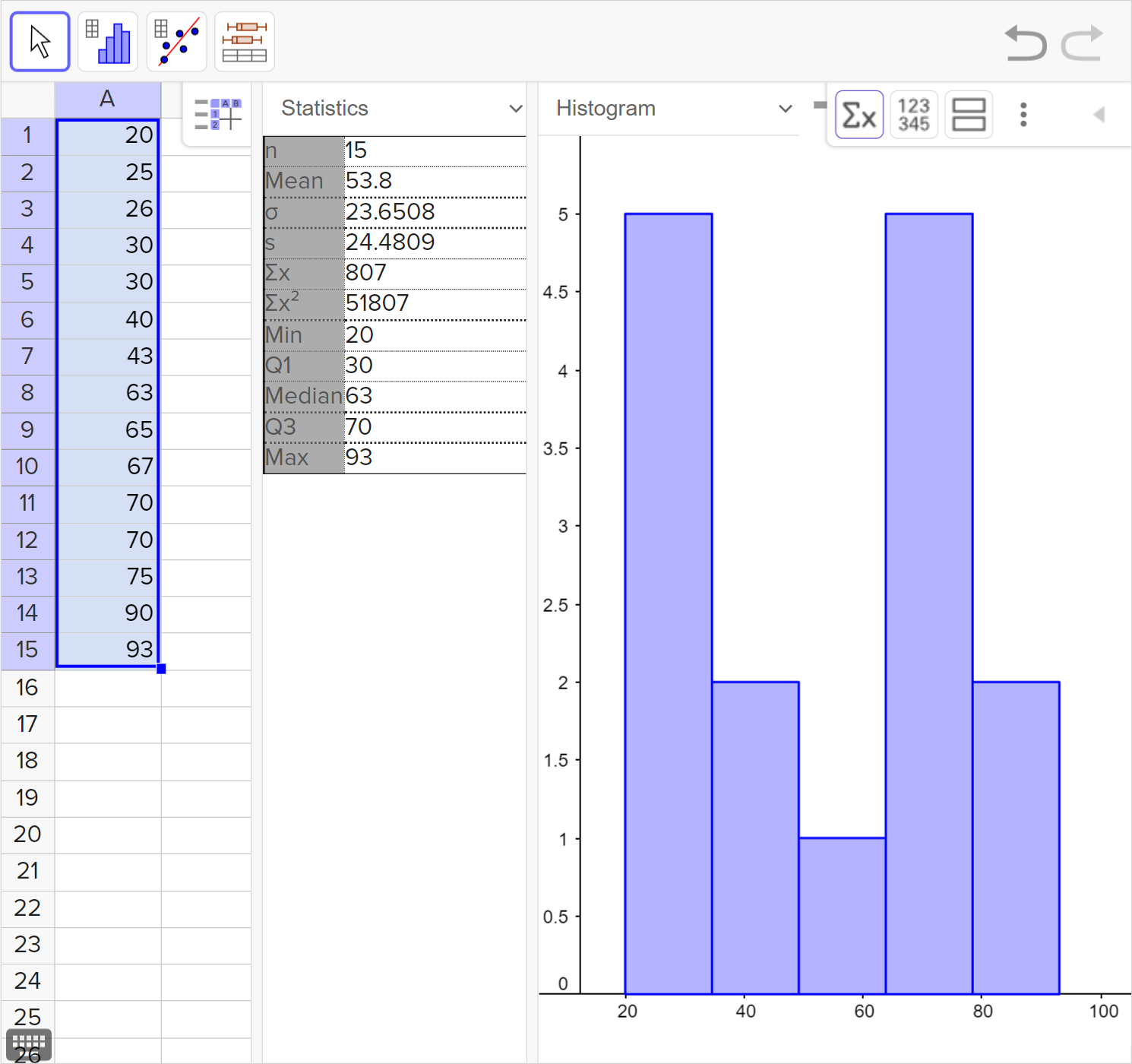
What are the advantages and disadvantages of a box plot?

Worked Solution
Apply the idea

Box plots visually summarize large sets of data, although they can be used for small sets too, like this one. In a box plot, it is easy to see and estimate the shape, center (median), and spread of data. However, if we were not given the individual data points, we would not know how many students are in the set of data and their individual quiz scores.

Even without that information, the box plot can still provide important information about the quiz. We can see at a glance that most of the students did not do very well on the quiz. We can see that 75\% of the students scored 70 or below, 50\%of the students scored below about 63 and 25\% did not even get a score of 30.

Reflect and check

25 \% of the quiz scores lie between the minimum and first quartile, the first quartile and the median, the median and the third quartile, and the third quartile and the maximum value. This is true even when the quarters of the box plot are uneven in length.

c

Explain whether a dot plot or a histogram could be a better display for the data.

Worked Solution
Create a strategy

Use the size of the data set and its range to determine which would be better.

Apply the idea

While the data set is made up of only 15 students' scores, the scores are spread out from 25 \% to 93 \%, which would mean the dot plot is very long for the data points. We also don't need to see every single integer score from the minimum of 20 to the max of 93, as there would be several integer values that don't have a score.

A histogram could be graphed by organizing the data into 10\% intervals. One advantage of the histogram is that we would be able to see the gaps in the 50s and 80s which are lost in the box plot.

Example 3

Consider the years of experience of various employees at a company: \{ 1, 1, 2, 2, 2, 2, 2, 3, 3, 4, 4, 5, 5, 5, 5, 6, 6, 6, 6, 6, 8, 8, 9, 10, 11, 12, 12, 12, 13, 13,\\ 13, 13, 13, 13, 14, 16, 16, 16, 17, 18, 18, 18, 18, 18, 18, 20, 20, 21, 21, 22 \}

a

Construct a histogram of the data. Choose appropriate scales and labels for the axes.

Worked Solution
Create a strategy

Consider the range of values and begin by breaking that into intervals. Since the values range from 1 to 22, we can try intervals of 5.

Apply the idea
A histogram titled Company Employees with Number of Employees on the y-axis, with numbers 0 through 20 in steps of 2, and Years of Experience on the x-axis, with bars labeled at their endpoint 0 to 25 in steps of 5. The 0 through 5 bar goes to 11 on the y-axis, 5 through 10 goes to 12, 10 through 15 goes to 12, 15 through 20 goes to 10,and 20 through 25 goes to 5.
b

Would another data display represent the data well? Explain.

Worked Solution
Create a strategy

Consider the range of the values and the size of the data set.

Apply the idea

A box plot would be another way to display the large amount of data in the set. With a box plot, we could see the median years of experience of a company employee.

Although the data set is larger, we could create a dot plot so that we could see each individual's years of experience at the company. The range of values would be 21 years, which would lead to a larger dot plot but is not unreasonable.

Idea summary

The best display for a data set is one that reveals the information we want to share. Some displays hide key information like the individual data points, the total number of data points, or features like the shape, clusters, gaps, and spread.

As a starting place, consider:

  • If there is a small quantity and range of data, try a dot plot.

  • If the data has a large range or quantity of data, try a histogram or box plot.

  • Choose a box plot if you only need to see an overview of center, spread and shape.

  • Choose a histogram if, in addition to center, spread, and shape, you want to know the size of the data set and view any gaps or clusters among various intervals.

Outcomes

S.ID.A.1

Represent data with plots on the real number line (dot plots, histograms, and box plots).

What is Mathspace

About Mathspace