
22.11 Box-and-whisker plots (Extended)
Five number summary
We previously looked at the quartiles of a data set, and found the first quartile, the median, and the third quartile. Remember that the quartiles can be useful to give some basic insight into the internal spread of data, whereas the range only uses the difference between the two extreme data points, the maximum and minimum. We can use the quartiles in combination with the two extremes of a data set to simplify the data into a five number summary:
- Minimum value: The minimum value is the lowest score in a data set.
- Lower Quartile $\left(Q_1\right)$(Q1): The lower quartile is also called the first quartile. It is the middle score between the lowest score and the median and it represents the $25$25th percentile.
- Median: The median is the middle score in a data set. It is calculated as the $\frac{n+1}{2}$n+12th score, where $n$n is the total number of scores.
- Upper Quartile $\left(Q_3\right)$(Q3): The upper quartile is also called the third quartile. It is the middle score between the highest score and the median and it represents the $75$75th percentile.
- Maximum value: The maximum value is the highest score in a data set.
The five numbers from the five number summary break up a set of scores into four parts with $25%$25% of the scores in each quartile. Have a look at the diagram here:

So knowing these five key numbers can help us identify regions, such as the top $25%$25%, $50%$50%, and $75%$75% of the scores.
Practice question
Question 1
Answer the following questions using the given data set.
$4,27,16,29,27,10,21,12,23,8,3,1,23,9,22$4,27,16,29,27,10,21,12,23,8,3,1,23,9,22
Complete the five number summary.
Minimum: $\editable{}$
Lower quartile: $\editable{}$
Median: $\editable{}$
Upper quartile: $\editable{}$
Maximum: $\editable{}$
Calculate the interquartile range.
Box-and-whisker plots
Features of a box-and-whisker plot
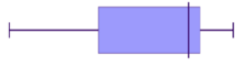
Start with a number line that covers the full range of values in the data set. Next, plot the values from the five number summary on the number line, and connect them in a certain way to create a box-and-whisker plot. Here is an example:

The two vertical edges of the box-and-whisker show the quartiles of the data range. The left-hand side of the box is $Q_1$Q1 and the right-hand side of the box-and-whisker is $Q_3$Q3. The vertical line inside the box-and-whisker shows the median (the middle score) of the data.
Then there are two lines that extend from the box-and-whisker outwards. The endpoint of the left line is at the minimum score, while the endpoint of the right line is at the maximum score.
Worked examples
example 1

For the box-and-whisker plot above, find the:
(a) Lowest score
Think: The lowest score is the furthest left point of the plot.
Do: So in this case, the lowest score is $3$3.
(b) Highest score
Think: The highest score is the furthest right point of the plot.
Do: So in this case, the highest score is $18$18.
(c) Range
Think: The range is the difference between the highest score and the lowest score.
Do: For this data set, the range is $18-3=15$18−3=15.
(d) Median
Think: The median is shown by the line inside the rectangular box.
Do: For this data set, the median line is at the score $10$10.
e) Interquartile range (IQR)
Think: The IQR is the difference between the upper quartile and the lower quartile.
Do: For this set, the lower quartile (at the left end of the box) is $8$8, while the upper quartile (at the right end of the box) is $15$15. This means that the IQR is $15-8=7$15−8=7.
example 2

Using the box-and-whisker plot above:
(a) What percentage of scores lie in each of the following regions?
- $10.9$10.9 and $11.2$11.2
- $10.8$10.8 and $10.9$10.9
- $11.1$11.1 and $11.3$11.3
- $10.9$10.9 and $11.3$11.3
- $10.8$10.8 and $11.2$11.2
Think: For these five regions, we should look at how many quartiles are in that region. Remember that one quartile represents $25%$25% of the data set.
Do:
- $50%$50% of scores lie between Q1 to Q3.
- $25%$25% of the scores lie between the lowest score and Q1.
- $50%$50% of scores lie between the median and the highest score.
- $75%$75% of scores lie between Q2 and the highest score.
- $75%$75% of scores lie between the lowest score and Q3.
(b) In which quartile (or quartiles) is the data the most spread out?
Think: Which quartile takes up the longest space on the graph?
Do: The second quartile is the most spread out.
example 3
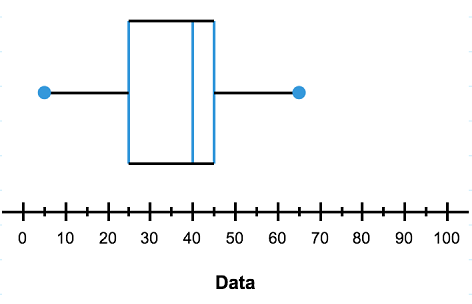
Create a box-and-whisker plot that represents the information in the five number summary below:
| Minimum | $5$5 |
| Lower Quartile | $25$25 |
| Median | $40$40 |
| Upper Quartile | $45$45 |
| Maximum | $65$65 |
Do: Here is our graph. Notice how the values in the five number summary correspond to particular places on the box-and-whisker plot.
Practice question
Question 2
Shape of data from box-and-whisker plots
We can now see that data can be displayed in histograms and box-and-whisker plots. These two displays are great for being able to identify key features of the shape of the data, as well as the range and in the case of the box plot the IQR and the median.
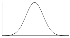
We should expect then that the shape of the data would be the same whether it is represented in a box-and-whisker plot or histogram. Remember that the shape of data can be symmetric, positively skewed or negatively skewed.
Symmetric
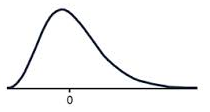
Positive skew
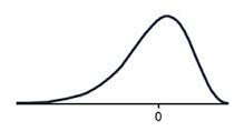
Negative skew
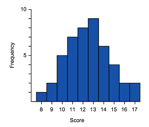
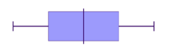
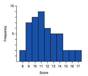
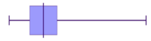
Let's now match some histograms to their correct box-and-whisker plot representation.
Worked example
Example 4
Match the box-and-whisker plots and histograms together.
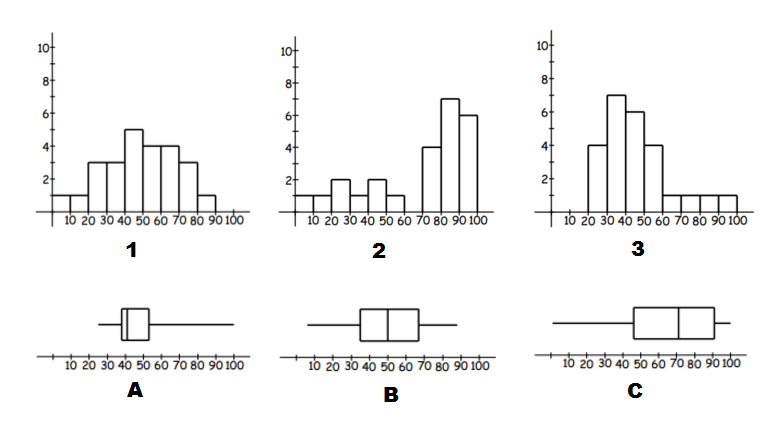
Think: To identify matching data start by identifying tails (left or right) and symmetric type data.
Do:
- We can see that $A$A and $3$3 have long tails to the right, so they are both positively skewed and are a match.
- $C$C and $2$2 both have long tails to the left, so they are both negatively skewed and are a match.
- This leaves just $B$B and $1$1. We can see that both of these are symmetric, without a long tail to either side, and are a match.
Practice question
Question 3
Consider the following pairs of histograms and box plots:
Which two of these histograms and box plots are correctly paired?

 A
A
 B
B C
C D
DIn part (a) we determined that the following histogram/box plot were an incorrect match:
Which two of the options correctly describe why?
The box plot has a long tail to the right which indicates positive skew, while the histogram does not appear to be skewed.
AThe data on the histogram is widely spread, while the box plot indicates that the data is mostly located around the median.
BThe median for the histogram is roughly in the middle, while the median of the box plot is located further to the left.
C