
Analysing univariate data: measures of central tendency
Measures of central tendency, or measures of location, refer to statistical quantities that tell us where the middle of the scores is (the average). There are 3 of these measures: mean, median and mode. They can all be referred to as "averages" of the data set.
Mean
The mean is what we typically consider to be the average of all the scores.
If the data is given as single scores, you calculate the mean by adding up all the scores, then dividing the total by the number of scores.
If the data is given in a frequency table then sum the scores multiplied each by their frequency before dividing by the total number of data points.
If the data is grouped, then first find the midpoint of each class interval, sum the midpoints multiplied by the frequency and then divide by the total of the frequency column.
Median
The median is the middle score in a data set when the scores are arranged in numerical order.
There are two ways you can find the median:
- Write the numbers in the data set in ascending order, then find the middle score by crossing out a number at each end until you are left with one in the middle.
- Calculate what score would be in the middle using the formula: $\text{middle term }=\frac{n+1}{2}$middle term =n+12, then count up in ascending order until you reach the score that is that term.
Note: If the data is grouped using class intervals you must add up the frequency column until you come to the interval where the middle score must lie. The interval will be called the median class.
Mode
The mode is the most frequently occurring score.
To find the mode, count which score you see most frequently in your data set. If the data is in a frequency table, the score with the highest frequency is the mode. If the data is grouped then the modal class will be the class interval with the highest frequency.
Worked example
Example 1
A statistician has organised a set of data into the frequency table shown. Determine the mean, median and mode for the data.
| Score ($x$x) | Frequency ($f$f) | $fx$fx |
|---|---|---|
| $44$44 | $8$8 | $352$352 |
| $46$46 | $10$10 | $460$460 |
| $48$48 | $6$6 | $288$288 |
| $50$50 | $18$18 | $900$900 |
| $52$52 | $5$5 | $260$260 |
| Totals | $47$47 | $2260$2260 |
The mean is $\overline{x}=\frac{2260}{47}=48.01$x=226047=48.01
To find the median first work out which score it must be using the formula
$\text{Middle term }$Middle term $=$= $\frac{n+1}{2}$n+12
Think: There are 47 scores so the median score will be the value of score number $\frac{47+1}{2}=24$47+12=24
Do: Add the numbers downwards in the frequency column until you get to the 24th score. $8+10+6=24$8+10+6=24
Therefore the median score is $48$48.
To find the mode find the score with the highest frequency. The highest frequency is 18, therefore
the mode is $50$50.
Practice questions
Question 1
Consider the table below.
| Score | Frequency |
|---|---|
| $1$1 - $4$4 | $2$2 |
| $5$5 - $8$8 | $7$7 |
| $9$9 - $12$12 | $15$15 |
| $13$13 - $16$16 | $5$5 |
| $17$17 - $20$20 | $1$1 |
Use the midpoint of each class interval to determine an estimate for the mean of the following sample distribution. Round your answer to one decimal place.
Which is the modal group?
$1$1 - $4$4
A$17$17 - $20$20
B$13$13 - $16$16
C$5$5 - $8$8
D$9$9 - $12$12
E
Analysing univariate data: measures of spread
The range, interquartile range, variance and standard deviation are all measures of spread. They tell us about how spread out the scores are.
Range
The range is the difference between the highest score and the lowest score.
To calculate the range, you need to subtract the lowest score from the highest score.
Interquartile range
The interquartile range (IQR) gives a measure of spread of the middle $50%$50% of the data set.
The interquartile range often gives a better indication of the internal spread than the range does, as it is less affected by individual scores that are unusually high or low, which are the outliers.
Remember to make sure the data set is ordered before finding the quartiles or the median.
Subtract the first quartile from the third quartile. That is,
$\text{IQR }=Q_3-Q_1$IQR =Q3−Q1
Practice questions
Question 2
Answer the following, given this set of scores:
$33,38,50,12,33,48,41$33,38,50,12,33,48,41
Sort the scores in ascending order.
Find the number of scores.
Find the median.
Find the first quartile of the set of scores.
Find the third quartile of the set of scores.
Find the interquartile range.
Question 3
The column graph shows the number of pets that each student in a class owns.
Find the first quartile of the set of scores.
Find the third quartile of the set of scores.
Find the interquartile range.
Standard deviation
Standard deviation is a measure of spread, which helps give us a meaningful estimate of the variability in a data set. While the quartiles gave us a measure of spread about the median, the standard deviation gives us a measure of spread with respect to the mean. It is a weighted average of the distance of each data point from the mean. A small standard deviation indicates that most scores are close to the mean, while a large standard deviation indicates that the scores are more spread out away from the mean value.
We can calculate the standard deviation for a population or a sample.
The symbols used are:
| $\text{Population standard deviation}$Population standard deviation | $=$= | $\sigma$σ | (lowercase sigma) |
| $\text{Sample standard deviation}$Sample standard deviation | $=$= | $s$s |
In statistics mode on a calculator, the following symbols might be used:
| $\text{Population standard deviation}$Population standard deviation | $=$= | $\sigma_n$σn |
| $\text{Sample standard deviation}$Sample standard deviation | $=$= | $\sigma_{n-1}$σn−1 |
Standard deviation is a very powerful way of comparing the spread of different data sets, particularly if there are different means and population numbers.
Standard deviation can be calculated using a formula. However, as this process is time consuming we will be using our calculator to find the standard deviation. Ensure settings are correct for the data given, this is particularly important when changing between data that is in a simple list to data that is in a frequency table. For questions in the exercise set, assume standard deviation refers to the population standard deviation unless otherwise stated.
Practice questions
Question 4
Find the population standard deviation of the following set of scores, to two decimal places, by using the statistics mode on the calculator:
$8,20,9,9,8,19,9,18,5,10$8,20,9,9,8,19,9,18,5,10
Question 5
The table shows the number of goals scored by a football team in each game of the year.
| Score ($x$x) | Frequency ($f$f) |
|---|---|
| $0$0 | $3$3 |
| $1$1 | $1$1 |
| $2$2 | $5$5 |
| $3$3 | $1$1 |
| $4$4 | $5$5 |
| $5$5 | $5$5 |
In how many games were $0$0 goals scored?
Determine the median number of goals scored. Leave your answer to one decimal place if necessary.
Calculate the mean number of goals scored each game. Leave your answer to two decimal places if necessary.
Use your calculator to find the population standard deviation. Leave your answer to two decimal places if necessary.
Question 6
Points scored by two friends over $10$10 rounds of a game are displayed below.
- Pauline: $10,31,23,6,5,38,18,19,15,21$10,31,23,6,5,38,18,19,15,21
- Dave: $52,51,77,40,61,53,60,81,52,82$52,51,77,40,61,53,60,81,52,82
Calculate the mean scores of the two friends.
Pauline: $\editable{}$
Dave: $\editable{}$
Calculate the sample standard deviation for the scores of each friend.
Round your answers to one decimal place.
Pauline: $\editable{}$
Dave: $\editable{}$
The statistics calculated explain which of the following?
Pauline is a more consistent player but has consistently lower scores than Dave.
APauline is a more consistent player and has consistently higher scores than Dave.
BPauline is a less consistent player but generally scores higher than Dave.
CPauline is a less consistent player and generally scores lower than Dave.
D
Analysing univariate data: outliers
An outlier is an event that is very different from the norm and results in a score that is far away from the rest of the scores.
A data point is classified as an outlier if it lies more than $1.5$1.5 interquartile ranges above the upper quartile or more than $1.5$1.5 interquartile ranges below the lower quartile.
Below $Q_1-1.5\times\text{IQR}$Q1−1.5×IQR
OR
More than $Q_3+1.5\times\text{IQR}$Q3+1.5×IQR
Analysing univariate data: box plots
A five number summary consists of the:
- Minimum value
- Lower quartile (Q1)
- Median
- Upper quartile (Q3)
- Maximum value
Using the five number summary we can construct a box and whisker plot.

The two vertical edges of the box show the quartiles of the data range. The left hand side of the box is the lower quartile (Q1) and the right hand side of the box is the upper quartile (Q3). The vertical line inside the box shows the median (the middle score) of the data.
Then there are two lines that extend from the box outwards. The endpoint of the left line is at the minimum score, while the endpoint of the right line is at the maximum score.
Practice questions
QUESTION 7
VO2 Max is a measure of how efficiently your body uses oxygen during exercise. The more physically fit you are, the higher your VO2 Max. Here are some people’s results when their VO2 Max was measured.
$46,27,32,46,30,25,41,24,26,29,21,21,26,47,21,30,41,26,28,26,76$46,27,32,46,30,25,41,24,26,29,21,21,26,47,21,30,41,26,28,26,76
Sort the values into ascending order.
Determine the median VO2 Max.
Determine the upper quartile value. Leave your answer as a decimal if necessary.
Determine the lower quartile value. Leave your answer as a decimal if necessary.
Calculate $1.5\times IQR$1.5×IQR, where IQR is the interquartile range. Leave your answer as a decimal if necessary.
An outlier is a score that is more than $1.5\times IQR$1.5×IQR above or below the Upper Quartile or Lower Quartile respectively. State the outlier.
Here is a box and whisker plot for the data.

An average untrained healthy person has a VO2 Max between $30$30 and $40$40. The majority of this group of people are likely to:
do moderate amounts of exercise
Abe professional athletes
Bdo none to moderate amounts of exercise
C
Question 8
Consider the following set of data:
$1$1 $6$6 $4$4 $9$9 $8$8 $5$5 $2$2
Complete the five-number summary for this data set.
Minimum $\editable{}$ Lower quartile $\editable{}$ Median $\editable{}$ Upper quartile $\editable{}$ Maximum $\editable{}$ Would the value $15$15 be considered an outlier?
Yes
ANo
B
Analysing univariate data: the shape of data
Measures of central tendency and measure of spread can be very powerful in comparing and contrasting two different data sets.
We also can benefit from examining the shape of the distribution of two sets of data when comparing them.
Symmetry
Data may be described as symmetrical or asymmetrical.
There are many cases where the data tends to be around a central value with no bias left or right. In such a case, roughly $50%$50% of scores will be above the mean and $50%$50% of scores will be below the mean. In other words, the mean and median roughly coincide.
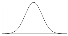
The normal distribution is a common example of a symmetrical distribution of data. The normal distribution looks like the following bell-shaped curve:
The picture below shows how a data set that has an approximate normal distribution may appear in a histogram. The dark line shows the nice, symmetrical curve that can be drawn over the histogram that the data roughly follows.

In the distribution above, the peak of the data represents the mean, the median and the mode (taken as the centre of the modal class)–all these measures of central tendency are equal for this symmetrical distribution.
A uniform distribution is a symmetrical distribution where each outcome is equally likely, so the frequency should be the same for each outcome. For example, when rolling dice the outcomes are equally likely, while we might get an irregular column graph if only a small number of rolls were performed if we continued to roll the dice the distribution would approach a uniform distribution like that shown below.

Skew
If a data set is asymmetrical instead (i.e. it isn't symmetrical), it may be described as skewed.
A data set that has positive skew (sometimes called a 'right skew') has a longer tail of values to the right of the data set. The mass of the distribution is concentrated on the left of the figure.
A positively skewed graph looks something like this:
 |
 |
| General shape of positively skewed data with right side stretched out | General shape shown over a histogram of positively skewed data |
A data set that has negative skew (sometimes called a 'left skew') has a longer tail of values to the left of the data set. The mass of the distribution is concentrated on the right of the figure.
A negatively skewed graph looks something like this:
 |
 |
| General shape of negatively skewed data with left side stretched out | General shape shown over a histogram of negatively skewed data |
Clustering
In a set of data, a cluster occurs when a large number of the scores are grouped together within a small range. Clustering may occur at a single location or several locations. For example, annual wages for a factory may cluster around $\$40000$$40000 for unskilled factory workers, $\$55000$$55000 for tradespersons and $\$70000$$70000 for management. The data may also have clear gaps where values are either very uncommon or not possible in the data set. If the data has two clear peaks then the shape is called bimodal.
Practice questions
Question 9
State whether the scores in each histogram are positively skewed, negatively skewed or symmetrical (approximately).
A histogram that represents the distribution of scores. The x-axis enumerates discrete scores as individual points, while the y-axis corresponds to the frequency of each score interval. Each bar on the histogram corresponds to one of these distinct scores, with the bar's height reflecting the count or frequency of occurrences for that particular score. Most of the scores are relatively high. Positively skewed
ASymmetrical
BNegatively skewed
CA histogram that represents the distribution of scores. The x-axis enumerates discrete scores as individual points, while the y-axis corresponds to the frequency of each score interval. Each bar on the histogram corresponds to one of these distinct scores, with the bar's height reflecting the count or frequency of occurrences for that particular score. Approximately, as the score goes higher, the frequency goes lower. Positively skewed
ANegatively skewed
BSymmetrical
CA histogram that represents the distribution of scores. The x-axis enumerates discrete scores as individual points, while the y-axis corresponds to the frequency of each score interval. Each bar on the histogram corresponds to one of these distinct scores, with the bar's height reflecting the count or frequency of occurrences for that particular score. The scores have its peak approximately in the middle. Negatively skewed
ASymmetrical
BPositively skewed
C
Question 10
The beaks of two groups of bird are measured, in mm, to determine whether they might be of the same species.
| Group 1 | $33$33 | $39$39 | $31$31 | $27$27 | $22$22 | $37$37 | $30$30 | $24$24 | $24$24 | $28$28 |
|---|---|---|---|---|---|---|---|---|---|---|
| Group 2 | $29$29 | $44$44 | $45$45 | $34$34 | $31$31 | $44$44 | $44$44 | $33$33 | $37$37 | $34$34 |
Calculate the range for Group 1.
Calculate the range for Group 2.
Calculate the mean for Group 1. Give your answer as a decimal.
Calculate the mean for Group 2. Give your answer as a decimal.
Choose the most appropriate statement that describes the set of data.
Although the ranges are similar, the mean values are significantly different indicating that these two groups of birds are of the same species.
AAlthough the ranges are similar, the mean values are significantly different indicating that these two groups of birds are not of the same species.
BAlthough the mean values are similar, the ranges are significantly different indicating that these two groups of birds are not of the same species.
CAlthough the mean values are similar, the ranges are significantly different indicating that these two groups of birds are of the same species.
D
Question 11
The box plots drawn below show the number of repetitions of a $70$70 kg bar that two weightlifters can lift. They both record their repetitions over $30$30 days.

Which weightlifter has the more consistent results?
Weightlifter A.
AWeightlifter B.
BWhat statistical evidence supports your answer?
The mean.
AThe range.
BThe mode.
CThe graph is positively skewed.
DWhich statistic is the same for each weightlifter?
The median.
AThe mean.
BThe mode.
CWhich weightlifter can do the most repetitions of $70$70 kg?
Weightlifter A.
AWeightlifter B.
B