
When we describe the shape of data sets, we want to focus on how the scores are distributed. Some questions that we might be interested include:
- Is the distribution symmetrical or not?
- Are there any clusters or gaps in the data?
- Are there any outliers?
- Where is the centre of the data located approximately? (Recall our three measures of centre: mean, median and mode)
- Is the data widely spread or very compact? (Recall our three measures of spread: range, interquartile range and standard deviation)
Symmetry
Data may be described as symmetrical or asymmetrical.
There are many cases where the data tends to be around a central value with no bias left or right. In such a case, roughly $50%$50% of scores will be above the mean and $50%$50% of scores will be below the mean. In other words, the mean and median roughly coincide.
The normal distribution is a common example of a symmetrical distribution of data. The normal distribution looks like the following bell-shaped curve:
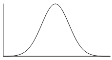
The picture below shows how a data set that has an approximate normal distribution may appear in a histogram. The dark line shows the nice, symmetrical curve that can be drawn over the histogram that the data roughly follows.

In the distribution above, the peak of the data represents the mean, the median and the mode (taken as the centre of the modal class)–all these measures of central tendency are equal for this symmetrical distribution.
A uniform distribution is a symmetrical distribution where each outcome is equally likely, so the frequency should be the same for each outcome. For example, when rolling dice the outcomes are equally likely, while we might get an irregular column graph if only a small number of rolls were performed if we continued to roll the dice the distribution would approach a uniform distribution like that shown below.

Skew
If a data set is asymmetrical instead (i.e. it isn't symmetrical), it may be described as skewed.
A data set that has positive skew (sometimes called a 'right skew') has a longer tail of values to the right of the data set. The mass of the distribution is concentrated on the left of the figure.
A positively skewed graph looks something like this:
 |
 |
| General shape of positively skewed data with right side stretched out | General shape shown over a histogram of positively skewed data |
A data set that has negative skew (sometimes called a 'left skew') has a longer tail of values to the left of the data set. The mass of the distribution is concentrated on the right of the figure.
A negatively skewed graph looks something like this:
 |
 |
| General shape of negatively skewed data with left side stretched out | General shape shown over a histogram of negatively skewed data |
Practice questions
Question 1
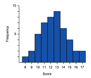
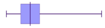
What type of skew is shown in the graph below?
No skew
ARight skew
BLeft skew
C
Question 2
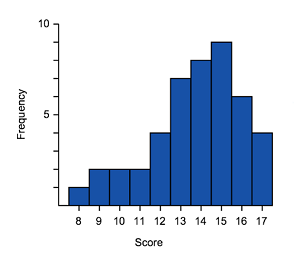
The table shows the number of crime novels in a bookshop for different price ranges.
| Price of crime novel to nearest $\$5$$5 | Frequency |
|---|---|
| $5$5 | $5$5 |
| $10$10 | $10$10 |
| $15$15 | $17$17 |
| $20$20 | $8$8 |
| $25$25 | $17$17 |
| $30$30 | $10$10 |
| $35$35 | $5$5 |
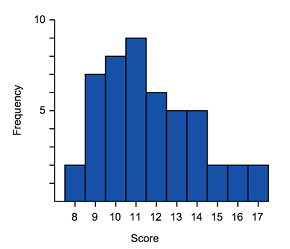
Plot this data as a histogram.
Which of the following best describes the data in the graph and table?
Symmetrical
ARight skewed
BLeft skewed
CUniform distribution
D
Connect histograms and box plots
We have seen how data can be displayed in histograms and in box plots. These two displays are great for being able to identify key features of the shape of the data, as well as the range and in the case of the box plot, the interquartile range and median.
We should expect then that the shape of the data would be the same whether it is represented in a polygon, box plot or histogram. Remember that the shape of data can be symmetric, negatively skewed or positively skewed.
Symmetric
 |
 |
|
| Common shape of a symmetrical distribution | Histogram of approximately symmetrical data | Box plot of symmetrical data |
- The median is in the centre of the range and the tails (whiskers) of the data are of equal length
- The graph should be approximately a mirror image of itself about the centre of the data
Positive skewed (also called skewed right)
|
 |
|
| General shape positively skewed data | Histogram of positively skewed data | Box plot of positively skewed data |
- The data is stretched out to the right, producing a longer tail (whisker) to the right of the graph
- The bulk of the data is to the left–higher frequency columns and the box should appear to the left
Negative skewed (also called skewed left)
|
 |
|
| General shape negatively skewed data | Histogram of negatively skewed data | Box plot of negatively skewed data |
- The data is stretched out to the left, producing a longer tail (whisker) to the left of the graph
- The bulk of the data is to the right–higher frequency columns and the box should appear to the right
Looking at the diagrams above, can you see the similarities in the representations?
We can see the skewed tails, where the bulk of the data sits and general shape. These are some of the features you can use to match histograms and box plots. We can also look at the data range.
Let's try matching histograms to their correct box plot representation.
Worked example
Example 1
Match the histograms to its box plot.
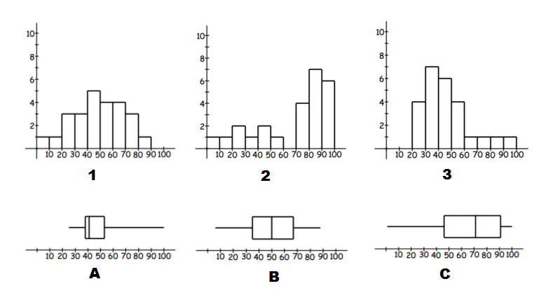
Think: To identify matching data we can start by looking for skew (left or right) and symmetric distributions of data.
Do:
- A and $3$3 have extended right tails, and thus are both right skewed. We can also use the range by noticing these are the only graphs with no values in the $0$0 to $10$10 and $10$10 to $20$20 intervals. So they are a match.
- C and $2$2 have stretched out left tails, and thus are both left skewed. So they are a match.
- Which leaves B and $1$1. They are both symmetric data and have no values in the interval $90$90 to $100$100. So we have our final match.
Practice questions
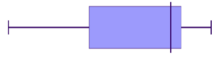
question 3
Match the box plot shown to the correct column graph.
- ABCD
question 4
Consider the following pairs of histograms and box plots:
Which two of these histograms and box plots are correctly paired?

 A
A
 B
B C
C D
DIn part (a) we determined that the following histogram/box plot were an incorrect match:
Which two of the options correctly describe why?
The box plot has a long tail to the right which indicates positive skew, while the histogram does not appear to be skewed.
AThe data on the histogram is widely spread, while the box plot indicates that the data is mostly located around the median.
BThe median for the histogram is roughly in the middle, while the median of the box plot is located further to the left.
C
Clustering
In a set of data, a cluster occurs when a large number of the scores are grouped together within a small range. Clustering may occur at a single location or several locations. For example, annual wages for a factory may cluster around $\$40000$$40000 for unskilled factory workers, $\$55000$$55000 for tradespersons and $\$70000$$70000 for management. The data may also have clear gaps where values are either very uncommon or not possible in the data set.
In the dot frequency graph below, we can see that the data for girls is clustered around $2-3$2−3 minutes, $5-7$5−7 minutes and $9-12$9−12 minutes.

Modality
We have learned that the mode of a data distribution is the data value that occurs most frequently. In the case of grouped data we refer to the modal class as the group that has the highest frequency.
Sometimes there is more than one value or group that has the highest frequency, so the modality is an important characteristic when we are describing the distribution.
- uni-modal - a distribution where there is a single value or class with the highest frequency
- multi-modal - more than one value or class have the equal highest frequency. (If there are exactly two modes, the data can be referred to as bi-modal.)
It is important to recognised the modality when we are analysing our data because it could indicate that our population is made up of two or more distinct groups.
For example, if we were to analyse long-jump results for a population made up of Year 8 students and Year 12 students we would very likely find that this data is bimodal—with one peak (at a shorter distance) for the Year 8 students, and another peak (at a greater distance) for the Year 12 students.
The histograms below are examples of a bimodal and multimodal distributions. If the data has multiple dominant peaks it can be described as bimodal or multimodal, even if the peaks are not exactly the same height.
Bimodal distribution

Multimodal distribution

Outliers
An outlier is a data point that varies significantly from the body of the data. An outlier will be a value that is either significantly larger or smaller than other observations. Outliers are important to identify as they point to unusual bits of data that may require further investigation and impact some calculations such as mean, range and standard deviation.
For the dot plot given above the score of $9$9 would be considered an outlier as it is well above the body of the data.
Identifying outliers
In many cases, outliers can be identified by inspection. However, it can be useful to have a systematic process to determine outliers.
To do this, we calculate values for "fences" that set the limits for the expected normal range of data. Any data that fall outside the fence lines will be considered an outlier.
Lower fence $=$= Lower quartile $-1.5\times$−1.5× Interquartile Range
Upper fence $=$= Upper quartile $+1.5\times$+1.5× Interquartile Range
We can display outliers separately in box plots to highlight the shape and location of the majority of the data in comparison to the outliers. The whiskers of the box plot should extend to the smallest and largest values that are not outliers.

Worked example
Example 2
Consider the box plot given below.

By calculating the lower and upper fence, determine whether the data points $4$4 and $32$32 can be considered outliers.
From the graph we can see that
Lower quartile $=$= $11$11
Upper quartile $=$= $19$19
and we can calculate the interquartile range
IQR $=$= $19-11=8$19−11=8
Now we can determine the fences, which define the limits for a value to be considered an outlier.
Lower fence $=$= $11-1.5\times8=-1$11−1.5×8=−1
Upper fence $=$= $19+1.5\times8=31$19+1.5×8=31
Since $4$4 is above the lower fence of $-1$−1, it is inside the fence and hence not an outlier.
Since $32$32 is above the upper fence of $31$31, it is outside the fence and hence is an outlier.
Effect of outliers
Once we identify an outlier we should further investigate the underlying cause of the outlier. If the outlier is simply a mistake then it should be removed from the data - this can often occur when recording or transferring data by hand or conducting a survey where a respondent may not take the questionnaire seriously. If the data is not a mistake it should not be removed from the data set as while it is unusual it is representative of possible outcomes - for example, you would not remove a very tall student's height from data for a class just because it was unusual for the class.
When data contains an outlier we should be aware of its impact on any calculations we make. Let's look at the effect that outliers have on the measures of centre and spread:
| Statistic | Effect of outlier |
|---|---|
| Mean |
The mean will be significantly affected by the inclusion of an outlier:
|
| Median |
The median is the middle value of a data set, the inclusion of an outlier will not generally have a significant impact on the median unless there is a large gap in the centre of the data. Thus, generally:
|
| Mode |
The mode is the most frequent value, as an outlier is an unusual value it will not be the mode. Hence:
|
| Range |
An isolated outlier will be the maximum or minimum value in a set. Thus:
|
| Interquartile range |
The interquartile range relies on the first and third quartiles, as these are within the body of the data the inclusion of an outlier will not generally have a significant impact on the interquartile range unless there is are large gaps in the data around the $25$25th or $75$75th percentile. Thus, generally:
|
| Standard deviation |
The standard deviation is a weighted average of how much the data varies from the mean. An outlier varies from the mean by a relatively large amount, thus:
|
Practice questions
Question 5
For the Stem and Leaf plot attached:
| Stem | Leaf | |
| $0$0 | $5$5 | |
| $1$1 | $7$7 $8$8 | |
| $2$2 | $0$0 $8$8 | |
| $3$3 | $0$0 $4$4 $6$6 $7$7 $8$8 $9$9 | |
| $4$4 | $1$1 $3$3 $5$5 $8$8 $8$8 $8$8 | |
| $5$5 | ||
| $6$6 | ||
| $7$7 | ||
| $8$8 | ||
| $9$9 | $3$3 | |
|
||
Are there any outliers?
Yes
ANo
BIdentify the outlier.
Is there any clustering of data?
Yes
ANo
BWhere does the clustering occur?
10s - 20s
A30s - 40s
B20s - 30s
CWhat is the modal class(es)?
10-19
A40-49
B30-39
C20-29
DNot including the outlier, the distribution of the data is:
Positively skewed
ASymmetrical
BNegatively skewed
C
Question 6
Consider the dot plot below.

Determine the median, lower quartile score and the upper quartile score.
Median $=$= $\editable{}$
Lower quartile $=$= $\editable{}$
Upper quartile $=$= $\editable{}$
Hence, calculate the interquartile range.
Calculate $1.5\times IQR$1.5×IQR, where IQR is the interquartile range.
An outlier is a score that is more than $1.5\times IQR$1.5×IQR above or below the Upper Quartile or Lower Quartile respectively. State the outlier.
Question 7
Consider the following set of data:
$53,46,25,50,30,30,40,30,47,109$53,46,25,50,30,30,40,30,47,109
Fill in this table of summary statistics.
Mean $\editable{}$ Median $\editable{}$ Mode $\editable{}$ Range $\editable{}$ Which data value is an outlier?
Fill in this table of summary statistics after removing the outlier $109$109.
Mean $\editable{}$ Median $\editable{}$ Mode $\editable{}$ Range $\editable{}$ Let $A$A be the original data set and $B$B be the data set without the outlier.
Fill in this table using the symbols $>$>, $<$< and $=$= to compare the statistics before and after removing the outlier.
With outlier Without outlier Mean: $A\editable{}B$AB Median: $A\editable{}B$AB Mode: $A\editable{}B$AB Range: $A\editable{}B$AB
Suitability of measures of centre
We can use the mean, median or mode to describe the centre of a data set. Sometimes one measure may better represent the data than another and sometimes we want just one statistic for an article or report rather than detail on the different measures. When deciding which to use we need to ask ourselves which measure would best represent the type of data we have. Some main considerations are:
- Is there a repeated value? If there are no repeated values or only a couple of randomly repeated values then the mode will not be representative of the data. If there is one or two highly frequent data points these may be a fair representation of the centre of the data.
- Is there an outlier? As we have seen an outlier will significantly affect the mean–this may give a distorted view of the centre of the data. For example, if we had a list of houses sold in an area and a historic mansion was sold for a price well above the other houses in the area, then using the median would be a better representation of average house prices in the area than the mean.
- Do you need all the data values to be taken into account? Only the mean uses all the values in its calculation.
Practice questions
Question 8
The salaries of part-time employees at a company are given in the dot plot below. Which measure of centre best reflects the typical wage of a part-time employee?

The mean.
AThe mode.
BThe median.
C
Question 9
A journalist wanted to report on road speed cameras being used as revenue raisers. She obtained data that showed the number of times $20$20 speed cameras issued a fine to motorists in one month. The results were:
$101,102,115,115,121,124,127,128,130,130,143,143,146,162,162,163,178,183,194,977$101,102,115,115,121,124,127,128,130,130,143,143,146,162,162,163,178,183,194,977
Determine the mean number of times a speed camera issued a fine in that month. Give your answer correct to one decimal place.
Determine the median number of times a speed camera issued a fine in that month. Give your answer correct to one decimal place.
Which measure is most representative of the number of fines issued by each speed camera in one month?
the mean
Athe median
BWhich score causes the mean to be much greater than the median?
The journalist wants to give the impression that speed cameras are just being used to raise revenue. Which statement should she make?
A sample of $20$20 speed cameras found that the median number of fines in one month was $136.5$136.5.
AA sample of $20$20 speed cameras found that, on average, $182.2$182.2 fines were issued in one month.
B