
Investigation: Finding the line of best fit using technology
Introduction
Research shows that the IQ of young people is increasing over time, which means that you are a member of the smartest generation ever. As a whole, your generation is more intelligent than your parents', your grandparents', or any generation that ever came before it.
This steady rise in IQ scores over time is called the Flynn effect, and has been the subject of a great amount of research. Many people have a deep suspicion that the Flynn effect is some sort of statistical mistake, especially at a time when many adults grumble about how "kids these days" are vastly inferior to how kids "used to be" (although, adults have been saying that for thousands of years). However, the Flynn effect is real, having been confirmed using different IQ tests in a variety of countries , from American school-children to young people in rural Kenya.
In this investigation, you're going to have a look at the figures yourself, to see what the statistics show about the rise in intelligence.
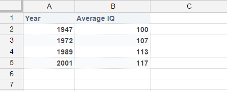
| Year | Average IQ |
|---|---|
| 1947 | 100 |
| 1972 | 107 |
| 1989 | 113 |
| 2001 | 117 |
This data is adapted from Flynn's "American IQ Gains From 1932 to 2002: The WISC Subtests and Educational Progress". Basically, the way IQ tests work is that 100 is set as the average. However, when the WISC IQ test (an IQ test for school-aged people) updated their test in 1972, 1989 and 2001, they found that the average of students had crept up. Therefore, they had to "standardize" the new version of the test so that it was harder than the previous one, in order to make the average 100 again. What this table represents is the way that average IQ would have changed if these "standardizations" had not taken place.
Just from the numbers alone, you can probably see the trend: IQs are going up. But how is it increasing? Is it linear, exponential or somewhat random? Is it speeding up or slowing down? It is hard to tell from the numbers alone, so we are going to do some fancy analysis to find out.
To analyze this data, we are going to use Google Sheets, a free online spreadsheet tool. If you have Excel on your device, you can use this as well, as the two programs are very similar.
Procedure 1 - Creating a line of best fit
- Begin by pasting the data into the spreadsheet, so that it looks like this:
- Ensure that your data set is highlighted. If it isn't click in cell A1 and hold shift then click in cell B5.
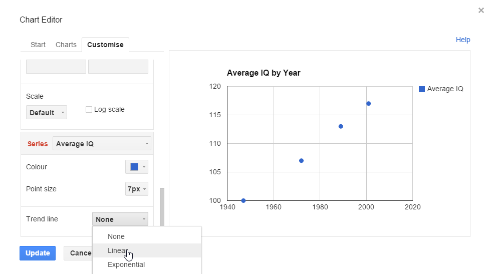
- Next, we're going to make a scatter plot of these figures. Click on "Insert" up the top, then "Chart". A column chart will pop up by default, so we need to click the drop down beside "Column chart" and scroll down to the scatter plot. If all those directions were confusing, here's a nice picture:

- Now you should have a nice chart. Click on the "Customize" tab, then "Chart & axis titles" and then "Title Text" to give it a sensible name. Center if desired.

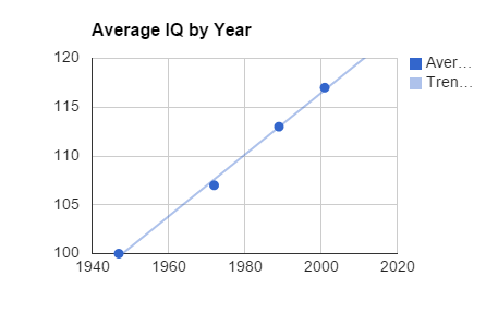
At first glance, the scatter plot looks like IQ is going up in pretty much a straight line.
- To make it even clearer, let's add a trend line. Right click on the scatter plot, and then click "Series". Scroll the left panel down until you get to about half way. There, you should see a box that says "Trendline". Tick that box and just below it should select "Linear" by default.
You should get a nice "line of best fit" on your graph.
Quantifying the correlation
Looks like a pretty good match. And if that's all we were interested in, we could probably close the book on this one. But sometimes it's nice to be able to put a number to these things, something which allows you to easily communicate the result to other people.
For our next step, we're going to get a number, called the Pearson Correlation Coefficient, which shows how the data are related, or "correlated". The Pearson Correlation Coefficient is abbreviated as "r".
To understand correlation coefficients you need to remember what correlation means.
The value of a correlation the coefficient ("r") ranges between -1 and +1. A negative sign means a negative correlation, and a positive sign means a positive correlation. Can you think of an example when the correlation coefficient would be exactly +1, which means a "perfect" positive correlation?
Generally, the following terms are used to describe correlation coefficients:
| Correlation Coefficient | Strength |
|---|---|
| +1 | Perfect positive relationship |
| +0.7 | Strong positive relationship |
| +0.5 | Moderate positive relationship |
| +0.3 | Weak positive relationship |
| 0 | No relationship |
| -0.3 | Weak negative relationship |
| -0.5 | Moderate negative relationship |
| -0.7 | Strong negative relationship |
| -1 | Perfect negative relationship |
Procedure 2 - Calculating the correlation coefficient
Google sheets can calculate the correlation coefficient for you in the blink of an eye, using the =CORREL function.
- On the spreadsheet, click on an empty cell
- Type the following command into the empty cell: "=CORREL(A1:A5, B1:B5)" (Without the quotation marks). If your data is in a different spot to the example, you'll need to change it to reflect this. In this command, "A1:A5" means "A1 to A5", and is the location of the first set of data (in our case, year numbers). "B1:B5" means "B1 to B5" and is the location of the second set of data (in our case, IQ). If your data is in different addresses, just change these cell references so they match with the location of your data.
- Hit enter. The correlation coefficient should come out as 0.998.
- Use the table above to describe this correlation in words as well.
So there you have it, the relationship between Year and Average IQ is pretty much perfect. If you do the calculations, you'll see that the rate of increase is approximately 3 points of IQ every ten years. That puts you guys on an average IQ of around 120 by 1940 standards, which back then would earn you an intelligence classification of "Superior"
Further information
As well as discovering that kids are getting smarter, Flynn also discovered that they are getting smarter in some ways more than others. The IQ tests measure groups of different subcategories, focusing on different kinds of intelligence.
Here are the results from one of these subcategories, called "information". The "information" category focuses on your knowledge of memorized facts, like "What is the capital of Brazil?" or "How many planets are there in the solar system?". Here are the results of this ability over time:
| Year | Score |
|---|---|
| 1947 | 100 |
| 1972 | 102 |
| 1989 | 100.5 |
| 2001 | 102 |
Doesn't look so impressive, does it? Copy and paste the data into Google Sheets, and follow the same procedure to generate a scatter plot with a trend line.
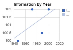
The spreadsheet thinks that overall it seems to be going up, but it's definitely not as strong a relationship as what we've seen before. Use the "CORREL" command again, this time writing in the addresses of the data yourself. You should get a result of 0.59. In other words, a moderate positive correlation, but not a strong one.
So you're not really much better at remembering facts than your grandparents were. However, whilst the "Information" subcategory has improved the least out of all of the subcategories, the "Similarities" subcategory has improved the most. This category measures your ability to perform abstract reasoning by asking you questions relating to how two things are similar, for example "How are a rabbit and a dog similar?".
Here is the data for the "similarities" subcategory:
| Year | Score |
|---|---|
| 1947 | 100 |
| 1972 | 113 |
| 1989 | 119.5 |
| 2001 | 124 |
Do the same thing again with Google Sheets, plotting the data and a trend line, and calculating a correlation coefficient. What does the correlation coefficient tell you? Notice how the improvement in IQ is close to 5 IQ points per decade. At this rate, if IQ were based solely on the performance in the similarities subcategory, the average IQ for your generation would be above 130, which is classified as "very superior".
So why is it that your generation is "superior" overall, "average" at remembering stuff, and "very superior" at abstract reasoning? Well, that's the tricky part. One popular theory is that young people's environment is generally more intellectually stimulating than before, both inside and outside of the classroom. You are getting better education than ever before at school and you are using technology like computer and the internet, which require high level abstract reasoning to use. This intellectually stimulating environment, could explain why you are not much better at fact recall, but a whole lot better at abstract reasoning.
Of course, this just one theory,and no-one really knows whether this is the right answer. Since your generation is apparently the smartest one so far, see if you can figure it out for yourself!
Discussion questions
1. What does a rising IQ mean for society?
2. How are you going to convince your parents that you are smarter than they are? (Hint: try saying "Longitudinal data from American school cohorts in the period 1947 to 2002 show a linear increase in IQ with a Pearson Correlation Coefficient of 0.998" - even if they don't understand what you mean, it sounds smart enough to prove your point)
If you want to read more about the Flynn effect, read this article, or watch James Flynn's TED Talk on the topic.
Another Analysis - Does Money Make People Happy?
In 2003, a poll called the "Gallup World Poll" asked people from 160 different countries the following question:
“All things considered, how satisfied are you with your life as a whole these days? Use a 0 to 10 scale, where 0 is dissatisfied and 10 is satisfied". The following data shows the result in a few of these countries, as well as those countries' GDP (which roughly measures how much money its citizens make per year).
| Country | GDP | Mean Life Satisfaction |
|---|---|---|
| Brazil | 7204.94 | 6.7 |
| China | 4969.64 | 4.5 |
| Denmark | 27969.73 | 8 |
| India | 2990.07 | 5.3 |
| Japan | 24036.74 | 6.6 |
| Russia | 11788.58 | 4.9 |
| Spain | 20644.31 | 7.2 |
| Togo | 789.04 | 3.3 |
| United Kingdom | 26045.56 | 7 |
| United States | 34875.37 | 7.1 |
| Venezuela | 6253.34 | 7.2 |
Over to you! Plot the result on a spreadsheet, make a scatter plot, add a trend line, get a correlation coefficient, and see if you can interpret it. More importantly, see if you can critique this approach: what does this data really say about the relationship between money and happiness? Can we trust it? What other evidence would you want to see? Should we even be analyzing things like this mathematically, or should we be leaving it to the philosophers? Does the answer matter enough to require a scientific response, or should it just be a matter of personal opinion?
If you want to read more about the mathematics of the relationship between money and happiness, you can read this article (which has groups of graphs and math), or this one (which has no graphs or math).