
7.04 Data distributions
When we learned about frequency data displays, we saw that data comes in all different shapes and sizes depending on the data that is being displayed. Sometimes there were lots of low scores, sometimes there were lots of high scores and sometimes most of the scores were right in the middle.
When we describe the shape of data sets, we focus on how the scores are distributed and whether the shape is symmetrical or not.
Symmetry
Data may be described as symmetrical or asymmetrical.
There are many cases where the data tends to be around a central value with no skew left or right. In other words, $50%$50% of scores will be above the mean and $50%$50% of scores will be below the mean.
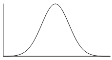
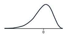
The normal distribution is the most common example of symmetrical data. The normal distribution looks like this:
The picture below shows how the normal distribution occurs on a histogram. The dark line shows the nice, symmetrical pattern in the histogram.

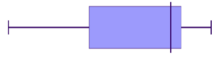
We can also have a symmetrical distribution on a box plot.
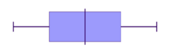
Below, the '0' point right in the middle of the distribution represents the mean, the median and the mode- all these measures of central tendency are equal. If we use that '0' line as our axis of symmetry, do you notice how the left hand side is a perfect reflection of the right hand side? That means it's symmetrical.

If your data is asymmetrical (ie. it isn't symmetrical), it may be described as skewed.
Skew
Positive skew
A positive skew means that the majority of the scores are low and the long tail is on the positive side of the peak of the graph. We can also say that the data is skewed to the right as the tail is on the right. This means the mean is greater than the median, which is greater than the mode.
MODE < MEDIAN < MEAN
A positively skewed graph looks something like this.
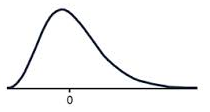
Notice how most of the scores are in the lower half of the graph?
The tail to the right, pulls the mean up, this is the positive skew.
Negative Skew
A negative skew means that the majority of the scores are high and the long tail is on the negative side of the peak. We can also say that the data is skewed to the left as the tail is on the left. This means the mode is greater than the median, which is greater than the mean.
MEAN < MEDIAN < MODE
A negatively skewed graph looks something like this.
Notice how most of the scores are in the higher half of the graph?
The tail to the left, pulls the mean down, this is the negative skew.
Clustering
A cluster is a number of similar things collected together. Similarly, in data displays, if lots of the scores in a data set are grouped together within a very small range, we also call this clustering.
Outliers
The shape of a data also shows us whether there are any outliers or unusually high or low scores in our data set.
For example, in the dot plot below, do you see how all the scores range between $12$12 and $14$14 except one? This means that $24$24 is an outlier.

In this case the data is very obviously way outside the range of the rest of the data set.
More formally we define that a score is an outlier if it is $1.5\times$1.5× IQR above the upper quartile $\left(Q_3+1.5\times IQR\right)$(Q3+1.5×IQR), or $1.5\times$1.5× IQR below the lower quartile $\left(Q_1-1.5\times IQR\right)$(Q1−1.5×IQR).
Practice questions
Question 1
State whether the scores in each histogram are positively skewed, negatively skewed or symmetrical (approximately).
A histogram that represents the distribution of scores. The x-axis enumerates discrete scores as individual points, while the y-axis corresponds to the frequency of each score interval. Each bar on the histogram corresponds to one of these distinct scores, with the bar's height reflecting the count or frequency of occurrences for that particular score. Most of the scores are relatively high. Positively skewed
ASymmetrical
BNegatively skewed
CA histogram that represents the distribution of scores. The x-axis enumerates discrete scores as individual points, while the y-axis corresponds to the frequency of each score interval. Each bar on the histogram corresponds to one of these distinct scores, with the bar's height reflecting the count or frequency of occurrences for that particular score. Approximately, as the score goes higher, the frequency goes lower. Positively skewed
ANegatively skewed
BSymmetrical
CA histogram that represents the distribution of scores. The x-axis enumerates discrete scores as individual points, while the y-axis corresponds to the frequency of each score interval. Each bar on the histogram corresponds to one of these distinct scores, with the bar's height reflecting the count or frequency of occurrences for that particular score. The scores have its peak approximately in the middle. Negatively skewed
ASymmetrical
BPositively skewed
C
Using the distribution
In order to get the full story about a data set, we need more than just the summary statistics to describe it. We should also use the distribution or shape of the data to summarize it. Also, the distribution can help us choose which statistics best represent the data set.
Summary statistics include both measures of center and measures of spread.
- 5-Number summary (minimum, lower quartile, median, upper quartile, maximum)
- Mean $\left(\overline{x}\right)$(x)
- Sum$\left(\Sigma x\right)$(Σx)
- Interquartile range (IQR)
- Standard deviation $\left(s_x\right)$(sx)
In measures of center, we looked at how the presence of outliers influences helps to determine the best measure of center to use. Similarly, the distribution will help us to decide on the best summary statistics to use.
Remember our dot plot from earlier with the outlier,
The mean is 14.1, the median is 13 and the mode is 13. The outlier of 24 really pulls up the mean to a value which does not really make sense based on the graph. Nearly all the values are between 12 and 14, so the measure of center should be within those values.
Similarly, the standard deviation is 4.8, which is quite high considering most of the values are quite close together. The interquartile range is 1, which makes more sense based on the distribution.
To summarize, the best choice of summary statistics is presented in the table below.
| Distribution | Symmetrical, no outliers | Skewed or with outliers |
|---|---|---|
| Measure of center | Mean | Median |
| Measure of spread | Standard deviation | Interquartile range |
Practice questions
Question 2
Consider the graph shown. Which measure(s) of center would best represent this data set?
All the measures of center will be the same.
AOnly the mean
BOnly the mean and the median
COnly the median and the mode
D
Question 3
Carl has been recording his spelling test scores for the past semester. His scores were $14,16,2,15,15,16,15$14,16,2,15,15,16,15.
Calculate the median of Carl's scores.
Calculate the mean of Carl's scores.
Round your answer to two decimal places if necessary.
Which measure of center more accurately describes the center of this data set?
The median
AThe mean
B
Connecting box plots and histograms
When we looked at histograms and box plots, we highlighted that histograms are ideal if you want to show the frequency of the data, while box plots are preferred if you want to show the spread of the data. In some scenarios, we may want to use both a box plot and a histogram to be able to see the full picture.
Histograms clearly show the frequency and distribution of the data. They are especially helpful to represent continuous data.
Box plots clearly show the spread and explicitly show outliers. They can be used for any numerical data.
Practice questions
Question 4
Match the column graph shown here to the correct box plot.
- 102030405060708090A102030405060708090B102030405060708090C102030405060708090D
Question 5
Consider the following pairs of histograms and box plots:
Which two of these histograms and box plots are correctly paired?

 A
A
 B
B C
C D
DIn part (a) we determined that the following histogram/box plot were an incorrect match:
Which two of the options correctly describe why?
The box plot has a long tail to the right which indicates positive skew, while the histogram does not appear to be skewed.
AThe data on the histogram is widely spread, while the box plot indicates that the data is mostly located around the median.
BThe median for the histogram is roughly in the middle, while the median of the box plot is located further to the left.
C