9.02 Scatterplots
How scattered is your data?
When trying to determine if there is a relationship between two variables, we will collect data for various values of two different variables. Often as we are collecting this data, we think that one of the variables might depend on the other. For example, if one variable we collected data on was the number of hours of sleep that students got on the night before an exam and the other variable we collected data on was the exam grades for those students, we might expect that the variable exam grades might depend on the variable hours of sleep. If this sounds familiar it is because we already discussed independent and dependent variables. A scatter plot is a statistical display that is often used to determine whether the expected relationship exists between the two variables.
The first step in determining the presence and type of relationship is to plot the data on a scatter plot. The independent variable will go on the horizontal ($x$x) axis and the dependent variable will go on the vertical ($y$y) axis.
Once we have a scatter plot, we can start to perform analysis such as determining correlation.
Correlations
A correlation is a way of expressing a relationship between two variables and, more specifically, how strongly pairs of data are related. We describe the correlation from data using language like positive correlation, negative correlation or no correlation. We can even further strengthen the language by using the words strong or weak to describe the correlation.
Just because two variables have a correlation, even to a very strong one, does not mean that one causes the other. For example, there is a strong of correlation between choosing to drink soda and being overweight. However, it doesn't mean that everyone who drinks diet soda will become overweight!
Linear patterns and scatter plots
Linear patterns reveal whether or not two measurements are connected to each other. In other words, the presence of a linear pattern signals that the two sets of are correlated. One way of understanding these relationships is by plotting ordered pairs onto a scatter plot. This makes it easier to recognize patterns in the data, especially whether or not these patterns appear to be linear.
This linear relationship can be seen through close and consistent grouping in a scatter plot. The more closely the dots resemble a straight line, the stronger the correlation between the variables.
A positive correlation is when the data appears to gather in a positive relationship, similar to a straight line with a positive slope.
In other words, as one variable increases, the other variables also increases or as one variable decreases the other decreases as well. So basically, the variables change in the same direction.
There are three types of positive correlation:
- Perfect positive correlation, where the data points line up exactly on a straight line with a positive slope.
- Strong positive correlation, where the data points are closely clustered and resemble a straight line with a positive slope.
- Weak positive correlation, where the relationship is still positive but does not resemble a line much at all.
For example, the scatter plot below shows a strong positive correlation between a person's height and arm span. You can see that as the first variable increases, the second increases too.
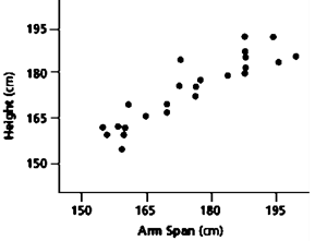
Linear Scatter
http://www.learner.org/courses/learningmath/data/session7/part_c/using.html
Below are some examples of different types of positive correlations.
 |
 |
 |
A negative correlation is when the data appears to gather in a negative relationship. Similar to a straight line with a negative slope.
In other words, as one variable increases, the other one decreases.
Like positive correlation, there are three types of negative correlation:
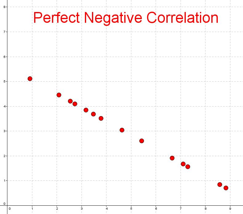
- Perfect negative correlation, where the data points line up exactly on a straight line with a negative slope.
- Strong negative correlation, where the data points are closely clustered and resemble a straight line with a negative slope.
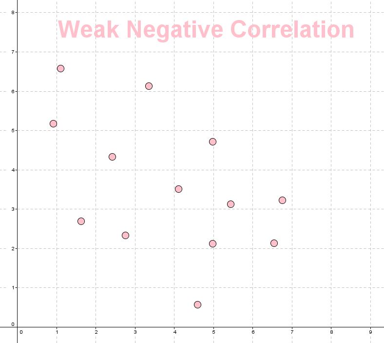
- Weak negative correlation, where the relationship is still negative but does not resemble a line much at all.
The next scatter plot shows a strong negative correlation. You can see that as the first variable increases, the second variable decreases.
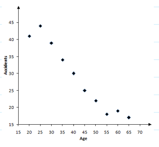
Below are some examples of different types of negative correlations.
 |
 |
 |
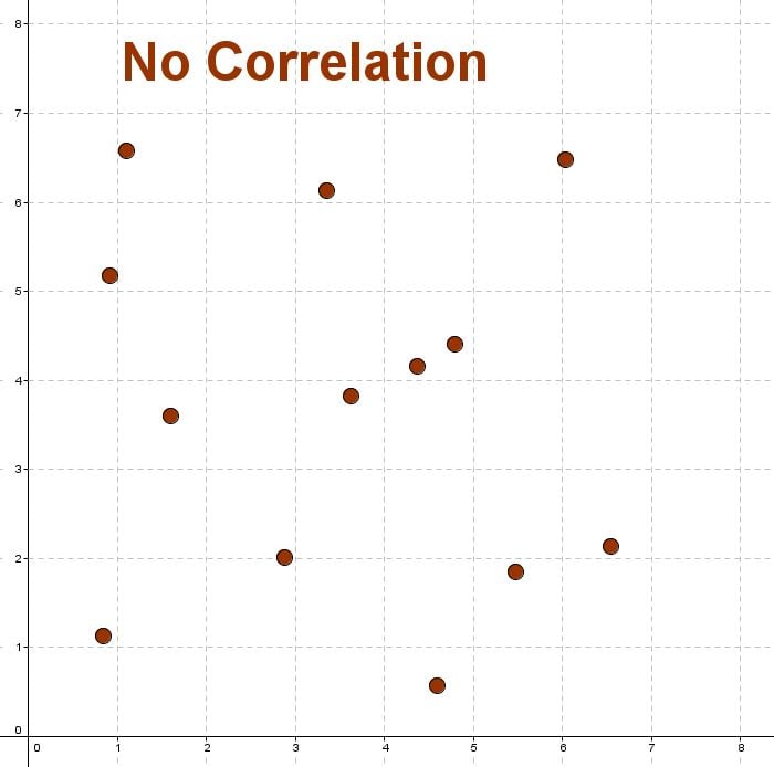
When there is no relationship between the variables we say they have no correlation.
This means that there is a random or nonlinear relationship between the two sets of data.
Below is an example of no correlation
Worked examples
Question 1
Identify the type of correlation in the following scatter plot.

Think: If we drew a straight line through the points, what value would be close to the slope?
Do: The correlation has a slope close to $1$1, so this is a strong positive correlation.
Question 2
Consider the two variables: eye color and IQ. Do you think there is a relationship between them?
Think: Do you think a person's eye color has anything to do with their IQ?
Do: No, there is no relationship between them. A person's eye color does not affect their IQ in any way.
Let's try a few practice questions.
Practice questions
Question 3
The following table shows the number of traffic accidents associated with a sample of drivers of different age groups.
| Age | Accidents |
|---|---|
| $20$20 | $41$41 |
| $25$25 | $44$44 |
| $30$30 | $39$39 |
| $35$35 | $34$34 |
| $40$40 | $30$30 |
| $45$45 | $25$25 |
| $50$50 | $22$22 |
| $55$55 | $18$18 |
| $60$60 | $19$19 |
| $65$65 | $17$17 |
Which of the following scatter plots correctly represents the above data?
 A
A B
B C
CIs the correlation between a person's age and the number of accidents they are involved in positive or negative?
Positive
ANegative
BIs the correlation between a person's age and the number of accidents they are involved in strong or weak?
Strong
AWeak
BWhich age group's data represent an outlier?
30-year-olds
ANone of them
B65-year-olds
C20-year-olds
D
Question 4
Consider the table of values that show four excerpts from a database comparing the income per capita of a country and the child mortality rate of the country. If a scatter plot was created from the entire database, what relationship would you expect it to have?
| Income per capita | Child Mortality rate |
|---|---|
| $1465$1465 | $67$67 |
| $11428$11428 | $16$16 |
| $2621$2621 | $35$35 |
| $32468$32468 | $9$9 |
Strongly positive
ANo relationship
BStrongly negative
C