Data is important. More and more, big decisions are being made based on data, from doctors using genetic analysis to give people the right medicine for them to Facebook deciding what to show on your news feed. Indeed, the notion of making decisions based on huge data-sets, called "Big Data", is one of the defining technologies of the 21st century.
But there's no point in collecting all this data if you don't have a good way of looking at it. The way in which you present data can make all the difference in actually allowing people to draw conclusions from it.
Let's get you started on the basics of data visualisation, starting with the basics: what graph to use for what kind of data.
What do you want to show?
Your choice of graph should reflect what you want to show. The 5 main motives for creating a graph are to:
- Highlight - when you want to bring focus to a single important fact or statistic
- Contrast - when you want to compare across categories or show the break down of a data set
- Change - when you want to show variation in data over time or location
- Organise - when you want to show rankings, procedural relationships, classifications, links between categories
- Connections - when you want to examine data for possible relationships
When you have a clear goal gather data to suit the goal and select a graph that is appropriate for the data and achieves your goal. Don't forget to avoid the traps of creating a misleading graph.
Let's look at a selection of graphs suitable for each purpose.
Highlight
When you want to highlight a single idea or statistic then call-out bubbles, pictographs, icon charts, simple pie or doughnut charts are a good choice.
 |
 |
|
| Pictograph | Icon chart | Doughnut chart |
A doughnut chart is similar to a pie chart with some arguing it may be easier to visually compare the lengths of the arcs than areas or sectors. It also gives area in the middle which can be used to display important information.
Contrast
When you want to compare values across categories or the composition of a data set then graphs such as column graphs, bar charts, pie charts, doughnut charts, simple bubble charts, stacked bar graphs and treemaps are some common graphs used.
 |
 |
 |
 |
| Paired column graph | Pie chart | Stacked bar chart | Simple bubble chart |
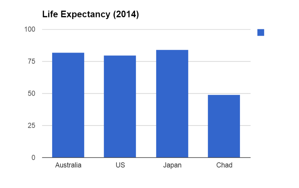
If you want to compare values or frequencies across a few categories, a column graph is a good first choice. It is simple to understand, and gives a good visual sense of how different things are. Here is an example:

The reason that column graphs like this are so easy to understand is that you can easily compare the sizes between the columns. Here we can see that the difference between Australia, the US and Japan is really quite minor compared with the huge difference with the world's lowest life expectancy in Chad.
Often when textbooks introduce graphs, they describe bar graphs as a horizontal version of a column graph. So then, why do we need them? Why can't we just use column graphs?
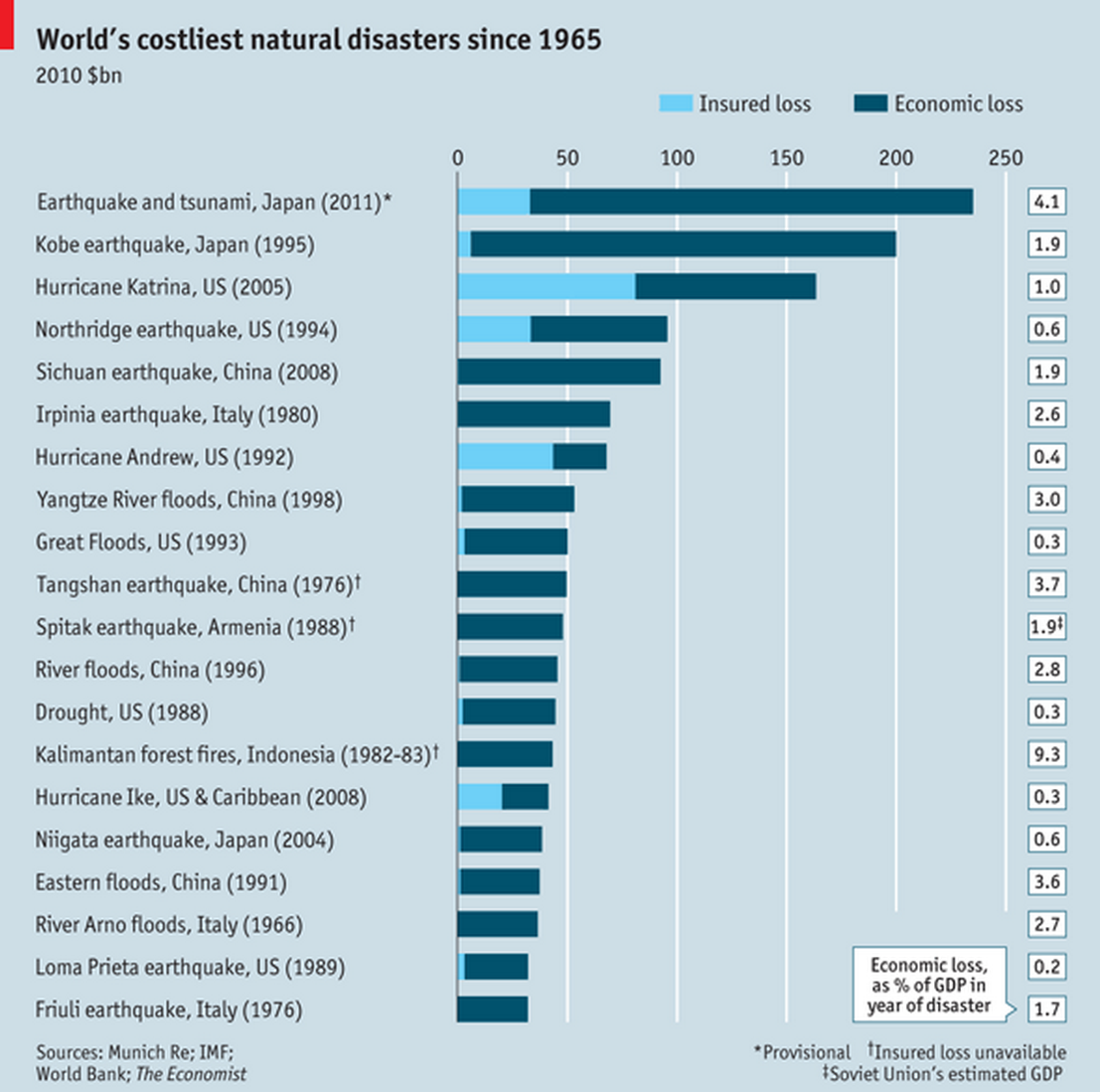
The answer is that bar graphs have a definite advantage when the category names are very long, or when there are lots of them:

As you can see, the names would be too long for a column graph, and a column graph with this many columns would be confusing. This graph is from The Economist's daily chart, which contains many examples of well-crafted graphs for the enjoyment of graph connoisseurs.
Pie charts, segmented bar graphs and doughnut graphs are used to show the proportional break down of data. These are only appropriate when you comparing separate parts that make up 100\% of the data set. To make these charts easy to read and understand it is good practice to order the segments from greatest to least and limit the chart to at most of 7 categories.

This set of pie charts, for example, makes its point about the relative frequency of climate change denial amongst scientists and members of the public very succinctly. Even with a lot of exact figures and long category names, this graph does not come out as overwhelming, as it might if we tried to do the same thing with a paired column graph.
Change
To display change in data over time popular graphs are line graphs and area graphs.
To show change in a variable across locations we can use map charts (choropleth map).
 |
 |
 |
| Line graph | Area chart | Choropleth map |
Column graphs are not recommended to show change over time, particularly when there are a large number of data points or small changes. As you can see in the column graph below, the graph format is not well suited to showing such a large number of columns and as we are interested in the change from year to year this would be more easily seen by connecting the top of the columns with lines. To show the trend clearly the graph has also been truncated which is misleading to a viewer comparing the size of the columns.

A line graph such as the one below, allows us to clearly see the data, trends and we can graph and compare several series of data at once.

Organise
Tables, lists, flowcharts, Venn diagrams and mind maps are popular ways to summarise and organise data to show how the data can be grouped or interrelated.
 |
 |
 |
|
Venn Diagram Showing groupings of the data. |
Mind map Showing how concepts within a topic are related. |
Flowchart Showing steps in a process or hierarchy. |
Connections
Often we wish to further analyse data to find relationships between different variables or distributions of a variable. Scatterplots are commonly used to identify the relationship between two variables and histograms are useful for displaying the distribution of a continuous variable.
 |
 |
| Scatterplot | Histogram |
Part 1
What would be the best choice of graph for:
- Comparing the GDP of China and the US for two different years?
- Showing how the number of internet users has changed over time?
- Showing the percentage of people who would vote for different political candidates?
- Showing the percentage of people who play different sports?
Part 2
Visual essays and articles rich with graphics are popular to engage readers. Find some articles on a topic that interests you that contains statistics and information presented in graphs.
Here are a few suggested articles with strong use of data visualisation:
The Pudding is a site that offers visual essay on a range of topics including: dialogue in movies broken down by age and gender, vocabulary of rappers, statistics of captive whales and dolphins.
The ABC's Story Lab also strives to create articles with interactive graphics on topics including: homelessness in Australia, what information collected from phones tells you about someone and comparison of income in Australia.
Analyse the graphs and statistics shown in your chosen articles and answer the following questions:
- What information was the graph trying to convey?
- What do you is the motivation for creating the graph? (Highlight, contrast, change, organise, connections)
- Was the type of graph chosen the best choice for the data? Why or why not? If not, what graph would have been a better choice?
- Where the graphs easy or challenging to read and interpret? What elements affected this?
- Did the article use a range of graphs? Did you find the information engaging in this format?
- Did the information in the graphs lead you to certain conclusions?
- Did you see some unfamiliar graphs?
Furthering skills in data visualisation
Alright, so now you've got the basics down. You know when to use column graphs, bar graphs, line graphs and pie charts to succinctly make a point using data. But a true graph wizard can do more than that: they can take huge amounts of data, which would normally be incomprehensible to human beings, and make them understandable. As "big data" becomes even "bigger", the need for people with the skill to present huge data-sets in a comprehensible way is growing. The art of "data visualisation" takes years to master, and you can even do a university degree in it, let's look into some of the more advanced types of graphs which such wizards may use.
The Ted talk by Han's Rosling on the topic of global health is a fantastic example of bringing statistics to life to tell a story. He has also presented a documentary for the BBC called the Joy of Stats, this has highlights for data visualisation on crime statistics (from 6:20 - 11:30) and effective use of graphs (from 24:00 - 33:00).
Watch the presentations linked above to grasp the ability and importance of using data visualisation and statistics to tell a story.
With the amount of information collected on us every day, big data is now big money. Understanding how to visualise large data sets and solve problems is a fast growing field of employment and there are also open problems with large cash prizes. Use the following link to investigate the wide range of data and fields offering challenging problems.
Part 3 - Bubble charts
Generally speaking, it is only possible to show two independent variables in one graph, because graphs and charts we have shown are two dimensional. If we want to show more variables we can show multiple graphs on the one axis such as a paired column graph or a combination column and line graph but these quickly become unreadable if we have many data points. We could also display three variables using a three-dimensional graph simulated on a computer but these are not easily included in an article or report.
However, we can sidestep this difficulty by using bubble charts, which use not only the position of the dots, but also their size and colour to successfully convey four independent variables.
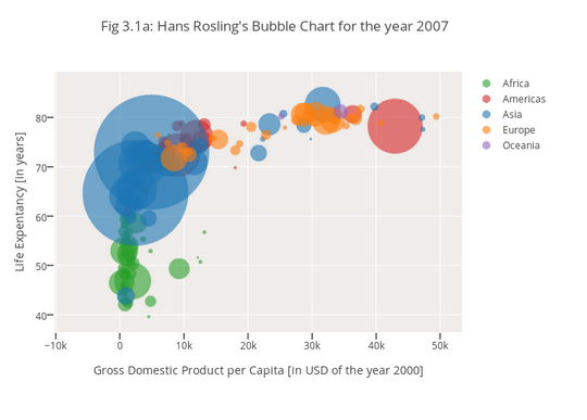
Have a look at this chart, taken from Hans Rosling's presentation on life expectancy:

Source: https://plot.ly/python/bubble-charts-tutorial/
Here the horizontal-axis shows GDP, the vertical-axis shows life expectancy, the size shows population, and the colour shows which region of the world the country is in.
Hans Rosling's presentation goes one step further than this, adding motion to the graph as well, displaying changes over time, bringing the total to five independent variables. This gives a powerful way to use data to tell a story.
Watch the presentation and experiment with the data yourself here. Try changing the variables on the horizontal and vertical axis to investigate the relationship between the following:
- Income vs. life expectancy
- Income vs. \text{CO$_2$} emissions
- Literacy rate vs. babies/woman
- Explore some other combinations
With great power comes great responsibility
Now that you have your new powers to use data to make a point, you must use them for good, not evil. Graphs are powerful visual tools which convince people that "the facts" support what you are saying, and can easily be used to mislead people. Make sure you use your graph-creating powers to help show people what the data actually says, rather than what you would like it to say!