
Misleading Viewers
Claims not supported by statistics
Sometimes claims are made without any support by available statistical information. Most likely they were made because the authors did not bother checking them against the publicly available statistics. For example, the Economist magazine stated: “Back in Vietnam days, the anti-war movement spread from the intelligentsia into the rest of the population, eventually paralyzing the country’s will to fight.” But the results of a poll conducted by Gallup in 1971 contradict this claim. The table below shows that the less educated people were more in favour of withdrawing the US troops than the more educated. This example illustrates the importance of gathering statistics to support claims.
| Grade school education | High school education | College education | All adults | |
| % for withdrawal of US troops | 80% | 75% | 60% | 73% |
| % against withdrawal of US troops | 20% | 25% | 40% | 27% |
| Total | 100% | 100% | 100% | 100% |
Comparing apples with oranges
Source: http://www.econoclass.com/misleadingstats.html
Claims can be misleading if they are based on comparisons of raw numbers when adjustments are required to make the comparisons meaningful. For example, the gross domestic product metric is often used as a measure of a country’s wealth and hence the well-being of its people. According to this measure, Russia has a higher GDP than Luxembourg, but it also has many more people. So for a more meaningful comparison, we should compare countries by GDP per person. According to GDP per person, Luxembourg is ranked much higher than Russia, reflecting the fact that the average person in Luxembourg is much wealthier than the average person in Russia.
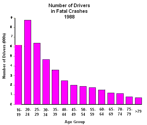
For a specific example of how making comparisons based on just raw numbers is misleading, consider the graph to the right. It seems to suggest that teenage drivers are safer drivers than those in the 20-24 age group and that elderly drivers are the safest. But such a conclusion would be wrong because teenagers and the elderly drive much less than people of other ages.

Source: http://www.econoclass.com/misleadingstats.html
The graph to the left shows a more reasonable comparison with the raw crash numbers being adjusted for the frequency of driving. It shows a result that is the complete opposite of that of the first graph. Teenage drivers are in fact extremely unsafe drivers, as are the elderly.
Misleading graphs

Source: Time Magazine
Sometimes reports of studies can be misleading not only as a result data being flawed, but also through the way the data are presented. Most often this involves the use of misleading graphs. One of the simplest examples is that of a pie chart in which the slices are not proportional to the quantity they represent. Consider the pie chart to the right, for instance, which shows the number of nuclear weapons owned by country. From the numbers on the chart it’s clear that the US has the largest nuclear stockpile out of any country; much larger than its closest rival Russia. But if only the size of the slices is considered, it appears that Russia has a larger stockpile than the US.
Graphs with nonzero axes

Graphs can also be misleading if large sections are cropped off and one of the axes starts at a number greater than zero. For example, the graph to the left shows the results of a poll in the US that asked people whether they agreed or disagreed with a court’s decision to remove the life support of Terri Schiavo, a woman in a vegetative state. Here the bottom sections of the bars have been cropped and the axis begins at 53 rather than 0. This has created the impression that there is a lot of support for the court’s decision among Democrats, but very little support among Republicans and Independents. Yet the difference between the levels of support between Democrats and Republicans / Independents is only 62% - 54% = 8%.

The figure to the right shows how the original graph would have appeared had the vertical axis started at zero. Here you can see that the difference in the support for the court’s decision between Democrats, Republicans and Independents is actually quite small.
Graphs not drawn to scale

Source: http://blog.1000memories.com/
75-number-of-people-who-have-ever-lived
Another way in which graphs can be misleading is if they are not drawn to scale. Typically this will involve nonlinear scales. For example, the graph to the right shows the population of the world over time. Since the bar representing 300 million is about half the length of the bar representing 1 billion, the graph is obviously not drawn to scale. Also, the bar representing 10,000 shouldn’t even be visible on a linear scale that reaches 7 billion, since the bar representing 7 billion should be 70,000 times the length of the bar representing 10,000.

Source: www.forbes.com
The figure to the left shows the above graph lined up with how it would have looked had it been drawn to scale. By not drawing the graph to scale, the author has made the population in the earlier years of the world appear much larger than they really were.
Misleading pictograms

Source: Omaha World Herald
To make graphs look more interesting, many authors have resorted to making pictograms. Consider the pictogram to the right that compares the proportion of Nebraskans in jail, on parole, on probation or in juvenile detention in 1982 and 2007. In this case, thumbprints have been used to represent the numbers. However, like a bar graph, only the height (and not the area) of the thumbprint matters in this graph. Since the number in 2007, 2.27%, is almost double the number in 1982, 1.15%, the height of the thumbprint on the right has been made to be twice the height of the thumbprint on the left. But the width of the thumbprint on the right has also been made twice that of the thumbprint on the left. The area of the figure on the right is therefore four times the area of the figure on the left. So if someone were to look only at the area of the thumbprints, they would mistakenly think that the proportion of Nebraskans under correctional control in 2007 was four times the proportion in 1982.
Discussion
- The statistics appear to show that United Airlines, American Airlines and Delta Airlines offer the worst service to customers, while Alaska Airlines, Southwest Airlines and Continental Airlines offer the best. What would be misleading with this conclusion?

- Find a claim in a newspaper or magazine article that is misleading and not supported by statistical data. Collect the relevant statistics to support your belief.
- Read the article on http://www.heraldsun.com.au/news/boys-missing-a-life-lesson-from-male-teachers/story-e6frf7jo-1225830246785 and answer the following questions.
- What are the statistics in the article that support the author’s overall claim?
- How does the graph attached to the article support the author’s claim?

- Redraw the above graph on the figure below.

- What is the difference between the two graphs?
- What do you think was the reason behind the inclusion of the nonzero scale in the original graph?
- What are some other possible explanations for the rising youth violence?
- The line graph shows the improvement in the scores of Year 4 students in the mathematics component of a national exam in the US from 1990-2000.

Source: Brookings Institution report on American education
- What is non-standard about the vertical axis and what was the intended effect of this?
- What is non-standard about the horizontal axis?
- What effect did this have on the steepness of the black lines?
- What misleading message is being sent about the increase in the scores over the time periods?
- Redraw the graph so that it is not misleading.
- Refer to the following "graph".

- What is wrong with this graph?
- What changes should be made to make it more informative?
- The figure shows the number of tourists from each country to the US for the top 20 countries.

Source: http://jacklucky.posterous.com/top-20-countries-generating-visitors-to-the-u#
- Do the lengths of the sections for each country correspond to the numbers they represent? If not, what do you think the lengths of the sections correspond to, if anything?
- Are the positions of the sections in any particular order?
- Do you think there has been any benefit to making the graph this particular way (i.e. in the form of a snake)?
- What changes would you make to the graph to make it more informative?