
Misleading graphs
Given how often graphs are used by people to support their claims, it is important to be aware of the ways that graphs can be misleading or downright wrong.
Circle Graphs

One of the simplest examples of an incorrect graph is a pie chart in which the percentages don’t add up to 100%. Consider, for example, the chart to the right which supposedly shows the distribution of voters in the US supporting each candidate. It shows that Palin has 70% of support, Huckabee has 63% of support and Romney has 60%. But 70% + 63% + 60% = 193%, not 100%. Obviously, this pie chart can’t be right. (In case you were wondering how this mistake came about, the poll didn’t actually ask people for the candidate they supported, but instead asked them whether they had a favourable or unfavourable opinion of each of the candidates.)
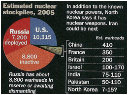
Not only should the percentages in a pie chart add up to 100%, but the slices in a pie chart should be proportional to the numbers they represent. For example, if a slice is to represent 50% of the population, then it must be half the size of the entire pie. If not, then the graph becomes misleading. Consider the following pie chart to the left, for instance, which shows the number of nuclear weapons owned by country.
If you look at the numbers on the chart it’s clear that the US (with 10,315) has by far the largest nuclear stockpile out of any country; much larger than its closest rival Russia (which has 7,200 deployed). But if you look only at the size of the slices, it appears that Russia (represented by the red slice) has a larger stockpile than the US (represented by the blue size). There wouldn’t have been this problem if the slices had been proportional to the numbers they represented.
Discussion
Consider the following pie chart (or pizza chart if you like) that appeared on the cover of an Italian magazine. Trust me, you don’t have to know Italian to understand what is wrong with it.

- What do the percentages in the pie chart add up to?
- Is this possible for a pie chart?
- Also, are the slices proportional to the data they represent?