
Tabulate and Graph Data (Investigation)
When you're trying to figure out what is going on in the world, having data about the thing that you're interested in helps. However, the problem is that data is often really boring. That's why it's better to display data in graphs, so that data is shown in a way which is both visually engaging and much easier to understand. In this exercise, we're going to show you how to make graphs of your own, to turn data from a boring bunch of numbers into a colourful graph.
Will China become the world's most powerful nation?
Let's see if we can answer this by comparing the economic power of the US, China, and Australia. Specifically, we'll try to use Gross Domestic Product, or GDP for short, (which measures the size of an economy) for these three countries as a measurement of economic power. This is what it looks like, as of 2015:
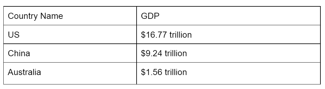
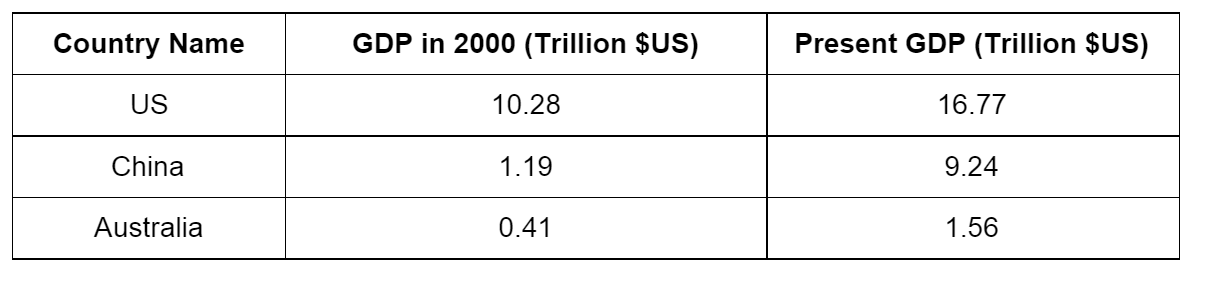
US current GDP - \$16.77 trillion
China current GDP - \$9.24 trillion
Australia current GDP - \$1.56 trillion
In this exercise, we'll use these figures for the example graph. However, when you make your own, you should get the latest figures. It's not that hard to find, just do a quick search!
As of 2015, the case looks pretty clear. Out of the three countries that we've picked, the US is No. 1, China is No. 2, and Australia is No. 3. But just looking at the numbers makes it hard to get a feel about just how different the sizes of the economies are, and the best way to do this is to make a column graph.
In this tutorial, we'll be using Google Docs and Google Sheets to make our tables and graphs, since they are free and available to anyone. If you've got Microsoft Word and Excel on your computer, you can use this instead, as the instructions are fairly similar. First, log into Google Docs (or make an account if you don't have one), and create a new document.
Making a table
The first step to making a graph is making a table. A table is also good if you want to present the figures in writing, as no-one wants to read a block of text with numbers in it.
To make a table, we first need to decide what size of table we want. The first row should generally be used for the labels, and since we have three countries to compare, we will have three more rows for data, bringing the total to four rows. We will also have one column for each "variable", and in this case there are two types ("country name" and "GDP").
Go to your Google docs document and click "Table", "Insert Table", and then make the size "2x4", meaning "two columns by four rows". In the table that comes up, write in all of your data, so that it looks like this:
Now the data is all there, but it doesn't look very professional. We can tidy things up a bit by making a few formatting changes:
- Make the headings bold, so that they stand out
- Trim the empty space in the table by clicking and dragging the vertical lines that separate the columns
- Make all the text center aligned (different people may have different opinions about this one - what do you think looks best?)
- Put the units into the heading, so that you don't need them in the table
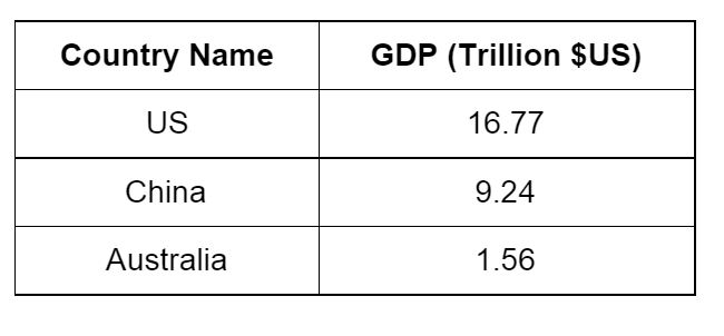
Now we have our table! Quite a bit easier to read than a block of text, but a graph would be better still...
Making a column graph
For this one, we're going to use Google Sheets, the spreadsheet partner of Google Docs.
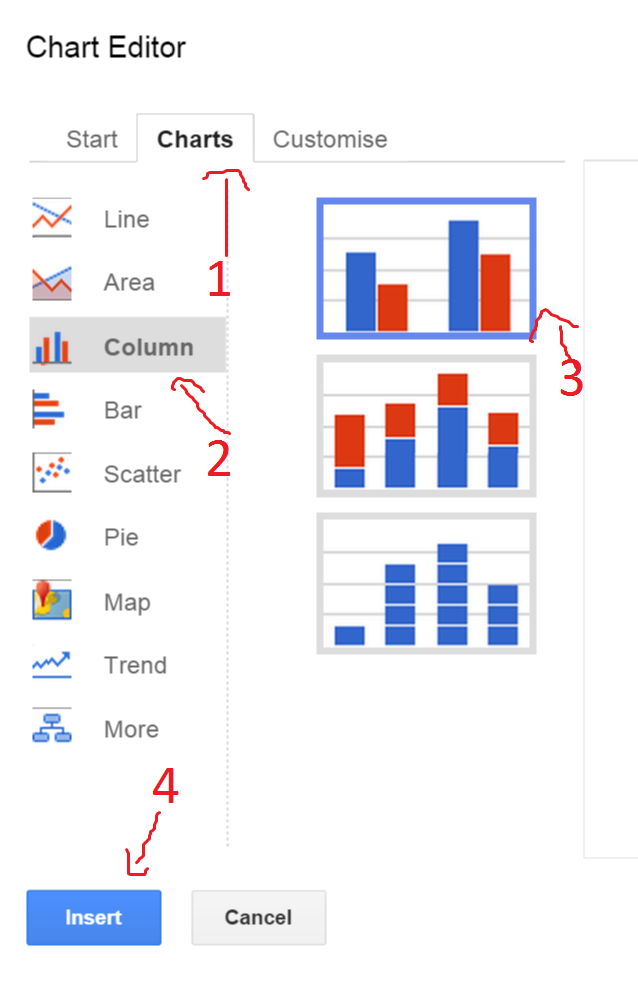
First, create a new spreadsheet and copy and paste the data in. Next, select all of the data and click "Insert",and then "Chart".
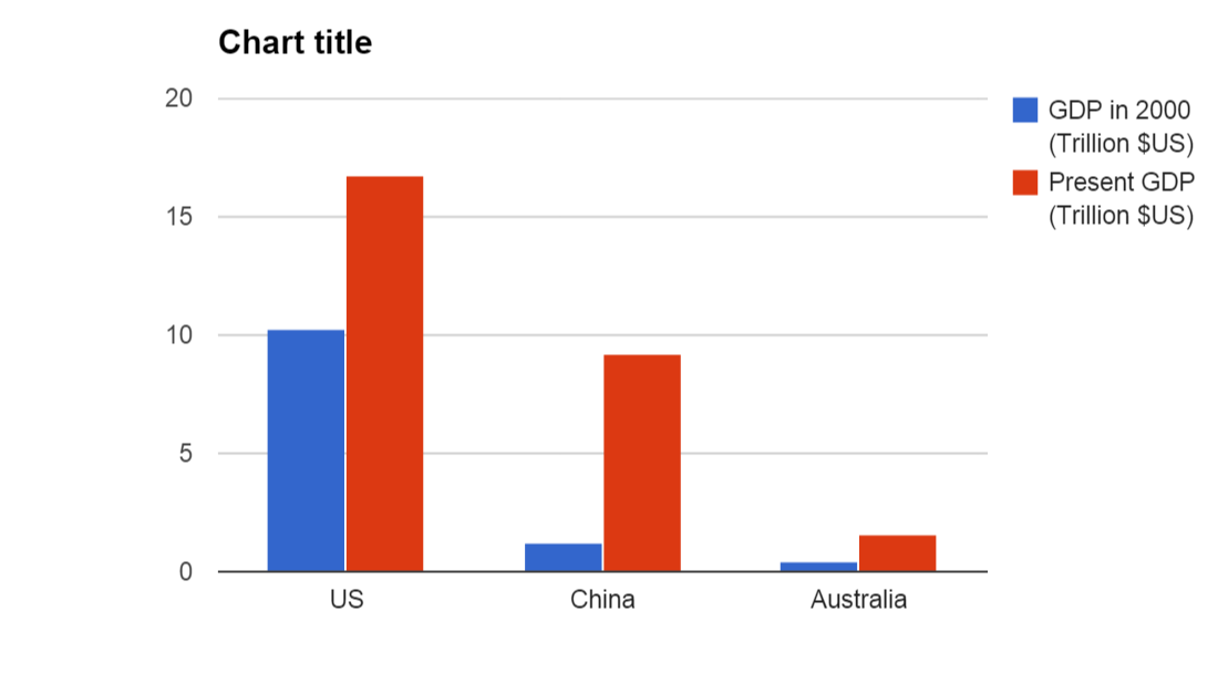
In the box which comes up next, click on the "Charts" tab and select "Column", then choose the topmost one. If all those word instructions were too complicated, here's a picture:
And your result should look something like this:
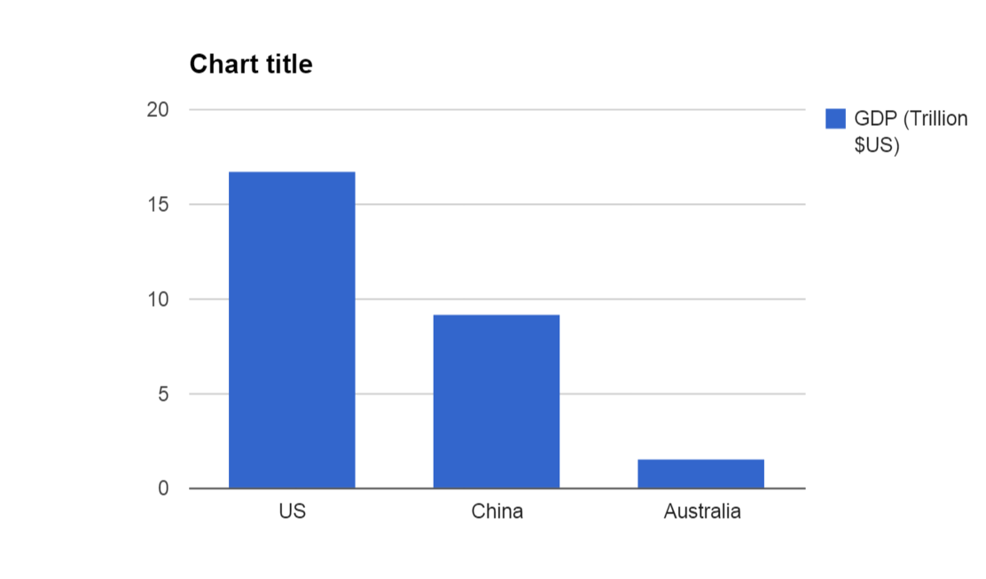
As you can see, the visual impact of this graph is much more than that of the table. The economy of the US is really big. And the economy of Australia is really small in comparison. And the economy of China is somewhere in the middle.
Making things more complicated - using two sets of data
We can now go one step further, and add in some more complicated data. Try looking for the GDP of each of these countries in 2000. Add that information into your table, by putting an extra column in the middle. To do this, click "Table", then "Insert column left". After you add the information, it should look like this:
Go back to your spreadsheet, delete everything, and copy and paste your new graph. Then, make a new graph of the same type as last time. This time, you'll find that the software has automatically made two different coloured columns, one for the year 2000 and one for the present year:
When you're done, give your graph an informative title, like "GDP, Year 2000 and Present". You should always give your graph a boring title that says exactly what data the graph is showing, so that people don't have to read the axis labels too much. Next, we should label the left axis, to indicate the units. To do this, right click on your graph, then click "Axis", then "Left axis title", and change it to "Trillion $US":
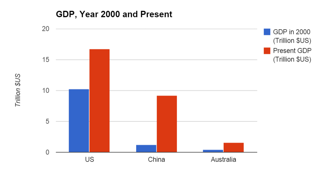
As you can see, your new graph says more than boring numbers ever could. You can see that within 15 years or so, China's GDP has increased from barely larger than Australia's to more than half of America's, whilst the US and Australia have not grown by anywhere near as much. So, at the moment, the US is the most economically powerful nation in the world, but as this graph shows, China may well overtake them sometime soon.
Now your turn: what about India?
We often hear of India as another upcoming economic superpower. See if you can add India's GDP from 2000 and the current GDP to your graph, and see what you think about it's size and speed of growth.
Will computers take over the world first?
Computers are becoming faster and faster every year. Some people worry that computers might become so fast that they could become superintelligent and take over the world, maybe even sometime soon. Could it be true? Let's make a graph to find out!
Making a table
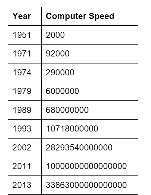
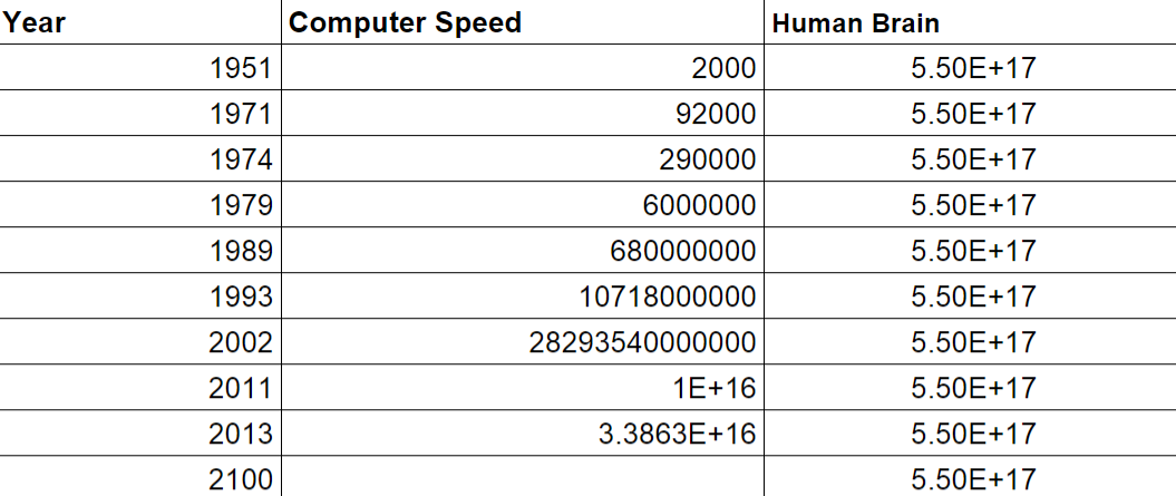
For this exercise, we're going to look at a fairly simple statistic - how many calculations can a computer do in one second? As it turns out, this number has increased a lot over the last few decades, as computers have got progressively more sophisticated. Here are a few examples of supercomputers over the decades. Usually, these numbers are abbreviated using FLOPS (which stands for Floating Point Operations Per Second).
UNIVAC I (1951) - 2000 calculations per second (usually abbreviated as 2 KiloFLOPS)
Intel 4004 (1971) - 92000 calculations per second
Intel 8080 (1974) - 290000 calculations per second
Intel 8035 (1979) - 6000000 calculations per second (usually abbreviated as 6 MegaFLOPS)
NEC SX-3 (1989) - 680000000 calculations per second
Fujitsu Numerical Wind Tunnel (1993) - 107180000000 calculations per second (usually abbreviated as 100 GigaFLOPS)
NEC Earth Simulator (2002) - 28293540000000 calculations per second (usually abbreviated as 28 TeraFLOPS)
Fujitsu K computer (2011) - 10000000000000000 calculations per second (usually abbreviated as 10 PetaFLOPS)
Tianhe-2 (2013) - 33863000000000000 calculations per second (usually abbreviated as 33 PetaFLOPS)
As of 2015, the Tianhe-2 is the world's fastest supercomputer, but don't forget to check if there is an even faster one now, and add this to your data if there is.
The problem is, those numbers are way too big to really mean anything. So what we need is a graph.
First we make a table, the same way that we did before. To keep things simple, let's leave out the computer names and just plot the year and the speed:

Once again, let's format the graph by making the labels bold, and getting rid of most of the empty space. We'll leave the text in left alignment for now, so that we can easily compare the size of the numbers:
Already, you can see that this is much easier to read and understand than the long list of numbers we went through earlier.
Making a line graph
Now, let's make a graph. First, copy the table into Google Sheets. Don't worry about some of the numbers having "E"s in them, "1E+16" is just E notation for "1 with 16 zeros after it". Next, select all the data and click "Insert" and "Chart", just like last time.
Now for an important bit: make sure you click "Use Column A as labels" on the next page:
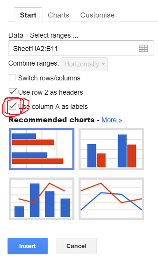
If you don't tick this box, the computer will think that 1951, 1971 etc. are numbers rather than years, and will unhelpfully try to make a graph of how they are getting bigger.
Next, click on the "Charts" tab again, and click "Line" and then the one up the top. The result should look like this:
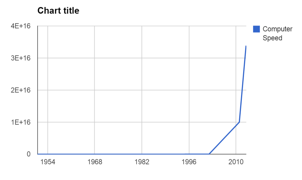
Well, this is...not really helpful. Basically, the vertical axis is in units of 1E+16 (1 with 16 zeros), which means that everything before the year 2000 looks pathetically tiny in comparison. So pathetic in fact, that they all look like zero.
This is a problem encountered in many scientific fields, and the answer is to use "logarithmic scaling". Rather than explain what that is, it'll be easier to just use it and see how it works! Right click on your graph and select "Advanced edit...". Now, scroll down a bit until you see the word "Axis". Now click on this box and select "Left Vertical":
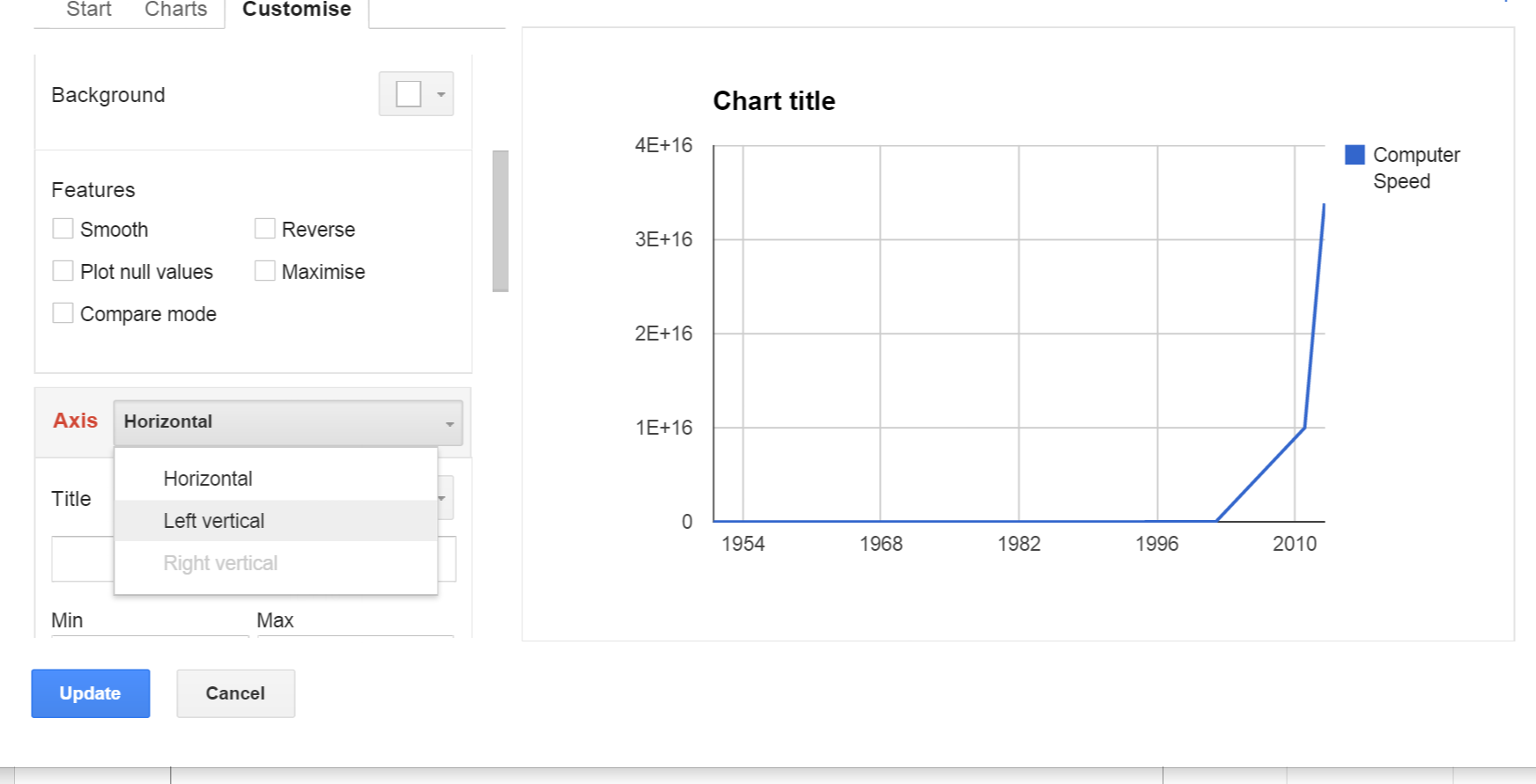
Scroll down a bit further now, until you get to "Scale". Next to it, you should see a little box which says "Log scale". Tick that box!
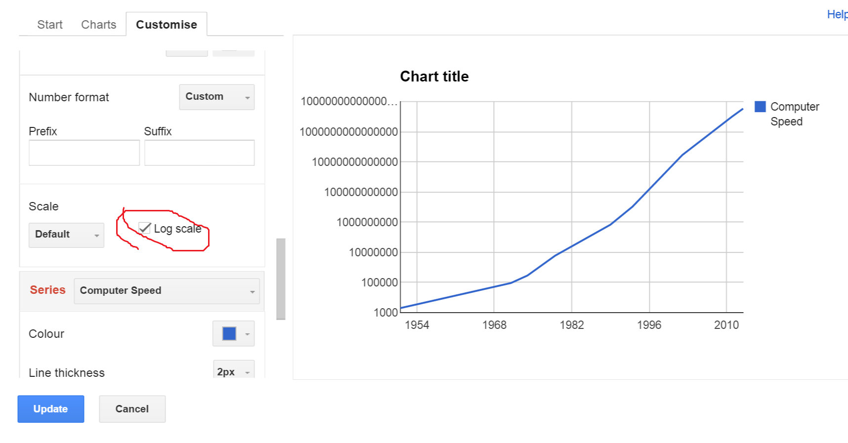
As you can see from the preview, the graph looks much better now. The left axis now scales in a more meaningful way, going up in multiples of ten each time rather than counting in units of 10 quadrillion.
The only problem is that the numbers at the top of the axis are so big that they are getting cut off. We can fix this, by changing the "Scaling" box next to the "Log scale" box you just ticked. Change it from "Default" to "1,000,000". This way, the axis counts in units of 1,000,000, rather than 1.
Finally, we need to add labels. Just like in the previous example, right click on the graph and select "Axis", and then select "Horizontal axis title". Name this one "Year". Do the same for "Left axis title", labelling it as "Millions of calculations per second". Also give your graph an informative title, like "Computer Speed Over Time". Now you have a perfect graph!
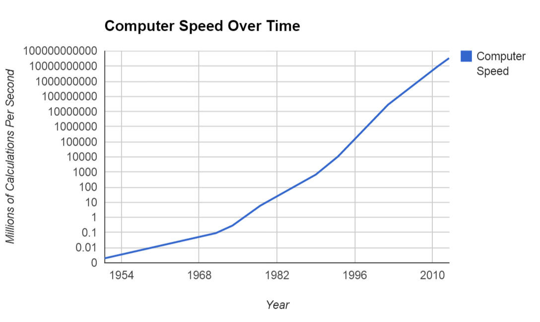
So, how does this graph help us figure out whether computers are about to take over the world? Well, it comes down to how smart computers are and how smart humans are.
Although you might not know it, your brain is in fact an extremely powerful supercomputer. You may not be able to multiply gigantic numbers in your head, but you can nonetheless do some very complicated things that require your brain to do very difficult calculations - things like walking in a straight line, or catching a ball.
When you do the calculations, it seems that a human brain is roughly equivalent to a 55 petaflop supercomputer. So, as of 2015, your brain is more powerful than the world's fastest supercomputer. But for how much longer? Well, here is a graph where this information has been added to show you:
If you want to learn how to make these kind of graphs, have a go at the extension exercise below!
Extension: predicting the date of the computer apocalypse
In the movie Terminator 2, the computer known as "Skynet" becomes super-intelligent at 2.14am on August 4th, 1997. Whilst this might have seemed plausible when the movie was released in 1991, we all know that there was nothing super-intelligent about computers in 1997. When the movie Terminator 3 was made in 2003, the date was changed to April 21st 2011. Once again, we know they were off by a long shot.
Why are movie producers so bad at predicting the date of the computer apocalypse? In this exercise, we're going to show how to come up with "scientific" predictions of when we can expect to see super-intelligent computers.
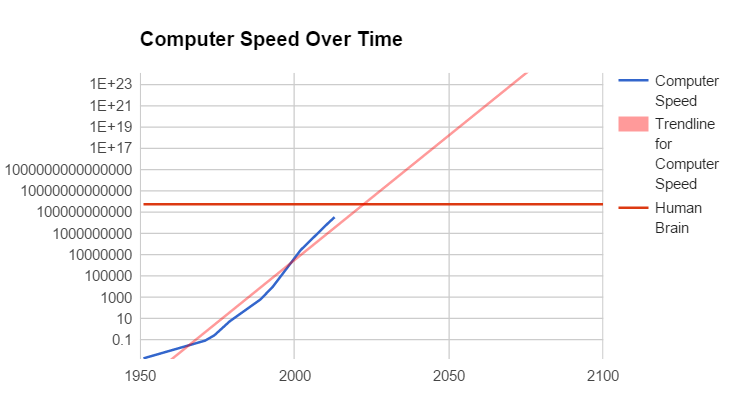
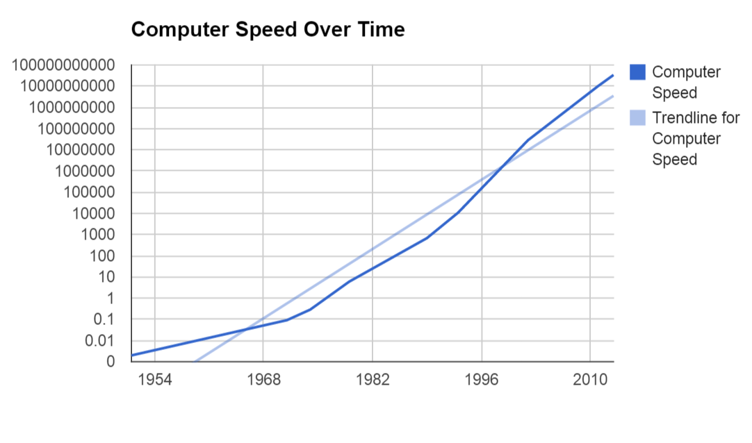
First, let's add a trend line to our graph, so we can clearly see the direction which computers are heading in. Right click on your graph, and go to "Advanced edit". Scroll down to the very bottom until you see the option called "Trend line". When you click it, you'll see a number of options. Basically, you have to figure out whether the trend is likely to be linear, exponential or fit to some polynomial (like a parabola). In this case, exponential seems like the best choice, so select "exponential".
Now you should have a nice trend line on your graph like this:
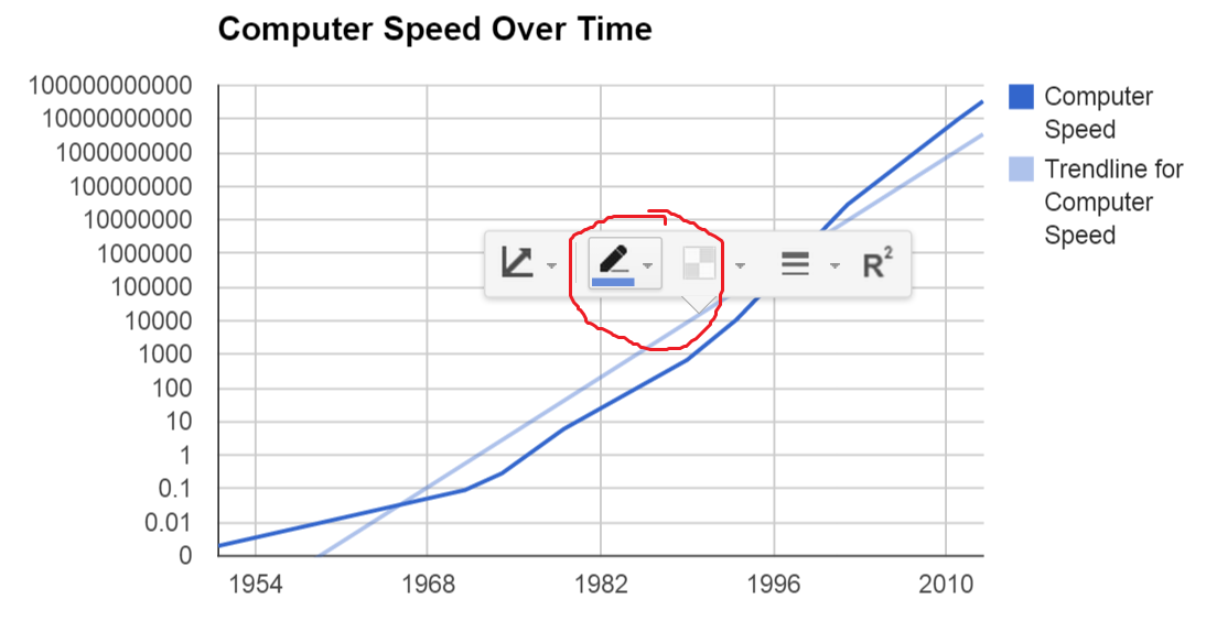
Pretty helpful! But it would be nice if that trend line was a different colour to the data. Let's change the colour by clicking on the trend line, and then using the little pen thingy that pops up to change the colour to red.
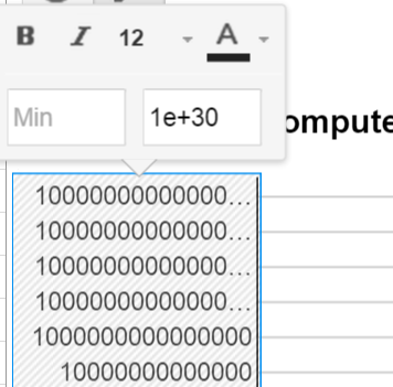
Now that we have that, let's make make the graph bigger so that we can extrapolate, by seeing where the line is heading over the next few decades. Click on the horizontal axis, and in the "Max" box, write 2100. This tells the graph that we want the horizontal axis to continue all the way to the year 2100. Now, for the left axis it's a bit tricky, because the numbers are so big its hard to write all the zeros. Instead, we'll use exponential notation, and set the maximum to "1E+30", which means "one with thirty zeros":
Next, we're going to add another column of data to represent the speed of the human brain, which you'll remember from before is around 55 petaflops (or 55 with 16 zeros). Rather than write in all those zeros, we'll just put this into exponential notation, which would be 5.5E+17 (5.5 with 17 zeros, same thing as 55 with 16 zeros). We'll also add a new row in for the year 2100, to show that the human brain is at the same speed over the entire timeframe. The end result should look like this:
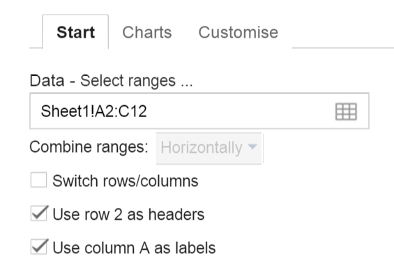
To include this new column in your chart, right click on your chart, select "Advanced edit...", and then go to the "Start" tab. Now in the "Data - select ranges..." box, change the "A2:B11" to "A2:C12". This changes the range of included data from "A2 to B12" to "A2 to C12", which as you can see includes your new data.
From this, you can see that a supercomputer will likely be smarter than the human brain a little after 2020. Scary stuff, hey?
However, if you think about it, it's not really that scary for a computer to be smarter than one human. There are still groups of us, and not many of them. To have Skynet-like superintelligence, you would need one computer to be smart than all humans put together.
When would this happen according to this graph? Well, that's a challenge for you to figure out! See if you can do some maths to figure out how smart all the humans in the world are (this might help), and add this information to your graph to see when a computer might reach this level.
Will any of these things actually happen?
As anyone who studies statistics can tell you, extrapolation often doesn't work out in reality. So whilst graphs like these show that China looks like it will overtake the US, and computers look like they will take over the world, there are plenty of people that argue that these numbers will not work out in the real world.
In the case of China, some people argue that China's growth will slow, preventing it from overtaking the US. In the case of computers, the rapid growth of the past few decades has been based on Moore's Law, which some predict is on the verge of being broken.
Whilst graphs can be a fantastic tool for visualising data, they are only as good as the statistics that are used to make them. So, whilst extrapolations can be thought-provoking, they shouldn't be thought of as an iron-clad scientific prediction of the future. Which may be good news for those of us who don't want to be taken over by robots...