
Often, it is necessary to make comparisons between different data sets to answer questions, or making a choice between two or more groups (or populations).
For example, if looking for the best tree to plant in the school courtyard for shade, it might be useful to compare two similar species of tree to determine "Which species of tree grows the fastest?". This is a statistical question and data can be collected by measuring the growth rates of many trees in a nursery.
If it turns out that all of the individual trees of one species grow faster than all of the individuals in the other species then it will be an easy decision. However, that is not always the case–each individual tree grows at a different rate, and there can be overlap between the measurements from both populations.
This is when statistical methods can be used to analyse and compare data sets.
By comparing the means of central tendency in a data set (that is, the mean, median and mode), as well as measures of spread (range, interquartile range and standard deviation), it is possible to make comparisons between different groups and draw conclusions about the data.
Practice questions
Question 1
Student X scored $86,83,86,88,98$86,83,86,88,98 and
Student Y scored $61,83,50,85,83$61,83,50,85,83 across 5 exams.
Find the mean score of Student X, writing your answer as a decimal.
Find the mean score of Student Y
Find the standard deviation of the scores for Student X, correct to two decimal places.
Find the standard deviation of the scores for Student Y, correct to two decimal places.
Which student performed better?
Student X
AStudent Y
B- Which student performed more consistently?
Student X
AStudent Y
B
Comparing histograms
Histograms, and similar graphs (such as column graphs, dot plots and stem and leaf plots) are popular ways to display data because they give a detailed picture of the distribution of data.
However, with histograms it is not always easy to compare the particular statistical values for our data sets. The numeric characteristics most easily identifiable in a histogram are limited to the following:
- mode (or modal class)
- minimum and maximum values
- spread (indicated by the range)
Since histograms are constructed from class intervals, the minimum, maximum and range can only be estimated because we don't know exactly which values are represented within each class interval.
Furthermore, it is not easy to identify the median or mean or interquartile range from a histogram by inspection, although often it is possible to see approximately where these values would lie. When necessary, it is possible to calculate an estimated value for the mean and standard deviation of the data represented by a histogram.
On the other hand, the histogram does provide excellent insight into non-numeric characteristics of the data which can be important for comparison, including:
- symmetry and skew
- modality, including the location and frequency of the mode(s) or modal class(es)
- size and location of clusters
- gaps, size and location of gaps
Key comparisons for histograms
Many of the comparisons that are described here for histograms can also be used with similar statistical graphs such as column graphs, dot plots, stem and leaf plots and even frequency tables.
If outliers are identified in the histogram, then it is important that these are mentioned in the comparison, with an explanation of how they are handled. In particular, a statement should be made if outliers are included or excluded from comparisons, and the effect that this has on the analysis.
Exploration
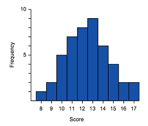
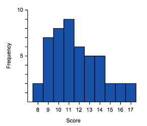
Consider the following histograms that show the height of students in two basketball teams. We know that one graph represents a team made up of Year $12$12 students and the other represents a Year $8$8 team. Which one corresponds to the year 12 team?

Team $A$A

Team $B$B
We can still compare these distributions, even though there is clearly a different number of students in the teams, because we are only interested in the shape and location of the data.
In our comparison we want to mention the most significant differences, and also describe relevant characteristics that are the same, or similar.
In this case we can observe these important similarities and differences:
- both distributions are approximately symmetrical, and uni-modal.
- the modal class for Team $A$A of $170-175$170−175 cm is much higher than the modal class $150-155$150−155 cm for Team $B$B.
- if we ignore the possible outlier values in the $195-200$195−200 class for Team $A$A, then the range of both distributions is similar, at $35$35 cm for Team $A$A and $30$30 cm for Team $B$B.
- student heights have greater spread overall for Team $A$A
- the heights for Team $A$A appear to be concentrated around the modal class so we can say that they are clustered at $170-180$170−180 cm.
Based on these observations, we could confidently say that Team $A$A is the team of Year $12$12 students. In this case, the decision is clear because of the difference in the height for the modal class, which we would expect to be significantly higher for the older students.
Connecting histograms and box plots
Recall that data can be displayed in histograms and in box plots. These two displays are great for being able to identify key features of the shape of the data, as well as the range and in the case of the box plot the inter-quartile range and the median.
The shape of the data will be the same whether it is represented in a polygon, box plot or histogram. Remember that the shape of data can be symmetric, left skewed or right skewed.
Symmetric
Positive (right) skewed
Negative (left) skewed
Looking at the diagrams above, notice the similarities in the representations.
Both representations have skewed tails, where the bulk of the data sits and general shape. These are some of the features that can be used to match histograms and box-and-whisker plots. The data range can also be considered.
Worked example
Example 1
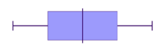
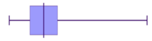
Match the box plots and histograms together.
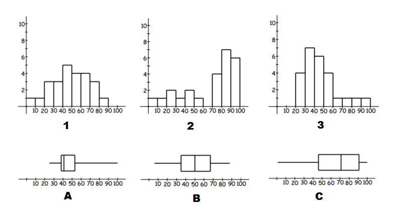
Think: To identify matching data start by identifying tails (left or right) and symmetric type data.
Do:
- We can see, that $A$A and $3$3 have right tails, and thus are both right skewed. So they are a match.
- $C$C and $2$2 have left tails, and thus are both left skewed and so are a match.
- Which leaves $B$B and $1$1, which are both symmetric data.
Practice questions
Question 2
Consider the following pairs of histograms and box plots:
Which two of these histograms and box plots are correctly paired?

 A
A
 B
B C
C D
DIn part (a) we determined that the following histogram/box plot were an incorrect match:
Which two of the options correctly describe why?
The box plot has a long tail to the right which indicates positive skew, while the histogram does not appear to be skewed.
AThe data on the histogram is widely spread, while the box plot indicates that the data is mostly located around the median.
BThe median for the histogram is roughly in the middle, while the median of the box plot is located further to the left.
C
Comparing parallel box plots
Parallel box plots are used to compare two (or more) sets of data visually. When comparing box plots, the $5$5 key numbers are going to be the important parts to consider. The $5$5 number summary will give:
- minimum value
- lower quartile
- median
- upper quartile
- maximum value
Other statistics can be derived such as the range and inter-quartile range, and visual observations can be made of symmetry and skew that should be considered in any comparisons.
The term parallel is used because the box plots are presented parallel to each other along the same number line for comparison. They must therefore be in the same scale, so a visual comparison is fairly straightforward.
Exploration
Here we have two sets of data, comparing the time it took two different groups of people to complete an online task. It is important to clearly label each box plot.

If we want to choose the best group to complete the task, based only on time (in real life other factors, such as accuracy might be more important), we could consider the following observations:
Note that lower numbers mean that the task was completed faster, so lower is better.
- the minimum, lower quartile, median, upper quartile and maximum were all lower for the under $30$30s group;
- the range is lower for the under $30$30s ($20$20 seconds) than the over $30$30s ($24$24 seconds);
- the interquartile range is lower for the under $30$30s ($8$8 seconds) than the over $30$30s ($9$9 seconds);
- at least $75%$75% of the under $30$30s completed the task in under $22$22 seconds, which is the median time for the over $30$30s;
- $100%$100% of the under $30$30s completed the task before the slowest $25%$25% of the over $30$30s.
Every one of these measures is in favour of the under $30$30s so, overall, we can conclude that the under $30$30s performed better.
Key comparisons for box plots
When comparing two sets of data, compare the $5$5 key points as shown above. There are key questions that should be asked:
- How do the spreads of data compare?
- How do the skews compare? Is one set of data more symmetrical?
- Is there a big difference in the medians?
- Can we see regions on one boxplot that extend past the comparable region on the other?
Always consider what factors are more important for the given situation. In some cases, it might be necessary to make judgements by simply comparing the median value; sometimes the minimum or the maximum value is the critical measurement. In other situations, the consistency will be more important than extreme values so it is also worth considering measures of spread to make judgements.
If outliers are identified in the box plots, then it is important that these are mentioned in the comparison, with an explanation of how they are handled. That is, there should be a statement if outliers are included or excluded from comparisons, and the effect that this has.
Exploration
The box plots show the distances, in centimetres, jumped by two high jumpers.

From these box plots, comparison statements can be made, such as:
- Both Bill and Jim have the same minimum jump of $60$60 cm.
- The median height for John's jump is equal to the maximum height for Bill. So the best $50%$50% of John's jumps are higher than Bill's best jump.
- Bill is more consistent than John, with the top $50%$50% of Bill's jumps limited to an interval of just $10$10 cm, compared to an interval of $30$30 cm for the top $50%$50% of John's jumps. Furthermore, the range of $60$60 cm for Bill compared to $90$90 cm for John. Both Bill and John have the same interquartile range of $60$60 cm.
Based on this comparison, if we had to choose one of these high jumpers for the school athletics team, we would most likely choose John. In this case, the maximum height that John can achieve is more important than the consistency (but lower height) of Bill's jumps.
Practice question
Question 3
The box plots below represent the daily sales made by Carl and Angelina over the course of one month.
0 10 20 30 40 50 60 70 Angelina's Sales |
0 10 20 30 40 50 60 70 Carl's Sales |
Two box plots displayed above horizontal number lines. The box plot above represents Angelina's sales and the one below represents Carl's sales. The number lines have major tick marks at intervals of $10$10, ranging from $0$0 to $70$70. Between each major tick marks, there are nine minor tick marks representing increment of $1$1 unit. On Angelina's box plot, the box spans from $16$16, representing the first quartile, to $42$42, representing the third quartile, with a vertical line dividing the box at $30$30, representing the median. Whiskers extend from the edges of the Angelina's box to $2$2 on the left and $51$51 on the right, representing minimum and maximum data points, respectively. On Carl's box plot, The box spans from $30$30, representing the first quartile, to $49$49, representing the third quartile, with a vertical line dividing the box at $42$42, representing the median. Whiskers extend from the edges of the Carl's box to $14$14 on the left and $64$64 on the right, representing minimum and maximum data points, respectively.
What is the range in Angelina's sales?
What is the range in Carl’s sales?
By how much did Carl’s median sales exceed Angelina's?
Considering the middle $50%$50% of sales for both sales people, whose sales were more consistent?
Carl
AAngelina
BWhich salesperson had a more successful sales month?
Angelina
ACarl
B