
When describing the shape of data sets, it is often useful to focus on how the data is distributed and whether the shape is symmetrical or not. Recall that the measures of centre previously explored were the median, mean and mode. Skew is considered relative to a central measure.
Symmetry
Data may be described as symmetrical or asymmetrical.
There are many cases where the data tends to be around a central value with no bias left or right. In such a case, roughly $50%$50% of scores will be above the mean and $50%$50% of scores will be below the mean.
The normal distribution is the most common example of symmetrical data. The normal distribution looks like this:
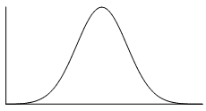
The picture below shows how the normal distribution can be approximated by a histogram. The dark line shows the nice, symmetrical distribution that can be drawn over the histogram.

In the distribution below, the $0$0 point in the middle represents the mean, the median and the mode–all of these measures of central tendency are equal for this distribution, since it is symmetrical. If there was a line at $0$0 as our axis of symmetry, notice that the left-hand side is a perfect reflection of the right-hand side.

Skew
If a data set is asymmetrical instead (i.e. it isn't symmetrical), it may be described as skewed.
Positive skew
A data set that has positive skew (sometimes called a right skew) has a long tail of values above the peak of the graph, such that more than half of the scores are above the peak. This means the mean is greater than the median, which is greater than the mode.
mode $<$< median $<$< mean
A positively skewed graph looks something like this.
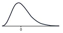
Notice that there are more scores above the peak than below the peak.
Negative skew
A data set that has negative skew (sometimes called a left skew) has a long tail of values below the peak of the graph, such that more than half of the scores are below the peak. This means the mode is greater than the median, which is greater than the mean.
mean $<$< median $<$< mode
A negatively skewed graph looks something like this.
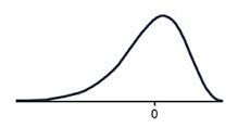
Notice that there are more scores below the peak than above the peak.
Clustering
In a set of data, a cluster occurs when a large number of the scores are grouped together within a very small range.
Outliers
The shape of data also shows us whether there are any outliers or unusually high or low values in a data set.
For example, in the dot plot below, do you see how all the ages range between $12$12 and $14$14 except one? This means that $24$24 is an outlier.

In this case, the outlier is very obviously way outside the range of the rest of the data set.
The formal definition of an outlier is a score that is more than $1.5\times$1.5× IQR above the upper quartile, or less than $1.5\times$1.5× IQR below the lower quartile. This will be discussed further in a later section.
Practice questions
Question 1
State whether the scores in each histogram are positively skewed, negatively skewed or symmetrical (approximately).
A histogram that represents the distribution of scores. The x-axis enumerates discrete scores as individual points, while the y-axis corresponds to the frequency of each score interval. Each bar on the histogram corresponds to one of these distinct scores, with the bar's height reflecting the count or frequency of occurrences for that particular score. Most of the scores are relatively high. Positively skewed
ASymmetrical
BNegatively skewed
CA histogram that represents the distribution of scores. The x-axis enumerates discrete scores as individual points, while the y-axis corresponds to the frequency of each score interval. Each bar on the histogram corresponds to one of these distinct scores, with the bar's height reflecting the count or frequency of occurrences for that particular score. Approximately, as the score goes higher, the frequency goes lower. Positively skewed
ANegatively skewed
BSymmetrical
CA histogram that represents the distribution of scores. The x-axis enumerates discrete scores as individual points, while the y-axis corresponds to the frequency of each score interval. Each bar on the histogram corresponds to one of these distinct scores, with the bar's height reflecting the count or frequency of occurrences for that particular score. The scores have its peak approximately in the middle. Negatively skewed
ASymmetrical
BPositively skewed
C
QUESTION 2
For the Stem and Leaf plot attached:
| Stem | Leaf | |
| $0$0 | $5$5 | |
| $1$1 | $7$7 $8$8 | |
| $2$2 | $0$0 $8$8 | |
| $3$3 | $0$0 $4$4 $6$6 $7$7 $8$8 $9$9 | |
| $4$4 | $1$1 $3$3 $5$5 $8$8 $8$8 $8$8 | |
| $5$5 | ||
| $6$6 | ||
| $7$7 | ||
| $8$8 | ||
| $9$9 | $3$3 | |
|
||
Are there any outliers?
Yes
ANo
BIdentify the outlier.
Is there any clustering of data?
Yes
ANo
BWhere does the clustering occur?
10s - 20s
A30s - 40s
B20s - 30s
CWhat is the modal class(es)?
10-19
A40-49
B30-39
C20-29
DNot including the outlier, the distribution of the data is:
Positively skewed
ASymmetrical
BNegatively skewed
C
Central tendency
So far, three measures of central tendency have been discussed: the mean, the median and the mode. These three measures all give an approximation of where the centre is in a data set.
So, when determining the centre of data sets by finding the mean, median and mode, it is possible to start to compare and make judgments about different data sets. For example, which one has the highest mode, the lowest median and so on.
Modality
Modality describes the prevalence of local peaks in a data set. The peaks don't necessarily need to be the mode of the whole data set, but rather a local cluster of data that is more frequent and stands out from the surrounding data. When looking at the modality of a data set, it is usually useful to examine a graph of the data.
Modality is described by the number of peaks. A data set that has two distinct peaks, like in the histogram below, is called bimodal.

To determine the modality of a distribution, simply identify the number of modal peaks. For instance, the data shown in the dot plot below has three modal peaks because there are local peaks at scores of $6$6, $12$12, and $20$20.

Practice questions
QUESTION 3
How many peaks are there on the graph?

$\editable{}$ peaks
Choosing a measure of centre
It is important to note that certain features in a data set can significantly affect one or more of the three measures of central tendency (the mean, median and mode).
So, how do we know which measure of central tendency is most appropriate for a data set?
Mode
Remember the mode is the most frequently occurring score. So, if a data set has a significant number of repeated scores, then the mode could be a good measure of centre.
Mean
If the range of scores is reasonably small and there are no outliers, then the mean is an appropriate measure of centre.
Median
Unlike the mean, the median is not affected by outliers. So, the median is a good measure of central tendency if a data set has outliers or a large range.
Choosing a measure of centre from a graph
The shape of the data may also determine which measure of central tendency is the most appropriate measure of a data set.
If a data set is symmetrical, then the mean and median will be approximately equal. If the data is unimodal (has only one mode) then the mode will also be approximately equal. If the data has more than one mode (e.g. if it is bimodal) then the modes may be different to the mean and median.
When data is positively skewed, the mean is the highest measure of central tendency and the mode is the lowest measure of central tendency.
For positively skewed data:
mode $<$< median $<$< mean
When data is negatively skewed, the mode is the highest measure of central tendency and the mean is the lowest measure of central tendency.
For negatively skewed data:
mean $<$< median $<$< mode
Therefore, in skewed data, the most appropriate measure of central tendency will be the median.
Summary
Here is a basic summary of selecting an appropriate measure of central tendency. Note that often it can be helpful to consider more than one measure.
| Data Set... | Mean | Median | Mode |
|---|---|---|---|
| has outliers | yes | ||
| has many repeated values | yes | ||
| has a relatively small range | yes | ||
| is skewed | yes |
Of course, sometimes the context of the data being analysed lends itself to particular measures as well.
Practice questions
Question 4
Which measure of centre would be best for the following data set?
$15,13,16,17,15,15,15$15,13,16,17,15,15,15
Mean
AMode
BMedian
C
QUESTION 5
Every week over $45$45 weeks, a kayaking club runs social sessions that are open to the public. On each session, the number of people who attend is recorded. The results are displayed in the table provided.
| Number of people attending | Number of Weeks |
|---|---|
| $12$12 | $6$6 |
| $13$13 | $5$5 |
| $14$14 | $6$6 |
| $15$15 | $5$5 |
| $16$16 | $6$6 |
| $17$17 | $5$5 |
| $18$18 | $6$6 |
| $19$19 | $5$5 |
| $20$20 | $6$6 |
Considering the distribution of the responses, which of the following is true?
The mean is a better indicator of the typical number of people who attended each session than the median.
AThe median is a better indicator of the typical number of people who attended each session than the mean.
BThe mean and median are equally accurate indicators of the typical number of people who attended each session.
C