11.03 Shape of data
When we describe the shape of data sets, we want to focus on how the scores are distributed. Some questions that we might be interested include:
- Is the distribution symmetrical or not?
- Are there any clusters or gaps in the data?
- Are there any outliers?
- Where is the centre of the data located approximately? (Recall our three measures of centre: mean, median and mode)
- Is the data widely spread or very compact? (Recall our three measures of spread: range, interquartile range and standard deviation)
Symmetry
Data may be described as symmetrical or asymmetrical.
There are many cases where the data tends to be around a central value with no bias left or right. In such a case, roughly $50%$50% of scores will be above the mean and $50%$50% of scores will be below the mean. In other words, the mean and median roughly coincide.
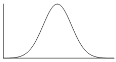
The normal distribution is a common example of a symmetrical distribution of data. The normal distribution looks like the following bell-shaped curve:

The picture below shows how a data set that has an approximate normal distribution may appear in a histogram. The dark line shows the nice, symmetrical curve that can be drawn over the histogram that the data roughly follows.
In the distribution above, the peak of the data represents the mean, the median and the mode (taken as the centre of the modal class)–all these measures of central tendency are equal for this symmetrical distribution.
A uniform distribution is a symmetrical distribution where each outcome is equally likely, so the frequency should be the same for each outcome. For example, when rolling dice the outcomes are equally likely, while we might get an irregular column graph if only a small number of rolls were performed if we continued to roll the dice the distribution would approach a uniform distribution like that shown below.
Skew
If a data set is asymmetrical instead (i.e. it isn't symmetrical), it may be described as skewed.
A data set that has positive skew (sometimes called a 'right skew') has a longer tail of values to the right of the data set. The mass of the distribution is concentrated on the left of the figure.
A positively skewed graph looks something like this:
 |
 |
| General shape of positively skewed data with right side stretched out | General shape shown over a histogram of positively skewed data |
A data set that has negative skew (sometimes called a 'left skew') has a longer tail of values to the left of the data set. The mass of the distribution is concentrated on the right of the figure.
A negatively skewed graph looks something like this:
 |
 |
| General shape of negatively skewed data with left side stretched out | General shape shown over a histogram of negatively skewed data |
Clustering
In a set of data, a cluster occurs when a large number of the scores are grouped together within a small range. Clustering may occur at a single location or several locations. For example, annual wages for a factory may cluster around $\$40000$$40000 for unskilled factory workers, $\$55000$$55000 for tradespersons and $\$70000$$70000 for management. The data may also have clear gaps where values are either very uncommon or not possible in the data set. If the data has two clear peaks then the shape is called bimodal.
Outliers
As we have seen previously, an outlier is a data point that varies significantly from the body of the data. An outlier will be a value that is either significantly larger or smaller than other observations. Outliers are important to identify as they point to unusual bits of data that may require further investigation and impact some calculations such as mean, range and standard deviation.
Example
For the dot plot given above the score of $9$9 would be considered an outlier as it is well above the body of the data.
Practice questions
question 1
State whether the scores in each histogram are positively skewed, negatively skewed or symmetrical (approximately).
Negatively skewed
APositively skewed
BSymmetrical
CPositively skewed
ASymmetrical
BNegatively skewed
CNegatively skewed
ASymmetrical
BPositively skewed
C
question 2
The stem and leaf plot below shows the age of people to enter through the gates of a concert in the first $5$5 seconds.
| Stem | Leaf | |
| $1$1 | $0$0 $1$1 $2$2 $3$3 $4$4 $5$5 $6$6 $6$6 $6$6 | |
| $2$2 | $0$0 $0$0 $1$1 $4$4 $9$9 | |
| $3$3 | $1$1 $4$4 $7$7 $9$9 | |
| $4$4 | ||
| $5$5 | $4$4 | |
|
||
What was the median age?
What was the difference between the lowest age and the median?
What is the difference between the highest age and the median?
What was the mean age? Round your answer to two decimal places if needed.
Is the data positively or negatively skewed?
Positively skewed
ANegatively skewed
B
question 3
The percentage of faulty computer chips in $42$42 batches were recorded in the histogram below.
Which of the following makes this statement true?
The distribution is:
Uni-modal
ABi-modal
BMulti-modal, but not bi-modal
CWhich of the following are the modal classes? Select all that apply.
$0-1$0−1
A$1-2$1−2
B$2-3$2−3
C$3-4$3−4
D$4-5$4−5
E$5-6$5−6
F


.svg)