When you're trying to figure out what is going on in the world, having data about the thing that you're interested in helps. However, the problem is that data by itself can often be difficult to interpret, compare and analyse. Displaying data in graphs, provides us with a way to present data which can be both visually engaging and easier to understand. In this exercise, we're going to look at how to make a range of graphs using spreadsheets to help us answer some interesting questions.
Creating graphs
Our first step is to look at how to create a variety of graphs and select an appropriate graph for a given set of data. In this investigation, we'll be using Google Sheets to make our tables and graphs, since it is free and available to anyone. If you have Microsoft Excel on your computer, you can use this instead and the instructions are fairly similar.
Let's look at two small sets of data and how to create an appropriate graph before tackling a real-life example.
Part 1
A teacher surveys her students on the sports they compete in over the year. The responses from 50 students are shown below.
| Sport | Frequency (number of students) |
|---|---|
| Football | 30 |
| Tennis | 5 |
| Rugby | 20 |
| Swimming | 10 |
| Basketball | 25 |
Let's create some graphs for this data and then determine which is most appropriate.
Step 1. First, create a new spreadsheet and copy the data from the table above into the sheet.
Step 2. Next, select all of the data and click "Insert", and then "Chart".
Step 3. The top recommended chart should appear and a menu on the right displaying the options we have. Select the "Chart type" drop-down menu and you will see a selection of recommended graphs plus a list of all other charts that can be selected.

Step 4. Choose the graph you wish to insert and then use the other options to format the titles, colours and gridlines to create an easy to read and appealing chart.
For our first example try creating a column graph, a pie chart, a line graph and two more graphs of your own choice. The first three graphs should look something like:
 |
 |
 |
| Column graph | Pie chart | Line graph |
These three graphs along with the two you have chosen each display the information given in the table in a different way but are the graphs all appropriate for this type of data? Which graph is best?
Discuss with a partner why you think a graph is suitable or not. Consider:
- Is it easy to read? Are you able to compare the amount in each category easily?
- Can you think of some examples where you would commonly see these types of charts? Which situations are similar to the current example?
We will look in greater detail at choosing appropriate graphs for different types of data in our next investigation. Let's look briefly at some reasons why our three graphs above are not equal when it comes to effectively displaying the data:
- Column graph: This is the best choice for the data given, it clearly compares the size of the different categories and the number of students(frequency) can easily be read from the scale.
- Pie chart: This chart is not appropriate for the data given. Here students may play more than one sport, so the percentages given do not tell us what percentage of the class plays each sport but the percentage of responses. While it does give comparative sizes of the different categories the percentages given may mislead some readers. Pie charts are best when representing the break down of a data set into separate components.
- Line chart: The line chart is not appropriate for the data given. Line charts are best for representing ordered data or data that changes over time. While we can read the frequencies from this chart, this type of chart will lead readers to look for trends which are not present, such as the line increasing or decreasing across the categories. However, the categories we have could be rearranged in any order and the resulting line graphs would give different impressions for trends which are not present in unordered categorical data.
Part 2
The following set of data shows the monthly average temperature in Melbourne for a year.
| Month | Jan | Feb | Mar | Apr | May | Jun | Jul | Aug | Sep | Oct | Nov | Dec |
|---|---|---|---|---|---|---|---|---|---|---|---|---|
|
Temp (\deg C) |
25.9 | 25.8 | 23.9 | 20.3 | 16.7 | 14.0 | 13.4 | 15.0 | 17.2 | 19.7 | 21.9 | 24.2 |
Using the steps from Part 1 create four graphs of the data including a column graph, a pie chart, a line graph and a graph of your choice.
- Discuss with a partner why you think each graph is suitable or not.
- Which graph do you think best represents the data?
- Does each graph give meaningful information?
- Are some better for displaying trends over time or larger sets of data?
Part 3
Let's now explore some real data and use graphs to help us illustrate and analyse the data to try and answer the following question:
Will China become the world's most powerful nation?
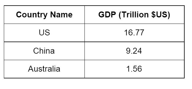
Let's see if we can answer this by comparing the economic power of the US, China, and Australia. Specifically, we'll try to use Gross Domestic Product, or GDP for short, (which measures the size of an economy) for these three countries as a measurement of economic power. This is what it looks like, as of 2015, in US dollars:
US current GDP - \$16.77 trillion
China current GDP - \$9.24 trillion
Australia current GDP - \$1.56 trillion
In this exercise, we'll use these figures for the example graph. However, when you make your own, you should get the latest figures. You can find the latest figures by doing a quick search.
As of 2015, the case looks pretty clear. Out of the three countries that we've picked, the US is No. 1, China is No. 2, and Australia is No. 3. But just looking at the numbers makes it hard to get a feel about just how different the sizes of the economies are, let's first create a table of the data.

The table is quite a bit easier to read than a block of text, but a graph would be better still.
Follow the steps from Part 1, to create an appropriate graph. What type of graph would best compare the relative sizes of the different countries GDP?
Use a graph that gives a good visual impact of the difference between the countries. The economy of the US is really big. And the economy of Australia is really small in comparison. And the economy of China is somewhere in the middle.
This gives us a good idea about the state of the economies at a point in time but how can we answer the question? We need to know how fast each economy is growing. Let's look at how the countries have changed in recent years.
Using two sets of data
Let's try looking for the GDP of each of these countries in 2000. Add that information into your table, by putting an extra column in the middle. After you add the information, it should look similar to this:

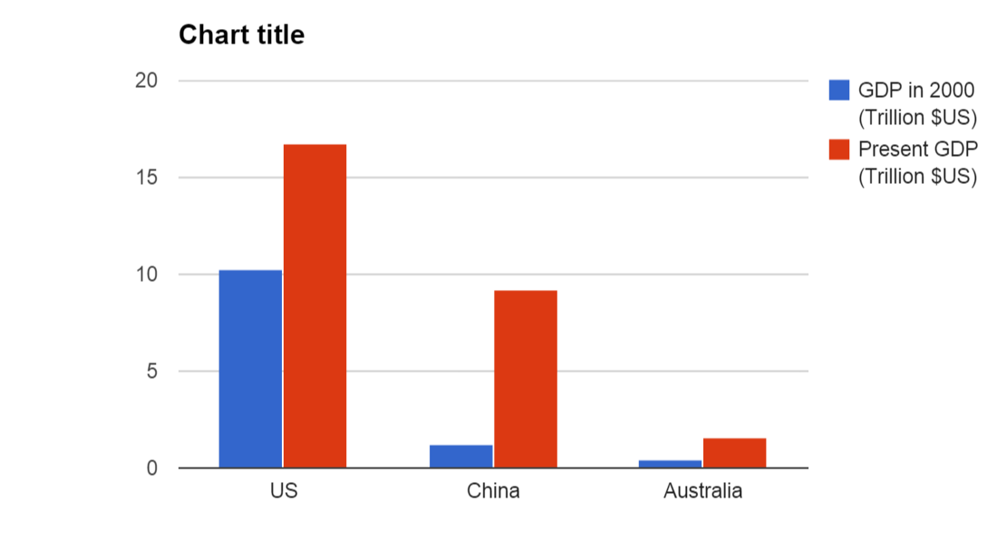
Then, make a new graph by highlighting the entire table and select "Insert" then "Chart". This time, you should find that the software has selected a paired column graph as the recommended graph and automatically made two different coloured columns, one for the year 2000 and one for the present year:

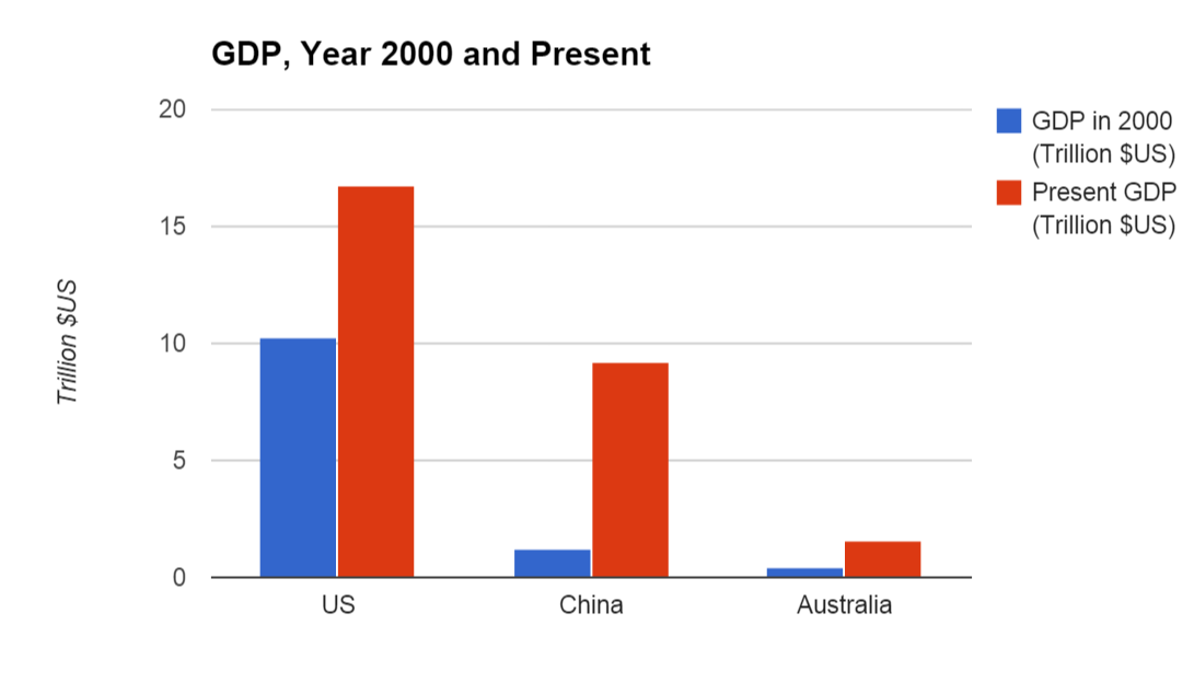
Don't forget to label your graph. Give your graph an informative title, like "GDP, Year 2000 and Present". And we should label the left axis, to indicate the units. To do this, right click on your graph, then click "Axis", then "Left axis title", and change it to "Trillion $US":

We can now see that within 15 years or so, China's GDP has increased from barely larger than Australia's to more than half of America's, whilst the US and Australia have not grown by anywhere near as much. So, at the moment, the US is the most economically powerful nation in the world, but as this graph shows, China may well overtake them sometime soon.
Looking further at trends
Looking at just two year's data it can be hard to gauge the trends in growth over time. Obtain data for each country's GDP for the last 15 years. And create line graphs for the data over time.
For each country answer the following:
- Has the growth been fairly stable over that time?
- Are there any significant deviations from the trend? If there are can you find a reason for it?
- Is the rate of growth getting faster or slower?
From the graphs do you think China will overtake the US? Do you have a prediction for when? How could you make this prediction?
What about India?
We often hear of India as another upcoming economic superpower. See if you can add India's GDP for the last 15 years to your graph, and see what you think about it's size and speed of growth.
Will any of this actually happen?
When making predictions past the existing data (extrapolating) we should be cautious of how reliable those predictions may or may not be. So whilst graphs like these show that China looks like it will overtake the US in the not too distant future, we should consider if there are reasons to think the trend will change. In the case of China, some people argue that China's growth will slow, preventing it from overtaking the US. Factors such as trade agreements, government changes and an ageing population may see trends change and growth rates slow.